
 Login
LoginOil Painting Mastery
Class 1
Class Overview and Supplies
In this course, you will learn the basics of oil techniques; everything from alla prima painting to oil glazing. You will need the following supplies:
Canvas: I reccommend canvas panels or pre-made stretched, primed canvas that’s ready to paint on.
The quality won’t be as high as what you would end up with if you stretched, primed, and sanded raw canvas yourself, but it’s much, MUCH easier and will mean that you can start painting right away.
Paint: Either traditional oil paints or alkyds. Alkyds are compatible with traditional oil paints, as well as with traditional solvents and mediums for oil paints.
The only difference is the binding agent used. In oil paints, the binder is linseed oil, and in alkyds, the pigment is bound with an artificial plasticy thing that makes them dry a lot faster.
The drying time makes alkyds preferable for slow-drying techniques, such as impasto or oil glazing, as well as for underpainting.
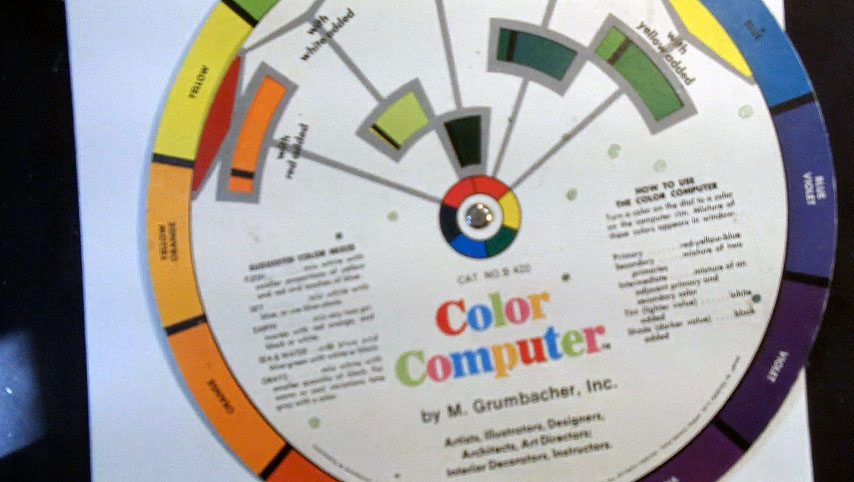
Choose at least 8 colors to begin with, including the three primaries and some earth tones as well as white.
Palette: to mix the colors on. Disposable paper palettes are fine if they are made for oil paint. otherwise wood or glass are great, because they’re sturdy enough to stand up to lots of mixing and scraping.
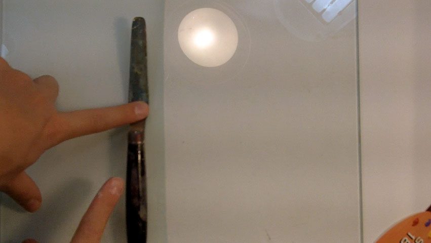
Palette knives and mixing knives: You’ll need palette knives for techniques that call on you to paint with knives, and you will need a mixing knife to mix colors on the palette and to get liquin out of the bottle.
Brushes: There are nylon brushes and soft brushes. In these two large categories, tthere are flats, fans, filberts, rounds, and brights.
You don’t need one of everything, but you’ll want a selection of about three sizes of flats and three of round. Oil brushes are often quite cheap, so start with lower quality.
Turpentine or Mineral Spirits to clean and thin paint. If you use turpentine, a well-ventilated studio is especially important, as the fumes are toxic and will build up quickly in a closed space.
Jar to hold the turpentine or mineral spirits. Use two; one for dirty thinner and a second that can be kept cleaner. That will save you time and money in changing the thinner less often.
Linseed oil and Liquin. These are mediums that you add to oil paint to change the way it goes on the canvas. Linseed oil makes it more drippy and lustrous, and liquin makes the paint thinner, improves glazes, and speeds up drying time.
Rags for clean up. You’ll need a lot; not only to dry brushes that you cleaned in turpentine, but to wipe paint off the palette or canvas.
Old ripped up t-shirts are a good choice, as are old washclothes, or paper towels.
Other than that, you may want to invest in some varnish and varnish brushes, smocks to protect your clothes, a mahl stick (or you can use a dowel), a roller brush, and of course, more variety in the paint and brushes that you begin with.
But if you’re a beginner and just want to try your hand at a new medium, don’t break the bank on a bunch of supplies that you may only use a few times.
Class Two
The Wipe-Out Method
We’re going to start the course as simply as possible, and that means learning the wipe-out method of oil painting.
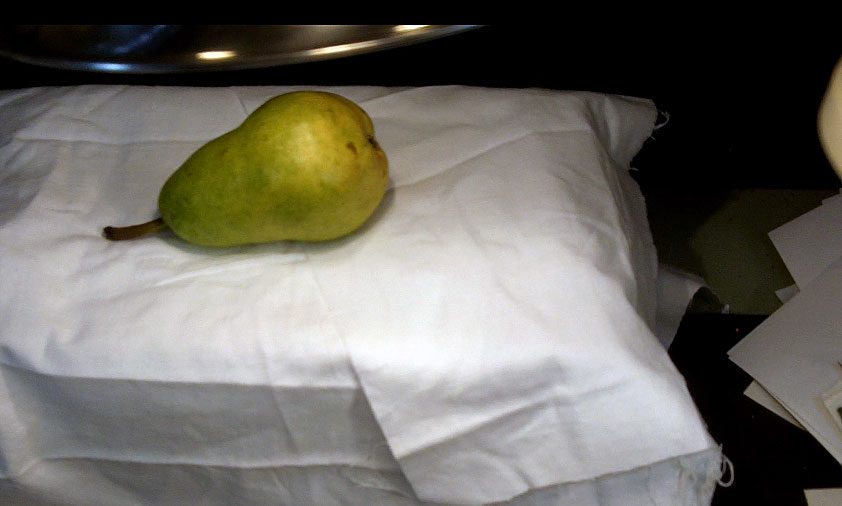
Set up something very simple to look at, such as a single piece of fruit under direct lighting.
You want to be able to see the lights and darks on the object, and to have clear shadows and highlights so that you can develop realistic contrasts.
Next, choose a single color such as burnt sienna, mix it on your palette with liquin using your mixing knife, and start to paint the color on the canvas.
Focus on building up the fruit on some sort of plane–a countertop or table, for instance.
Keep this initial pass of paint fairly thin; you don’t want so much color that most of it needs to be wiped away in the next step.
When the color has been established in the basic shape of your fruit, wrap a rag around your finger, dip it in mineral spirits, and start wiping the color in the fruit, foreground, and background.
You want enough difference between the tones that it’s clear what your subject matter is. Think of this step as painting with your finger. The mineral spirits will fill in the dry brush strokes of the first pass, creating more solid base tones, and the strokes you use will help bring out the volume of the fruit.
Next, you’ll need to bring out some of the darks and strengthen the highlights. Add darks by painting more color in the shadows, remembering that the darkest tone you can have is the color straight from the tube.
If you need to pull some color back out or lighten a tone, you can use a rag or brush dipped in some mineral spirits to wipe paint off the canvas.
For small areas, fold a paper towel into a tight triangle and dip the tip in mineral spirits. You can use this to take out small shapes and highlights.
While the paint is still wet, you can pull out even smaller hightlights by using a firm eraser with a small point.
You aren’t actually erasing the paint away, so don’t worry about leaving messy crumbs in your paint, but the pressure and friction from the eraser will take away the paint and leave you stark whites in thin lines.
You can then blend these white lines back into the painting a bit with a stiff bristle brush if needed.
Be careful when you pull color out though; it’s easy to accidentally wipe all your paint away, and then you’ll have to paint it on again and start over.
Also, try to avoid getting so much thinner on the canvas that you can’t put any more paint down, or you’ll have to wait for the canvas to dry. You want to be able to finish the painting in about fifteen minutes in a single sitting.
This exercise is wonderful way to get introduced to the medium and get some nice results. It’s very simple, and straight-forward to learn, and because you only have one color to worry about, you can use your time getting acquainted with how to put down paint and pick paint up, blending tones, and forming shapes with brushes or rags.
Class Three
Alla Prima Oil Sketch of Fruit
This will be a class in painting not only shaggy fur, but solid white fur.
After the wipe-out method, the next simplest form of oil painting is the oil sktech. The oil sketch is one variety of alla prima, or “all at once” painting, which is one branch of oil painting with many variations in style.
The oil sketch is meant to be fast, starting with large washes of color thinned down with turpentine or other solvent that will allow them to dry quickly.
The entire painting shouldn’t take more than fifteen or twenty minutes, so choose very simple subject matter that can be captured quickly.
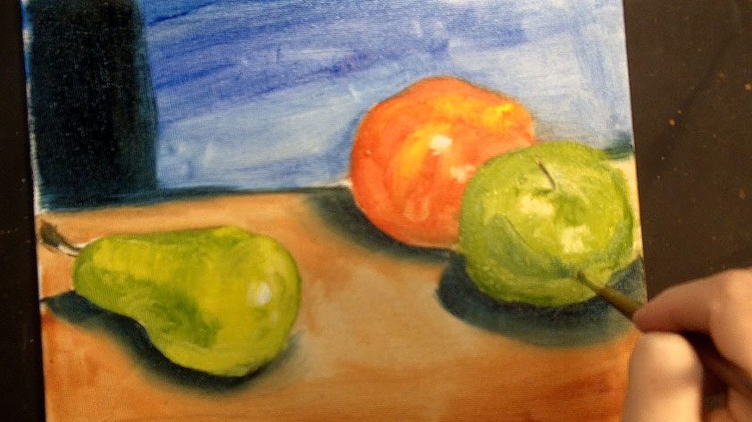
In this oil sketch, I chose a still life of three pieces of fruit. Begin by sketching the fruit very loosely in a charcoal pencil (or anything else except graphite, which will bleed through the paint).
For the alla prima painting, you’ll need more colors than the wipe-out monochromatic painting, but start with just a few of the local colors–green for the pear and apple, red for the red apple, and so on.
Thin the paint with turpentine or mineral spirits as you paint the local color to make the washes go down smoothly and quickly.
Next, choose a background color and paint it around the fruit using as large a brush as you can for the area.
This first pass will still be very thin, and then as it dries, you can paint fatter colors (color with more linseed oil and less solvent) over the top.
Do the same thing in painting a foreground color, which will establish what the fruit is sitting on.
You don’t have to necessarily cover every inch of canvas when making an oil sketch, but fill in what’s needed for the composition as your first step.
At the end of this stage, all of your washes are thin, done in basic local color.
When the washes are in place, add some fat colors to the fruit to start building up the shapes; add some yellows to the pear, and thin that yellow less to keep it fatter.
Focus on getting the shapes down accurately with as few strokes as you possibly can. It should be a low-stress painting method–you’re just describing a scene as simply as possible. It should be fast and fun and impressionistic.
When the fruit is in place with both fat and lean layers of paint, add some shadows, highlights, and finishing details such as the stems of the fruit.
You have a lot of freedom in oil painting, and especially in an oil sketch, because the style is meant to be loose and free, so you can easily cover mistakes by adding and removing paint.
Class 4
Alla Prima Oil Sketch of Figures in Motion
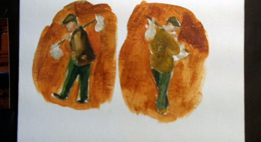
In the fourth class we’ll make another alla prima oil sketch, but this time, we’ll paint figures in motion.
You’re still focusing on being fast and efficient with your strokes and telling a complete story as qiuckly and accurately as possible, but now you’re applying the technique to slightly more complicated subject matter.
Start with references to look at and sketch the figures. If you use a blunt charcoal pencil, you won’t be able to “choke down” on it and make the sketch too tight.
Keep it loose and free flowing, even at this stage. Start each sketch with the head, and then build the body down from there, getting the angles of the spine, shoulders and hips in place right away and then filling in the outer shape of the body parts afterwards.
This is a lot like building a wire frame and then “fleshing it out” with paper mache or clay.
When the sketch is accurate to proceed, start painting by filling in the largest shapes of color that you can; brown coat, olive pants, then the shapes of the flesh tones on the hands and face.
You’re working large to small, putting down each color with as large a brush as you can manage for the area to keep your shapes smooth and clear.
When the large shapes are in place, add smaller shapes such as the hobo stick and shoes, then you can clarify the figure a bit more by painting a turpentine wash of a background color.
As you establish the background color, you’ll be cleaning up the profile and other shapes of the figure at the same time.
Don’t paint the background in one boring color; add two or three and keep it interesting.
After the background is in place, start the clean-up phase of the oil sketch. Make sure that the figure looks correct; it shouldn’t be a mess just because it’s impressionistic.
It may be helpful to squint at your reference material so that you can only see the highest areas of contrast, because that’s all you’re trying to capture.
Don’t get bogged down in the details. You’re trying to be spontaneous and to get the overall story told without being picky.
If this is difficult to understand, try doing a few oil sketches in one color so that you have to focus on contrasts without worrying about accurate color.
When you’ve improved in monochromatic oil sketches, start introducing color.
You can keep these small, and you shouldn’t be taking more than fifteen or twenty minutes for each, so you can do a lot of sketches on a single panel of canvas.
And remember, you can always paint over a used canvas with white Gesso after a painting has dried completely if you want to recycle it for a new piece!
Just let each coat of gesso dry completely before you add ad- ditional layers, and if needed, sand down any ridges with a piece of very fine sandpaper between layers.
Class 5
Making Color Studies
Making simple color studies will not only give you a chance to hone your newly developing skills as an oil painter, but it will provide you with a handy reference tool to use later on in your studio as your paintings become more involved.
Basically, a color study is a guide that will show you, at a glance, how two or more colors will look juxtaposed next to each other in a finished painting.
You can use anything you please to develop a series of color studies: an apple or pear is a nice simple shape if you want to stick to recognizable objects, but a plain square or circle will work every bit as well and perhaps be a bit faster.
Get a piece of canvas and draw six copies of the same shape on it, keeping them well spaced so you’ll have room to paint two background colors surrounding each shape.
If you don’t want the charcoal dust to mix into your paint and make it muddy, spray the drawings with some fixative before you start painting.
Paint the shapes first. If you’re using something with a local color, like an apple or a pear, you can choose to paint three shapes one color and three another.
If you’re painting a shape, just pick a few colors and paint the shapes. Your color studies will be more useful if you can see how one color (for instance, a green apple) will look with different backgrounds, so I reccom- mend painting the shapes in only one or two different colors.
Next, paint the top half of the background extending about an inch or so around the fruit or shape.
You may want to choose a compliment color for this; for example, if your first pear is green, you might want to see how it looks surrounded by red, which is green’s compliment.
Choose a different color for the bottom half of the background. You can even overlap the two background colors a bit and see what color they become when mixed.
I also recommend making a gradient of each background color by thinning it around the edges with a solvent or Liquin so you can see the effect of the color at different intensities.
Choose different background colors for each shape, and you wind up with a useful guide that will quickly show you how different color combinations will effect the mood of your painting.
Also keep in mind that the color’s intensity and the number of colors used will have varying impacts; subdued moods are created with colors of low intensity, often with a limited palette.
Happier, more energetic moods are conveyed with brighter colors, starker contrasts, and colors of bold intensity. Experiment, and don’t stop with just six or so small studies; expand until you have a good sense of what many, many color combinations will do on the canvas.
Also, keep some scraps of canvas or large panels nearby so you can test a combination out before you apply it to a finished painting.
You’ll save yourself a lot of time and effort this way, not to mention that every test expands your knowledge of color.
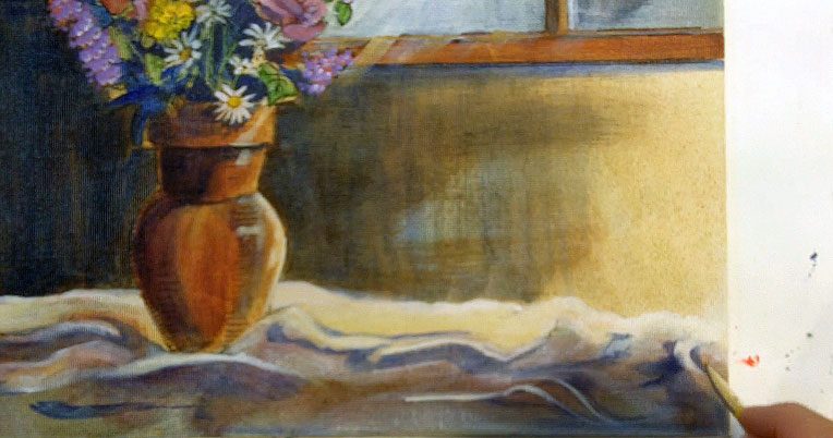
Class 6
Painting Still Life in Extended Alla Prima Style
Because this is still an alla prima style, you still want to get done with the painting in one sitting.
I set up a simple still life of three pears and sprayed the drawing with fixative. When the fixative is dry, you’re ready to start painting.
Start by washing in thinned color over everything. The color doesn’t have to be accurate, it just has to be thin so it will dry quickly.
Just fill in the canvas with rough washes. You shuld work fast, but not sloppily. Think of this stage as developing an oil sketch.
When the canvas is filled with thin washes, you can start adding local color to the pears. Local color is the “accurate” color of the object; the pear, for instance, is yellow.
However, don’t just paint everything yellow; bring out some greens and blues and start establishing some shadow shapes on the pear.
Add some additional color to the table and background, and at the same time, you’ll be carving out the shapes of the pears in the foreground better.
When the table is the right color, add some cast shadows from the pears on it.
Once the blocks of local shadow and shadows are on the pears, you can blend the colors smooth with a fan brush dipped in liquin, then add some highlights.
If the highlights aren’t standing out enough, you need to increase the constrast. That means either darkening the skin of the pear or lightening the highlight.
If you want to add an interesting textural quality to the background, scumble over the top with a light color, keeping the initial color visible here and there.
Do similar work to the table top, building up the contrasts more to make the painting more visually appealing.
Finally, take some time and work on the details. The pears might need stems, scars, speckles, and so on. However, you can easily ruin a piece by “majoring in the minors” as it were.
Don’t add too many details, or you’ll kill the freshness of your piece. To make sure you’re only adding the essentials, continally stand back from the piece and see it from the distance a viewer will be standing.
Your oil brushes have very long handles for a reason–you can paint as you stand back from the piece.
When you’re satisfied with the composition and your still life is detailed enough but not so much that it looks busy, put the painting away and let it dry completely.
This will take days and even weeks, especially if you used regular oil paint and not alkyds. Then, you can varnish it to seal out dust and preserve it.

Class 7
Painting a Figure in Extended Alla Prima Style
In this alla prima painting we’ll focus on the same technique, but applied to more difficult subject matter.
Begin with a charcoal sketch of the figure. Using a blunt charcoal pencil, make loose lines that very quickly start to describe the largest shapes of the head and body. Work from loose to tight–large shapes to small details, and clean up the lines as you go.
When the drawing is clear enough to work from, spray it with a fixative and you’re ready to start painting.
Start the same way as last time, with large washes of thinned color that establish the large, basic shapes of the background.
In the figure, squint at the figure to find the shapes of the shadows and paint them as your first step.
When the canvas is covered with washes, you can start the second phase of the painting, which is adding fatter layers of local color.
This includes the clothing, flesh tones, the grasses, and the house in the background.
This is a clarifying stage; the washes begin to take on more life and realism as you build up the local color and sharpen the shapes of contrasts.
The grass is darker in the shadows and lighter in the sun-struck places, so you can dab on color accordingly to tell the story of where the light is hitting.
Then, use a smaller brush to add even more detail to the more subtle shadow shapes and details on the figure. For example, you can add shadows on the flesh tones, the hat, the wrinkles in the clothing and so on.
Next, add some additional color to the house in the background and the fence. Work carefully when you get to places that lie against the smaller details in the foreground, or you’ll wind up losing your details.
The background color is a good way to carve out small shapes in the foreground, so take your time and work carefully.
The rest of the painting process is more of the same; go back and forth between local color and shadow color, adding finer details once the larger shapes of color have been put in.
Once the main color of the grass is painted, go back into it with a flat brush and add a few blades of individual grasses.
Do similar work in the flower garden, the fence, house, and figure. Just don’t be tempted to add fine details until the larger shapes are in place and correct: you don’t paint eyelashes until the eyelids are painted, and you don’t paint eyelids until the larger shape of the face is right.
Always work large to small and you can’t make too many mistakes.
Class 8
Alla Prima Painting Wet-on-Wet
Let’s move forward to another alla prima technique, called wet-on-wet.
You’re going to be doing a lot of mixing directly on the canvas for this painting method, so use long-haired bristle brushes that will stand up to the rough texture.
Start with a basic sketch that places the horizon line and the largest shapes that make up the composition with a piece of willow charcoal.
Spray it or not, depending on your preference. There shouldn’t be too much charcoal on the page, because your subject matter should be able to be described very simply with few lines.
However, if the smearing bothers you, it only takes a second to spray the drawing with fixative.
To start painting, always work back to front (backgournd elements before foreground).
That means starting with your sky. Next, while the color is still wet, start dropping in leaves right over the top of the sky.
Use more than one color of green to add interest, then go straight into developing the path.
You’re working your way from the top to the bottom and painting colors that are farther in the distance first so that ojects standing in front can be painted right on top once those first colors are down.
You can mix the colors right on your canvas as you layer these blocks of local color.
Use swooping, fast strokes to finish building up the green, then start adding the violet flowers over the top of the grass by stippling them (bouncing the brush up and down to make a series of small dots).
When the main shapes are all blocked in, refer to the reference material to see where the dark shapes of the tree branches are supposed to go.
Use the largest brush you can to paint the tree branches, establishing them as broken lines to give a sense that in some places the leaves are covering the tree branches.
Work that way for a while to build up the tree branches, then add some more detail to the path, flowers, and branches. Use a smaller brush when you get to the detail stage, but be careful not to tighten the picture up too much.
The wet-on-wet style should be spontaneous and loose, full of bright patches of color that work together to give the impression of a scene, more than capturing the small details that you see.
To make sure that you’re only emphasizing the essential details, continually step back from the work when you get to this stage.
If you’re adding details that you can’t even see from two or three steps back, they’re non-essential.
And remember, the clock is ticking. Keep your work loose and free-flowing by sticking to the timer.
If you can’t get it done in half an hour or so, you’re working too slowly or putting too much time into it.
Class 9
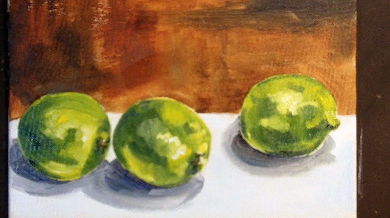
Alla Prima Painting in the Color Block Style
In this class we’ll be learning another alla prima technique called painting in blocks of color.
This style is based on painting color in large blocks of color, then making the blocks smaller and more jewel-like as the form becomes more finished.
This is a direct painting technique, and it will involve mixing colors on the paletee and then applying them to the canvas.
To begin, sketch your still life and spray it with fixative, then start applying thinned washes of large blocks of local color. In the example, I’m painting three limes and begin with washes of green.
Next, add some of the other colors you see, such as yellow, and lighter green mixed with white.
The strokes always stay angular in this painting method, even though they become smaller and the paint gets fatter as you progress in the painting. When you’re ready to move forward, start work on the background.
There is a table that the limes are lying on as well as the wall behind, so choose two colors that work well together to paint those.
Make sure to paint everything, even if you’re painting a white wall on a white canvas, or the styles of the background and foreground will fight each other.
As you paint the background color, you’ll be working on carving out more precise lines on the foreground elements as well. Make sure not to paint just one color in the table or wall; layer one color block on top of a different color, even if the colors are close to the same.
Always concern yourself with making a strong composition as well. The painting cannot be separated from the composition; composition is what ties all the elements of the painting together.
To test if you have a strong composition, step back from the piece and see if your eye wants to circulate around every part of the painting.
If your eye gets stuck at any point, or you find yourself focusing on just one portion of it, this is a sign that you have an unbalanced composition.
This is a great technique for learning how to see color as shapes, which is a skill you need to have in every style and medium of art, so practice several times in your own studio and work until you’re comfortable with the technique. It will serve you well throughout your life as an artist.
Class 10
Drawing a Sketch for the Dabbing Technique
Dabbing is another alla prima technique, almost like stippling. Dabbing uses larger dots, and doesn’t involve any mixing on the canvas.
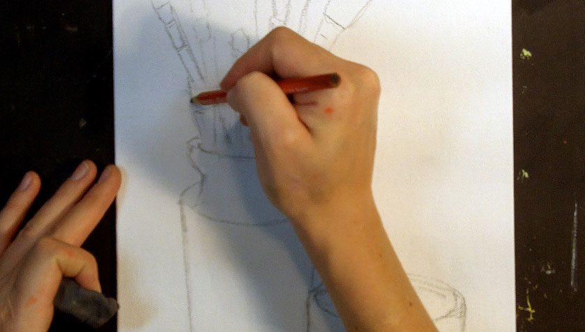
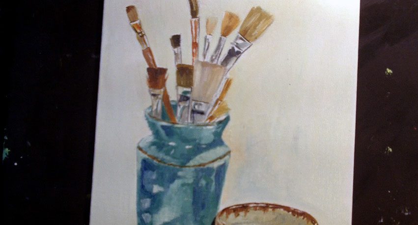
You mix up the colors on the palette and apply them in small splotches. We’re moving away from fruit in this class and working on a still life of two jars and some brushes, so the first step is to sketch that on the canvas.
Visually divide the canvas with your hand or a pencil and decide where on the canvas to place your first jar.
Then, draw a line (start simple so it will be very easy to correct mistakes) with boundary lines for where the jar will end in width and length. Inside those general hatch marks, sketch a simple jar and then mark off where on the jar the second jar will intersect.
Always sketch this way, setting up perameters first to decide the basic placement of the largest objects on the canvas, and ONLY when you know where everything will go relative to each other do you start to draw the actual objects within those perameters.
The jars and bowl are very mechanical, but don’t use a straight edge to clean up the lines until after the general shapes are sketched quickly in place.
After at least the large shapes have been established on the page, then you go back into the drawing and clean up rough lines with a kneaded eraser and re-draw them straighter and more accurately with a straight edge like a ruler.
When the largest shapes are done, clean up the smaller shapes (such as the brushes in this case), always keeping the composition in mind.
Remember, the composition is how the elements work together on the page, and so it determines if the finished piece is eye pleasing.
If the composition is weak, the work you put inot the painting is going to be wasted.
Regarding the still life, remember that you have control over it, so arrange it carefully enough that you can refer to it meaningfully as you start painting.
Don’t go through the hard work of setting up a still life only to not refer to it later on. If you need to change the position of the bowl or brushes, etc, do that before you start drawing.
Take some time to study the still life before you start drawing and painting to make sure that it will make for an eye-pleasing arrangement.
When the drawing is cleaned up and everything is in place to paint, spray the charcoal lines with a fixative, let it dry completely, and you’re ready to move forward.
Class 11
Painting in the Dabbing Technique
On your palette, mix up large blobs of the main colors that you’ll be using in preparation for painting.
Dabbing is similar to color block painting, but the blobs are smaller, and you’ll use a small flat or a bright to established the mottled, jewel-like dabs of color.
Instead of mixing the color on the canvas, have the colors mixed to the correct shade before you apply them to the canvas.
This method is no different from any other style in that you still work up the shapes of color by seeing the shadows, base tone, and highlights of the various objects as shapes.
The only difference is how you apply the paint to the canvas. Use small dabs of color to fill in the jar, beginning with the base tone, then adding shadow colors on top.
Use this same technique to fill in the background shape of the wall behind the vase or the table that the objects are resting on, and work on clarifying the jar and bowl in the foreground at the same time.
In light colored objects like the bowl, establish the base tone first, and then go back over the top to add the shape of the shadows.
There are shadows that are being cast by the object (such as what the bowl casts on the vase or on the table) and shadows on the objects themselves.
Remember that the closer the shadow is to the object that’s casting it, the darker it will be. Shadows disperse and lighten the farther they stretch from their object.
When the base tone and shadows are in place, you can add a few of those small highlights, and then move to the smaller objects.
In this piece, the smallest shapes are the brushes, and specifically, the metal ferrules on the brush handles.
To paint metal, make sure that you maintain stark contrasts in the color–stripes of white, black, and yellow are all going to exist on a bronze ferrule. Metal is also highly reflective, so look for colors from the jar and bowl being cast up into the metal as well.
That is all there is to the dabbing process; remember, it’s not so much wiping the color as it it stippling it in place with a small flat brush (a bright).
It takes a long time, so go easy on yourself especially in the beginning and work small, on simple subject matter that won’t take too long to execute.
When you’re learning a new technique, stay away from portraits, people, animals, and so on and stick to simple shapes in two or three objects.
You don’t want to be struggling with what you’re painting in addition to learning a new way to paint it.
Class 12
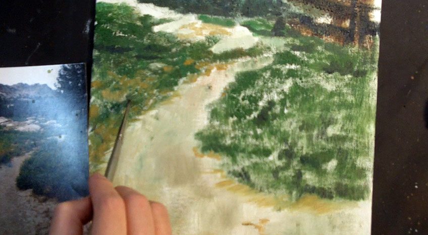
Alla Prima Painting Drybrush Technique
Another alla prima technique to learn is drybrush. It will involve a slow build up of color, and will give you a soft, almost pastel-like look.
You can use it in combination with other techniques, especially when working on underpaintings or in the final stages of other paintings, but in this class I’ll do an entire painting in drybrush.
Sketch the basic lines of your composition and work back to front, same as always.
Choose some stiff, flat bristle brushes that will uphold under a lot of bounching against the canvas and start filling in the sky. In drybrush, you don’t use a lot of wet washes or mediums to make the color flow smoothly, which is what makes it look different, while also making it slower than other techniques.
You can use anything to apply the paint to the canvas, though–rags, toothbrushes, and so on.
You should still focus on using the largest brush (or other object) that you can for filling in the tone to make the process go faster and make the layers of color smoother.
After adding the sky, add the mountains that juxtapose against it in the background, then move down to add the trees, path, and grasses.
You move down on the canvas as you move forward in the picture plane, so the last thing you paint should be the details in the closest foreground area.
But don’t paint those details until the larger blocks of color are all in place.
Even with large brushes, you can still add surprisingly small details (trees in the background, for instance) just by tilting it to one corner and painting wiht that.
Don’t expect to get very sharp details wiht this technique, however; drybrush is supposed to look soft and fuzzy around the edges.
Keep your reference material close as you work to stay consistent with the composition and colors.
When the large shapes are in place, go back into the painting to add the elements that are sitting on top of the grasses and path, such as rocks in the distance, gravel in the foreground, and flowers.
You can change to a smaller brush to add the details, just make sure that it’s still dry so that your style stays consistent.
And don’t add too much wet paint as you fill in the details, or the color will loose its soft, diffused look and become closer to a dabbing painting.
Class 13
Palette Knife Painting Technique
This technique is about as direct a painting method as you can use, aside from squirting paint directly from the tube onto the canvas.
Palette knife painting is just what you would expect; everything done with a palette knife instead of with brushes.
Even the initial drawing is done with a palette knife. You will need a mixing knife, and at least two palette knives with pointed and blunt tips to execute this style well.
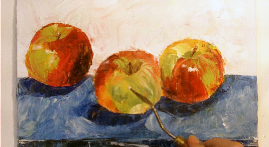
Set up a very simple still life to refer to and sketch out those basic shapes with the tip of a palette knife. In this class, I paint three honeycrisp apples.
So I simply draw three circles where I want them to be, then immediately start to fill in the color using a palette knife.
The apples are red, yellow, and green, so I have puddles of each color ready to go on the palette before I start painting.
If you make a mistake, simply scrape off the color with a palette knife and then re-apply it somewhere else on the canvas, or scrape it off on the palette and wipe your knife clean.
Once the main shapes are fairly well established (just the base colors, no shadows or highlights), start thinking about what colors you want in the background.
This is a great opportunity for using your color chart to see what impact different color combinations will make in the piece.
And don’t be afraid to use multiple colors in the background; palette knife painting is no different from other techniqes in that you should always use two or three colors to paint even a seeminly solid color instead of sticking to one.
A you scrape on your color in the background, you’ll also be polishing and refining the apples in the foreground. Don’t be afraid to change the shapes if you need to; it should be very simple to scrape up mistakes and re-apply new colors with the palette knife.
Once the largest shapes are established, move to a smaller palette knife or one with a different shaped tip to add the smaller shapes and the shadows on the table, on the apples, and wherever else you need them.
Add stems and highlights to the apples with a small knife as well, and for the details on the skin of the apples, such as streaks and spots, you can either add more color, or scrape through the existing color with the tip of a palette knife.
Because palette knife painting involves a buildup of ridges and fairly thick coats of paint, it will take several days to weeks for the painting to dry completely to the touch.
So you have ample ime to go back into it and make changes as needed, though remember that in alla prima techniques, you’re going to get a fresher look if you can work quickly and focus on finishing the painting in one sitting.
Class 14
Reverse Palette Knife Painting
Reverse palette knife painting is the inverse of the regular palette knife technique. In this approach, you focus on removing paint with the knife in addition to adding it, and you wind up with a very thin layer of paint in the darkest areas, while while the highlights of the painting are almost scraped bare.
It’s especially useful for developing underpainitngs, but you can also use it to make beautiful, subtle finished paintings that can stand on their own.
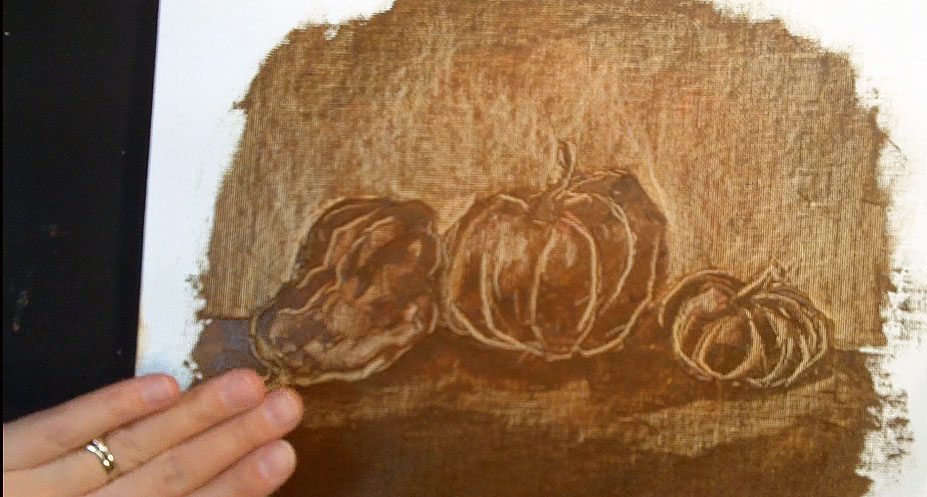
In this class, I’ll use reverse palette knife painting in a monochromatic painting to develop a still life of gourds.
Start by applying a thin, even layer of paint (I use raw sienna) with the flat blade of a palette knife. Cover the entire area of the painting with this even layer of paint.
Next, using the tip of a palette knife blade, start scratching out the outlines of the gourds.
This will be difficult, becuase you won’t be able to draw the lines first; you have to get it right the first time or re-cover the area with fresh paint and try again.
When the basic outlines of the squash are in place, you can start scratching out the background around the squah and the lighter areas on the gourds themselves.
This will take some getting used to, because it’s the reverse of normal painting; instead of adding darks, you start with all the darks and scratch out the lights.
So if you scratch paint off the wrong places, you’ll have to re-add the paint and try again.
Shadows are left on the canvas, highlights and midtones are removed by using varying amounts of pressure on the knife.
This technique is not only useful as a building block for other paintings (if you use it to develop an underpainitng, for instance), but also as a very clear way of learning the difference between line and form, which is something that all beginning artists struggle with.
Remember, lines don’t actually exist; the appearance of line is the result of two forms juxtaposing against each other. In reverse palette knife painting, you have to train your eye to see the forms and the shapes of shadows and lights on those forms, or the finished painting will look more like a cave drawing than a rendering of three-dimensional objects.
This is trickier than it seems, so expect that you may have to practice a few times to get it down.
The good news is that it’s fast, and straight-forward to learn.
After mastering the technique with simple subject matter, push yourself to see how well you can apply it to more difficult paintings.
Class 15
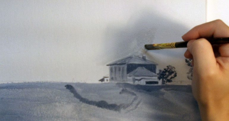
Painting a Grisaille for a Landscape
To this point, we’ve focused on alla prima techniques. In the last six classes, we’ll learn the more classical technique of oil glazing.
Oil glazing is a lot slower and more carefully rendered than alla prima painting, and involves a slow, deliberate build up of colors by glazing one over another, letting each layer dry completely before adding additional glazes.
The first step for oil glazing techniques is to create an underpainting in shades of grey, called a “grisaille.”
The grisaille has to be kept thin (meaning little fat in the color), and smooth. You’re going to be tinting this to create the color, so there can’t be any ridges in the paint that will in- terrupt the coloring process.
You also want to keep the gray and white very high value, meaning light in color, so that the finished, colored painting doesn’t become too dark.
Start with a charcoal drawing of a very simple landscape that you won’t have to struggle with.
Place a horizon line and the other largest elements, which are in this case a dirt ridge, fence, farmhouse, and trees. When the drawing is complete, spray it with a fixative and let it dry before you start to paint the grisaille.
When you’re ready to start adding the paint, mix up a few shades of grey on the palette and then start adding the greys to the canvas, beginning with the darkest tones everywhere you see them.
I find this the easiest way to translate a color picture into black and white, because once the darkest tone is established, I can use that as a guide to determine how light the rest of the colors need to be to keep the contrasts accurate with the reference material.
Everything you want to be included in the final painting needs to be included in the grisaille.
Make it a complete, finished painting, just like what you want the final painting to be, only in black and white.
When you’ve finished large shapes in shades of grey, you can gently roll a paint roller over the top to keep those colors smooth and even and to erase brush marks completely.
I use a paint roller that I bought at a hardware store in the house painting section; these aren’t readily available through art stores.
It needs to roll, though, so that you don’t remove paint from the canvas, but simply smooth out what’s there. Add smaller shapes of the details when the large shapes are smooth.
When you’re satisfied with your grisaille, let it dry completely.
That may take days, even if the washes are very thin and light, but don’t get impatient and push forward until the underpainting is completely dry to the touch, or the oil glaze step will simply smear your painting rather than tint the grays with color.
Class 16
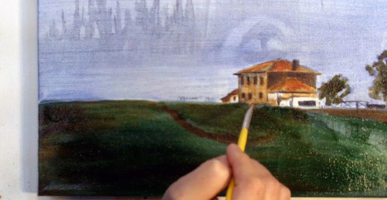
Oil Glazing a Landscape
When the grisaille is completely dry, you can start glazing.
Glazing relies on transparent colors, so before you begin, divide your paints into opaque and transparent colors. If you’re not sure which is which, consult this list:
http://academic.evergreen.edu/curricular/portraits/handouts/transparent%20opaque%20paints.pdf
You glaze the same way you would normally paint, working from the top of the canvas down.
The top will also have the obejects that are farthest in the background, which in this case is the sky. Paint the sky with ultramarine blue thinned with liquin so that you don’t cover too much of the grisaille, and use a large brush to tint the sky.
The most intense blue is at the horizon, so focus your color there, then blend up. When the blue is painted, you can smooth the color with a roller brush.
Glaze the sky color right over the background elements like the trees and fence so that there isn’t a sudden stop, and it looks more natural.
Then tint the grass in the foreground green, skipping the area that touches the wet sky so you don’t start accidentally painting wet-on-wet.
Glazing relies on totally dry layers. You can also tint the house, and then set the canvas aside to let it dry for a few days.
Next, add some color to the dirt on top of the green grass. There’s a ridge of dirt on the grass, as well as a plowed field to add.
You can also add a second pass of color to the farmhouse and roof, then add some additional vague shapes to the now dry sky.
Use liquin on a clean brush to help blend those details into the current sky color and to keep the color from being too overwhelming.
When the painting is completely dry again, add a second color to the grass to change the overall tone from emerald to a more sap green like you see in the reference material.
This second pass will give you a more realistic field of greens that alternate from blue to yellow than mixing up a single color and applying it in one application would.
Add darker details to the house with a small brush, darkening up the windows, adding more shadow to one side of the chimney and so on, then use the same small round to drop in the fence and gate.
Work this way until the painting is done. If this is your first time glazing, don’t push forward to more complicated subject matter until you’ve become comfortable with the process using it in a very simple landscape with few colors, like th
Class 17
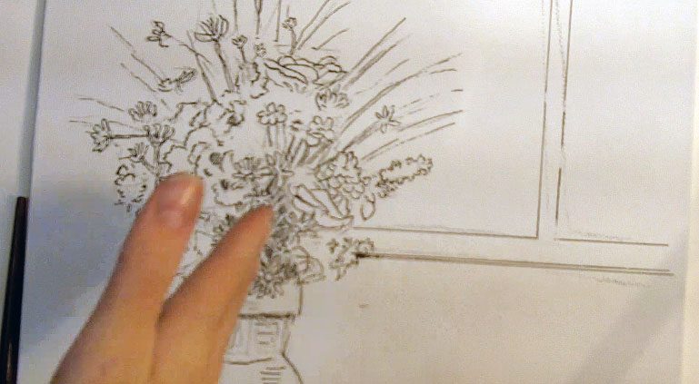
Underdrawing an Oil Glazing Painting in Pen and Ink
For the second oil glazing painting, I’m starting in a different way. You don’t have to use a grisaille as a first step to oil glazing.
Pastels, colored pencils, charcoal, watercolor, watercolor pencils and pen and ink are all acceptable mediums to use in developing underdrawings and underpaintings to use in an oil glazed painting.
The only medium to stay away from is graphite, which will eventually bleed through the oil painting. In this case, I’m using pen and ink.
Start with a rough drawqing in charcoal, then, before you spray fixative, start inking in the lines with a quill pen and india ink.
Dip your quill about halfway up the nib when you need to reload, and be aware that the canvas texture will wear down your nib more quickly than it would on paper, so have a large supply of nibs handy.
The pen and ink technique will still give you clear lines and a good variaiton between thick and thin parts of the line, but it will also be more linear and cartoony in the end than starting with a grisaille painting will.
Be aware of that, and use pen and ink for the type of painting that will compliment the style. Don’t fight your medium.
To ink in the flowers and leaves in the vase, you can use scribbly lines that are fairly impressionistic. Then, in areas where you want precise lines (such as in the windowsill) you can use a triangle or other straight edge to ensure precision.
In the sheet that the vase is resting on, you may need to tilt the canvas to put the lines in more easily.
You have more control over the pen when you move horizontally over the canvas as opposed to vertically, so when you’re drawing vertical lines, feel free to move your canvas to accomodate your comfort. You may also need to shift the canvas to avoid smearing ink that hasn’t dried yet.
When the outlines of the largest shapes are built up, you can start developing a sense of dimension by doing some light cross-hatching in the shadows.
A lot of that will be covered in subsequent glaze layers, but having the ink visible underneath the painting in places will add a unique look and bring a little somehting extra to your painting that you can’t get with other underpainting techniques, so don’t feel that you need to completely cover all of your ink lines.
Finally, stand back from the canvas and scrutinize your composition.
The lines of the piece should lead your eye all around, not just focus all the attention in one or two places or shoot the eye away from the painting.
Make adjustments as needed, then let the ink dry completely, erase your charcoal lines wiht a kneaded eraser, and spray the ink with fixative before adding color.
Class 18
Oil Glazing Over Pen and Ink
When the ink is dry and the drawing is sealed, it’s time to start painting. Begin with a faint, overall color called an imprimatura.
This color needs to be a transparent oil color. Whereas opaque colors cover completely, transparent colors are more like colored glass; one layer can be layered on top of another to create a third color. It is this technique that oil glazing relies on.
Thin the imprimatura with plenty of liquin and cover everything evenly. After painting the color with a brush, a roller brush can help you to even and smooth the color even more.
You should still be able to see the ink lines underneath. When it’s even, let the layer dry completely.
Next, use a large brush and start glazing. For the best results, glaze in large, vague areas to begin with.
Cover as much of the canvas as you can for each pass, to accomodate the slow drying time with maximum efficiency.
So, in this first glaze pass, glaze color into the vase, the flowers, the background, and the tablecloth in the foreground. Don’t worry about being too precise; you can always scumble into the painting with an opaque color later on.
When you have a large pass covered with paint, use a roller brush or a fan brush to blend out the directional strokes made by your large brush. Then, a second pass of glaze is ready to dry.
Repeat this process again and again, gradually changing the color and adding shadow colors with ultramarine blue or other shadow color once the local colors are built up.
You don’t have to cover every object completly with every new glaze pass; once the base color is in place on the vase, for instance, you might only need to add a touch of red to the shadow side to give it some more depth.
You don’t have to glaze red over the entire vase.
When you’re satisfied with the shadow shapes put in as glazes, let the painting dry completely, and then, if necessary, you may need to touch in to some of the brighter colors with scumbles.
Scumbling is adding opaque colors over the top of transparent glazes. You may find it a useful technique for adding bursts of color to the flower petals, to brighten highlights in the sheet that the vase is resting on, and to paint the light pouring through the window.
Be careful as you scumble that you don’t cover all your hard work, or you will have wasted your time by glazing.
You can make opaque colors somewhat transparent by thinning the paint with liquin, which will help you to blend the scumble into the surrounding glaze area without such high contrast between the two techniques.
Work this way until the painting is complete.
Remember too, once those opaque scumbles are dry, you can go back over the top with more transparent colors and add shadows or other details to those areas. Use both paint types together to finish the painting.
Class 19
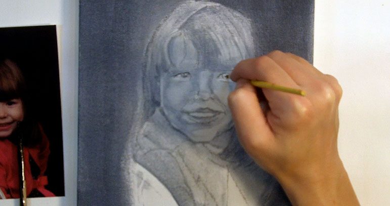
Painting a Grisaille for a Portrait
In the final oil painting class, we’ll tackle the hardest subject matter of all, which is a portrait.
Begin with a rough sketch in charcoal, spray it, and then you’re ready to start the grisaille painting. In this case, I begin with the dark background in dark gray; because the background is so black in the photo that I’m not afraid to make this pass even darker than I normally would.
Smooth the background with a roller brush, going right over the hair and face to ensure that you came down far enough with the background color. Let it dry.
Establish a light value over the whole face to establish an even skin base.
This needs to be kept very light; you might not even notice a difference between the new face tone and the original canvas.
Paint a slightly darker tone over the shirt, which will help you to establish the outer shape of the face at the same time, then do similar work in the hair.
You want to make the direction of the hair clear; not just big blocks of solid shapes, but shapes of lights and darks that are broken into with individual strokes that establish the pattern of hair growth.
Make sure that you avoid the highlights on the hair as you darken up the shadow shapes; you don’t want to rely on painting those highlights in with white paint, because that will never look as fresh.
White paint always looks chalky, so it’s better to paint the darks and leave the whites.
When the base tone on the face is totally dry, you can use a slightly darker tone to start establishing the shadow shpaes that fall over the whole face.
The shadows should connect from feature to feature; don’t put the shadow beside the nose down, then stop, then add some shadows to the cheek, stop, put the shadows by the eye, and so on.
Think of the face as having one large, complex shadow that links the eye, nose, cheek, mouth and chin.
When that shape is down, use a very soft, totally dry round to softly blend the edges out so it doesn’t look like a weird mask, but rather a three dimensional face with shadows, base tone, and highlights.
Add shadow shapes to the wrinkles in the shirt the same way; the darks begin as blocky chunks of dark in the darkest places of the folds, then are blended out to soften the tone and blend the darks into the rest of the shirt better.
You might need to add another pass of shadow color to the darkest areas of the hair, then use a dry flat to blend out some individual strokes to make the hair look loose and natural versus a solid piece of plastic.
Remember, if you want the detail to be in the finished painting, it needs to be present in the grisaille painting.
This is just like a black and white photo of your finished painting; adding the color should be more like tinting that photo than anything else.
Let the grisaille dry completely (several days), and seal it with a layer of liquin to help ensure that none of those details will be washed away by new passes of wet paint. When the liquin is dry, you’re ready to start coloring.
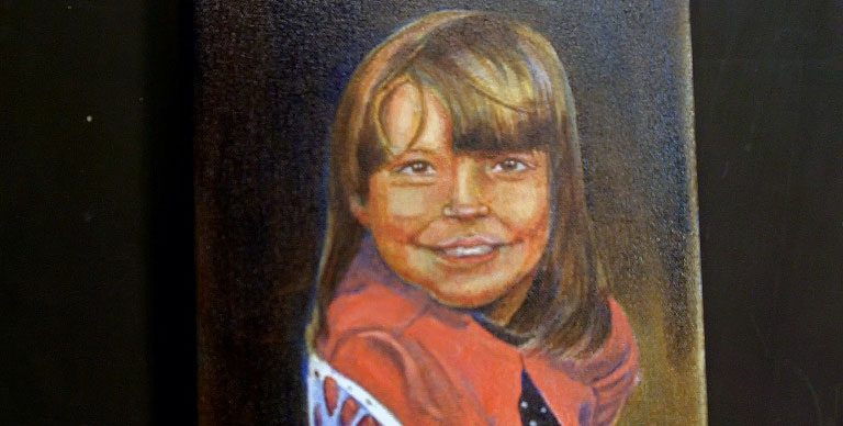
Class 20
Oil Glazing a Portrait
Glazing is different than just mixing a flesh tone and painting it wherever you see flesh. In this tech- nique, you layer the different colors of flesh by building them up color by color.
There’s a lot of green in flesh, not to mention reds, browns, yellows and blue. So to start glazing a portrait, start with that green undertone color and paint it thin and even in a layer over the whole skin base.
You can smooth that with the roller brush, then glaze an undercolor in the hair, such as a yellow.
The undercolor should be the lightest color that you see in the hair. Glaze a base color in the shirt, then use large brushstrokes to darken up the background evenly, working carefully around the face so you don’t interrupt any of the hair or skin.
Let the first coat dry completely, then tint the green face with a bit of sienna, which will make the face look sickly yellow.
Glaze a second pass into the shirt and hair as well. For the shirt, use ultramarine blue to start building up shadows where you see them by squinting at the reference material.
The blue layered over the yellow and red in the hair and shirt respectively, will darken those colors to brown or purple, both of which will work well for shadow colors. When the second pass is down, let it dry completely again.
Next, add a thin pass of alizarin crimson to the face. Keep it very thin, or her face will get too red.
Add some red in parts of the hair as well, and then mix a more intense shadow color of payne’s gray and ultramarine blue and re-darken the shadows in the chair and clothing. Let it dry completely.
At this point, you can start to carefully scumble in a pre-mixed flesh tone. You have to do this VERY carefully, or you’ll cover all the work you’ve done in the skin tones.
Just add a dab of the opaque skin tone to the highlight areas of the face, such as the tip of the nose, the forehead, a bit on the cheeks and on the chin, then use a clean brush dipped in liquin to carefully blend those patches into the surrounding glazed skin tones.
Let that dry, then do some similar work in the hair and shirt. Mix up a local color for the hair and dab it in here and there, then use a flat brush with the liquin on it to slice the local color into the glazed color.
You do not want to paint over everything and make the hair a solid brown.
Do similar work in the shirt to make it a brighter red, blending the new opaque base tone into the shadow colors carefully using liquin on a clean brush.
When that scumbled layer is dry on the whole canvas, you can start to draw out the features on the face.
Use a small round to draw out a few hairs in the eyebrows, then darken up tones in the eye and nose.
Drop in the darks in the shadow shapes first, then blend them if necessary with a small clean brush.
You also need to glaze alizarin crimson in the lips, as well as other areas that were deadened by the opaque scumble.
Oil glazing is a constant push and pull between transparent and opaque paints. Just make sure that you always let the layers dry completely before you add new color, or you will no longer be glazing.
Be patient with yourself, keep practicing, and don’t be afraid to take risks.
The face will be green or yellow or otherwise hideous at times. The shadows will look like a bad mask on the face.
Don’t be afraid of those steps; they’re necessary to what comes later, and they are the key to higher realism in your work.
 If you wish to download the files to your desktop, simply right click the link below and select ‘save as’
Then select the location you wish to save the files to (either your DESKTOP or MY DOCUMENTS e.t.c.)
Once finished, simply unzip the files (PC use winzip, MAC use stuffit) and your files will be there.
All written material can be opened as a PDF.
All videos files can be opened with VLC Media Player.
Select your download option below …