
 Login
LoginLandscape Mastery
Session 1
Graphite Sketch and Supplies
In this set of videos we’ll be drawing and painting five different landscapes, beginning each one with a graphite sketch before moving on to the painting.
Once you’ve chosen reference material for your landscape, move pieces of white paper around the picture to decide on the strongest layout and crop if necessary.
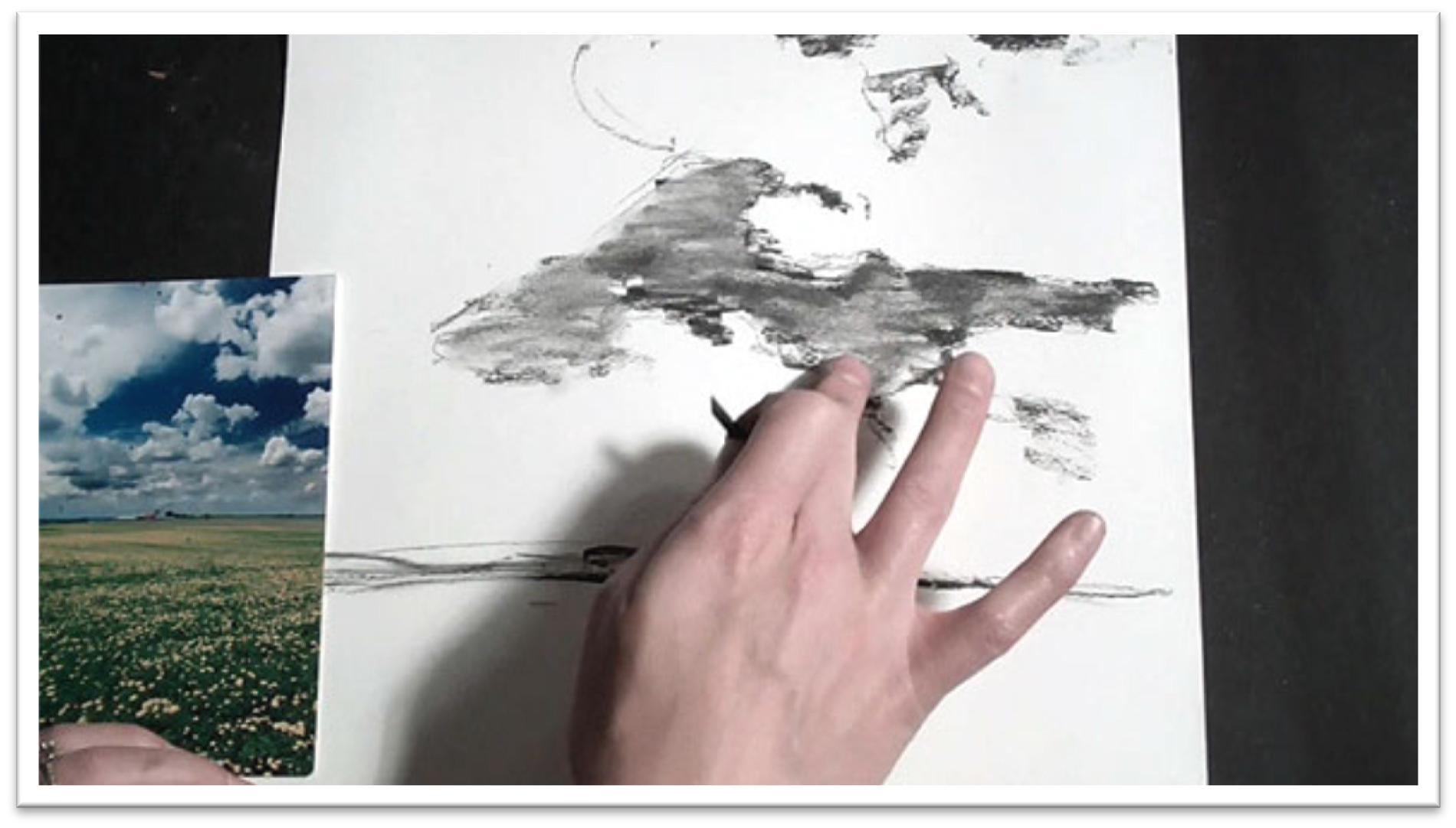
Once you’ve decided on the strongest composition, make a pencil study of the picture on plain scratch paper.
Pencil Study: The purpose of the tone study is to work out problems with composition and to familiarize yourself with the subject matter before you start painting, so work quickly but with a watchful eye and a careful hand. Don’t just slap graphite on the paper without intent.
Begin by placing the horizon line, then drop in the other major shapes of the composition by looking for lines that fall at convenient places to measure, such as the vertical and horizonal center lines.
Always look for the largest shapes first. Once you get their angles and lines correct, you can sketch in smaller shapes and more intricate details with confidence, knowing that they’ll be in the correct place.
If the landscape has a fence line or something man-made, sketch it roughly at first by marking off the endpoints and then connecting those.
Be aware that as evenly spaced objects retreat into the distance, they will appear shorter and closer together. You can clean up precise lines later with a ruler if needed.
When you’ve drawn the lines and shapes, move to a large chunk of solid graphite or charcoal to lay down the tone.
Keep the tone changes consistent with what you see on the reference photo. If you wish, you can blend the tones to make them appear more finished; just don’t stop working until you’re satisfied with the composition and you have a good understanding of every line and shape within it.
Fight the lazy tendency to say to yourself, “I can clean that up and work out the kinks later.” Don’t move forward until you’re satisfied with the work at each stage.
Transferring the Drawing: When you’re satisfied, transfer the drawing to the watercolor paper using the same key lines and shapes that you developed in the tone study.
Only transfer lines, no tone, and work only dark enough that you can see the lines. A 2H graphite pencil is a good choice for making lines that can be seen and yet aren’t distracting.
If there are small white lines or shapes that need to be preserved, paint them with masking fluid. For very fine lines, a bottle of miskit attached to a hollow needle such as the SuperNib is a good choice, and is available on-line through many art suppliers.
The masking fluid is ready to paint on when it’s dry to the touch, which usually only takes a few minutes.
Supplies: In the meantime, mix up a selection of watercolor paints in your palette and activate them with water.
Choose about three shades of each primary color, plus payne’s grey and some browns like burnt or raw umber or sienna.
You won’t need white, as this will be a course in transparent watercolor and adding white changes the style to opaque watercolor.
You should also have 3 flat and 3 round watercolor brushes; a small, medium, and large in each.
Get a bucket of clean water, a roll of paper towels, and some salt. If you continue in watercolor your list of supplies will grow and grow, but what I’ve listed here is enough to start.

Session 2
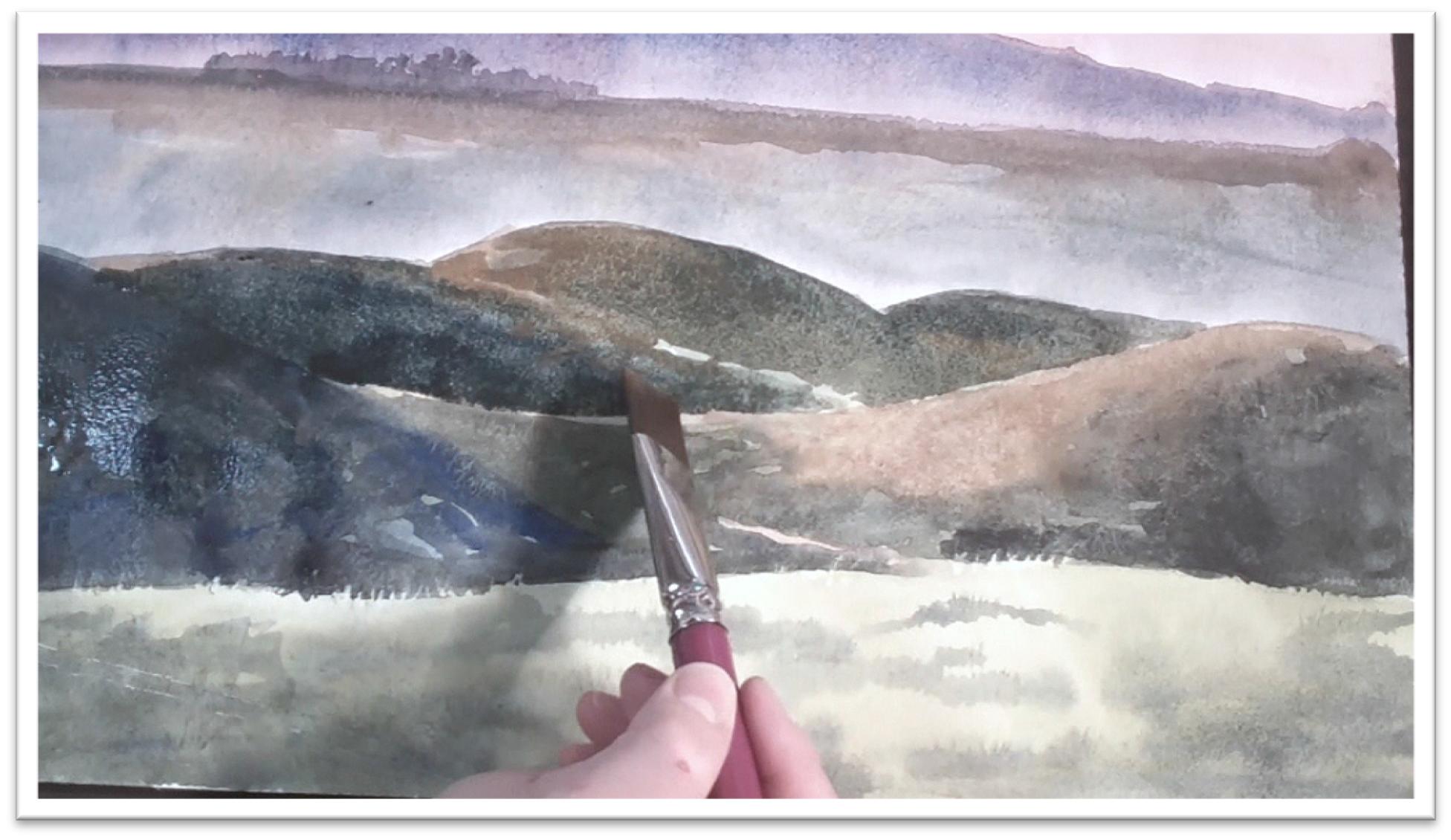
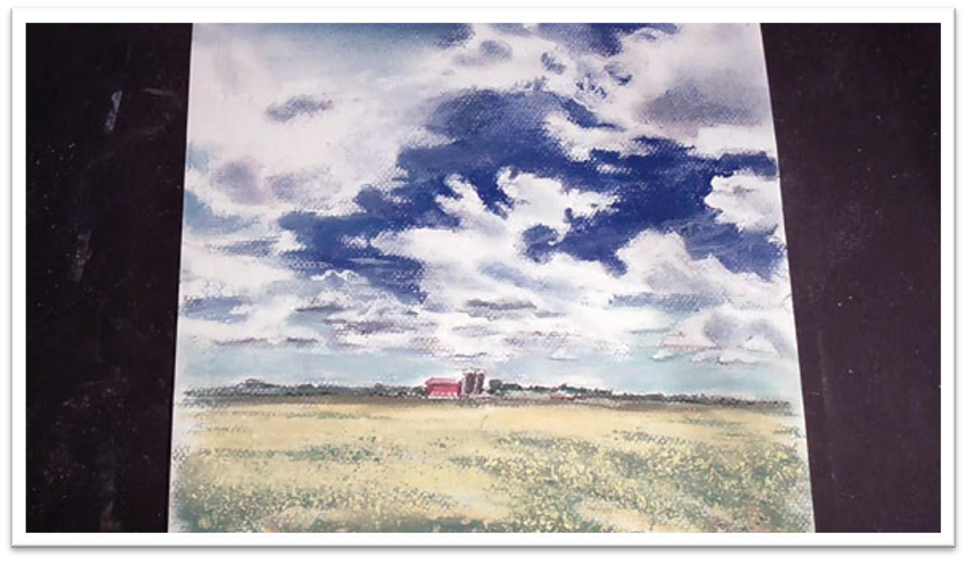
Painting Rolling Hills
Paint the details farthest from your vantage point first and then work your way forward, ending with the foreground.
Remember that in transparent watercolor painting you can’t paint highlights; they must be either avoided or preserved with masking fluid.
Keep that in mind as you work and be careful not to cover your whites.
Begin by wetting the sky with clean water, working carefully to preserve the details of the mountain ridge against the skyline.
The paint will follow the water, so wetting an area and then dropping in the color allows you to maintain control over free-flowing paint.
Paint in the base sky hue and then add more colors directly to the paper, allowing them to mix on the surface. Let the sky dry.
Paint the mountain range next, by first painting the entire section with clean water and then flooding in the appropriate colors.
It’s a good idea to keep to a common hue throughout a painting to make sure your landscape appears uniformly lit.
For instance, if your painting is overall cool colors, use alizarin crimson as your red when you mix your purples, browns and so on instead of using several different reds.
Otherwise, you may wind up with some warm reds and some cool ones, and the painting will become muddy.
To get the effect of diffused light, run a clean wash of water along the bottom of your mountains and the color will trickle down, becoming lighter all on its own.
When the mountains are dry, paint the stand of trees on top, using dark color and a small round brush.
For the most delicate shapes, drag the brush handle through the wet color to give a sense of trunks and branches. Bring down a neutral color into the middle ground, adding some stronger yellow and blues to add visual interest, then let that dry.
Lay in the foreground by first painting the large shapes of shadows, remembering that contrast increases with proximity.
The lines of distinction are important to differentiating between the different hills, so keep them white.
Use yellow ochre for the light-struck areas of hills, darker greens for the hills closer to the viewer, and more neutral greens for the background hills.
When the paper is still damp but not too wet, you can use a damp flat brush to gently lift out more light tone as needed. Let the washes dry completely.
Use a large flat brush to wash in a yellow ground in the closest area, then drop in some pattern and texture using a darker green.
When that wash is dry, preserve some grass blades using a masking pen.
Put dots of fluid under the surface and scratch individual blades upward with a needle. Let the masking fluid dry, then use a syringe of dark paint to darken the darkest shapes in the foreground.
Spatter in texture both by using a water bottle and by flinging paint on the surface with a round brush. In a way, the less “painting” you do, the better your final product will be.
Finally, work up the foreground details. Remove misket on the fence lines and darken the posts, emphasizing both a highlight and shadow side of each one, as well as a dark top.
Use a thin brush to add grass blades around the bottom of the fence and then go over the painting cleaning up ambiguous lines by lifting paint with a damp flat brush squeezed to a sharp point with your fingers.
Session 3
Drawing the Forest Scene
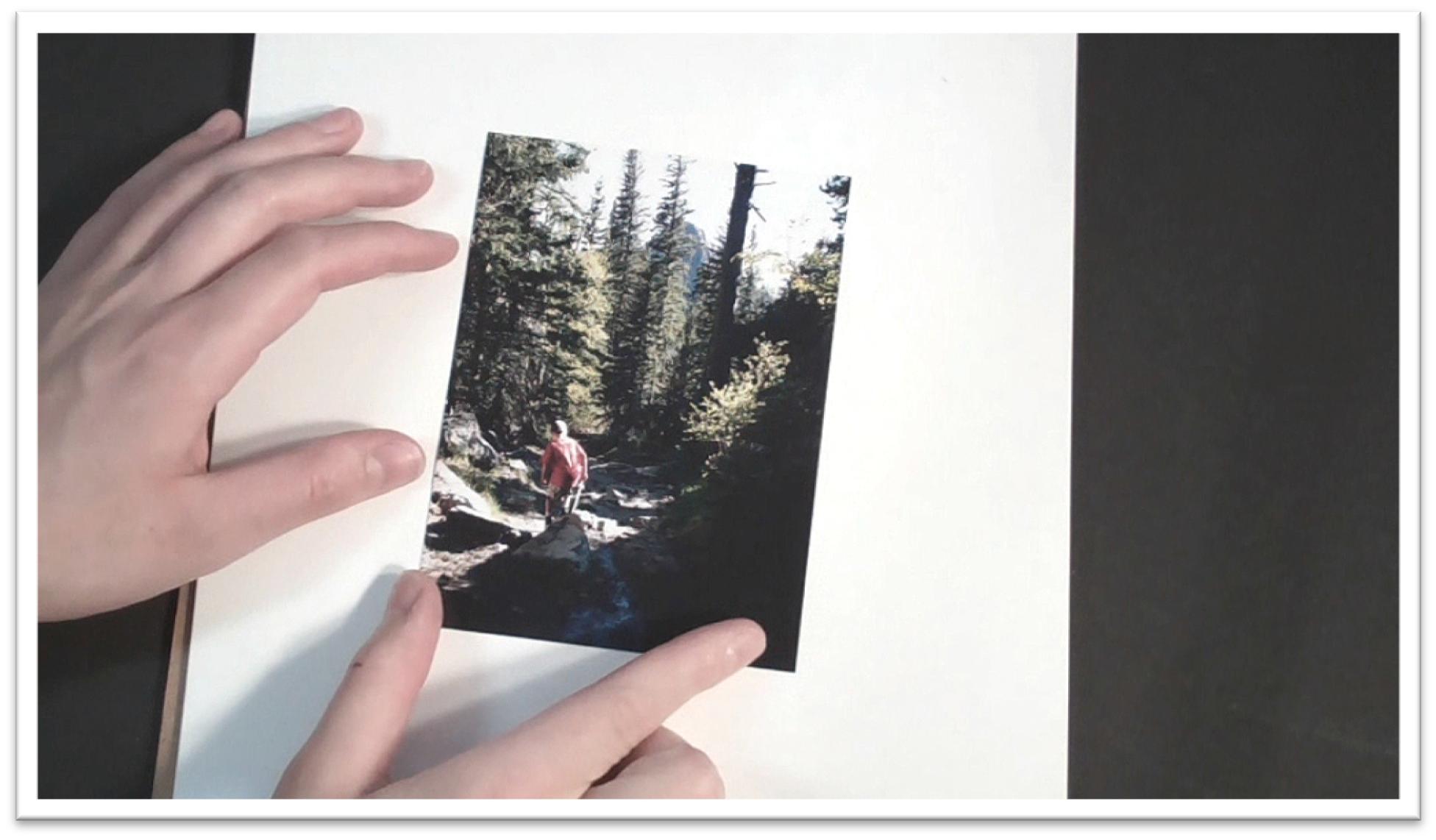
For the second piece, we’re working vertically and depicting a boy wielding a toy sword in the forest.
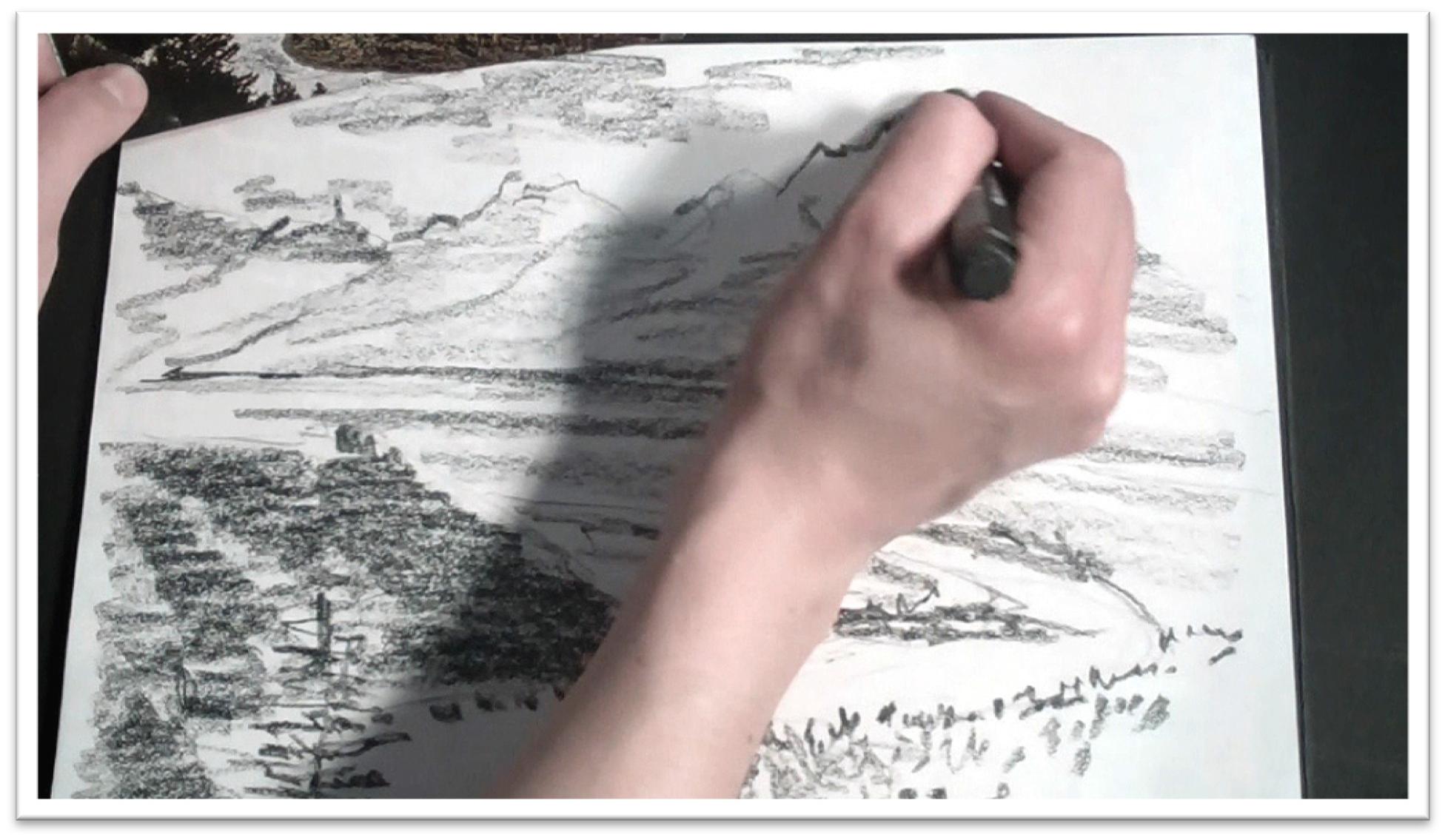
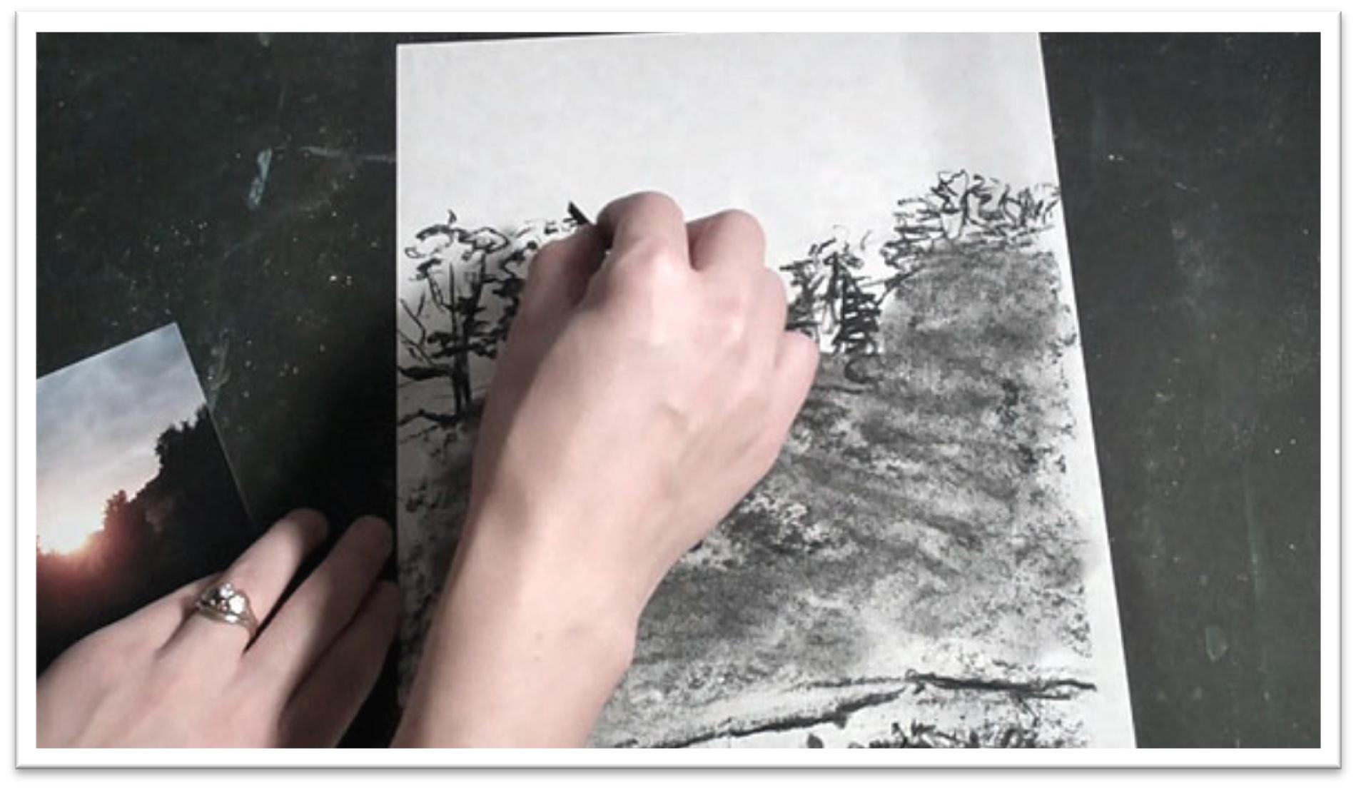
Once again, begin by working up a tonal study in graphite on a piece of scratch paper.
Determine the horizon line first, then sketch the boy’s head and body as it relates to the horizon.
Sketch the large, strong shadow shapes and vertical tree shapes in the background, squinting to help you better see the shapes of the shadows and light.
The purpose of the tonal study is not to be fussy with the lines, but to help you see the big shapes and familiarize yourself with the angles and proportions of the layout so you can paint the landscape with greater confidence.
Use a large graphite chunk to develop the tones after the lines of the large shapes are correct, and when you’re satisfied with the graphite sketch, move on to transferring the drawing to the watercolor paper.
Place the horizon line, boy, and other large shapes using a 2H pencil. Work lightly, and try to avoid erasing, which will wear down the tooth of the paper.
As you place the features, sketch the large shapes first and then place smaller shapes within them.
Always keep an eye on how the shapes and lines relate to one another in the reference material and keep those relationships consistent in your drawing.
When sketching the trees, use a triangle to guide your lines. This isn’t to keep the lines perfectly straight, but to make sure they stay at a relative 45-degree angle on the paper.
You don’t want your trees leaning, or the perspective will appear skewed.
Sketch in everything that you want to keep in the painting, but don’t over-draw. It’s a balance that can only be perfected with time and practice; the goal is to have enough information on the page so that you don’t get lost, but not so much that your painting turns into a paint-by-number.
Think of your sketch as a helpful map. It should show you where things belong, but not every detail of every object.
In light-struck areas, you may need to preserve some details with masking fluid. Make sure that the lines of your sketch are absolutely correct in those places, because the light will catch the eye right away.
Squint to see the areas of white that are clearly defined and will be difficult to preserve any other way and apply masking fluid in those places only.
It’s tempting to over-use masking fluid, but like any tool, it’s only useful when properly applied and otherwise will weaken your painting.
The areas that you choose to keep won’t necessarily be white; any high-value color up against a dark may need to be preserved, such as a bright yellow against a dark background.
When the masking fluid is dry, you’re ready to begin painting.
Session 4
Painting the Forest Scene
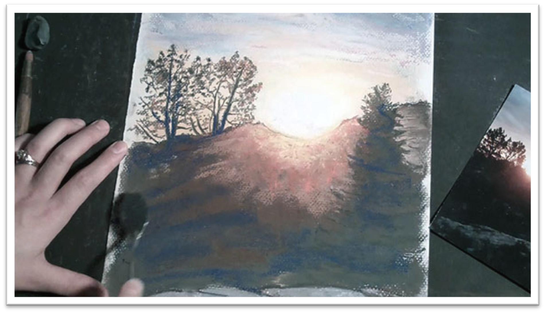
For this landscape, instead of using controlled washes we’ll concentrate on methods that capture the energy of the landscape but use very little traditional “painting” technique in the initial stages.
Begin in the background where you see high-value colors against darker trees.
Protect the sky with a piece of scratch paper, then use the blunt-tipped syringe
filled with yellows to fling a pattern of dots and lines into the light-colored tree areas. Since you can’t paint light colors over dark ones, you need to start with the light colors.
Spritz the area with water using a water bottle and tilt the paper back to forth to make the colors move.
Cut through the wet paint with a brush handle to better depict the intricate pattern of branches and leaves without lifting any color or introducing the brush.
Lift off the scratch paper to uncover the sky before the paint has dried and draw the color up into the tree tops using the brush handle and syringe again, but instead of flinging the paint, keep the needle of the syringe right against the paper so you can draw the shape more carefully.
Move the puddles of paint using a credit card on the side, which will allow you to quickly cover large areas while still maintaining an interesting texture and design.
Blot some light areas in the tree branches to make it look as though some branches are pushing back and others are popping forward, and while the paint is still somewhat wet, drop in more darks in the high-contrast areas using the syringe.
When the initial layer is dry, splash more dark paint in the foreground and move it around with the credit card, being careful not to cover the work that you’ve already done in the yellow areas.
Float some of those darks into the trees as needed, then run a neutral tan color over the path to make it read as separate from the trees.
When the background is fairly well finished, punch up the contrast in the foreground with more Payne’s gray and blues in the syringe, moving that color around in the methods already described.
You can use a damp flat brush to soften darks in areas where you want to lose distinct edges, but for the most part, you aren’t using the brush at all in the first stages.
Remove the misket when the paint is completely dry and begin working up the details in the foreground.
Wash some bright yellow into the leaves that were preserved with misket. Add details to the boy, and darken shadows and add textures to the stones and branches in the path.
Even in the details, though, use the brush in ways that disguise definite brush strokes: roll it on its side, stipple, and spatter with it instead of brushing paint on the paper in the traditional ways.
Rely on the largest shapes to tell the story; the details should only accent and sharpen what’s already there.

Session 5
Drawing the River Scene
For the third landscape we’ll paint a jagged mountain scene with a river cutting through the tree line in the middle ground.
Begin the pencil study on a piece of scratch paper to familiarize yourself with the layout and contrasts of the piece.
Draw the horizon line, then fold the paper in half vertically to better see the
landmarks that fall on that line, as well as how different elements in the picture relate to one another.
Define the high and lows of the mountain peaks with short guidelines, then develop the pattern of rises and falls between those two lines, seeing the ridges in relation to one another.
Work in a similar way to define the river, marking off the extremes of the upper and lowermost points, as well as the right and left sides of the bank, then sketch the s-curve within those guidelines.
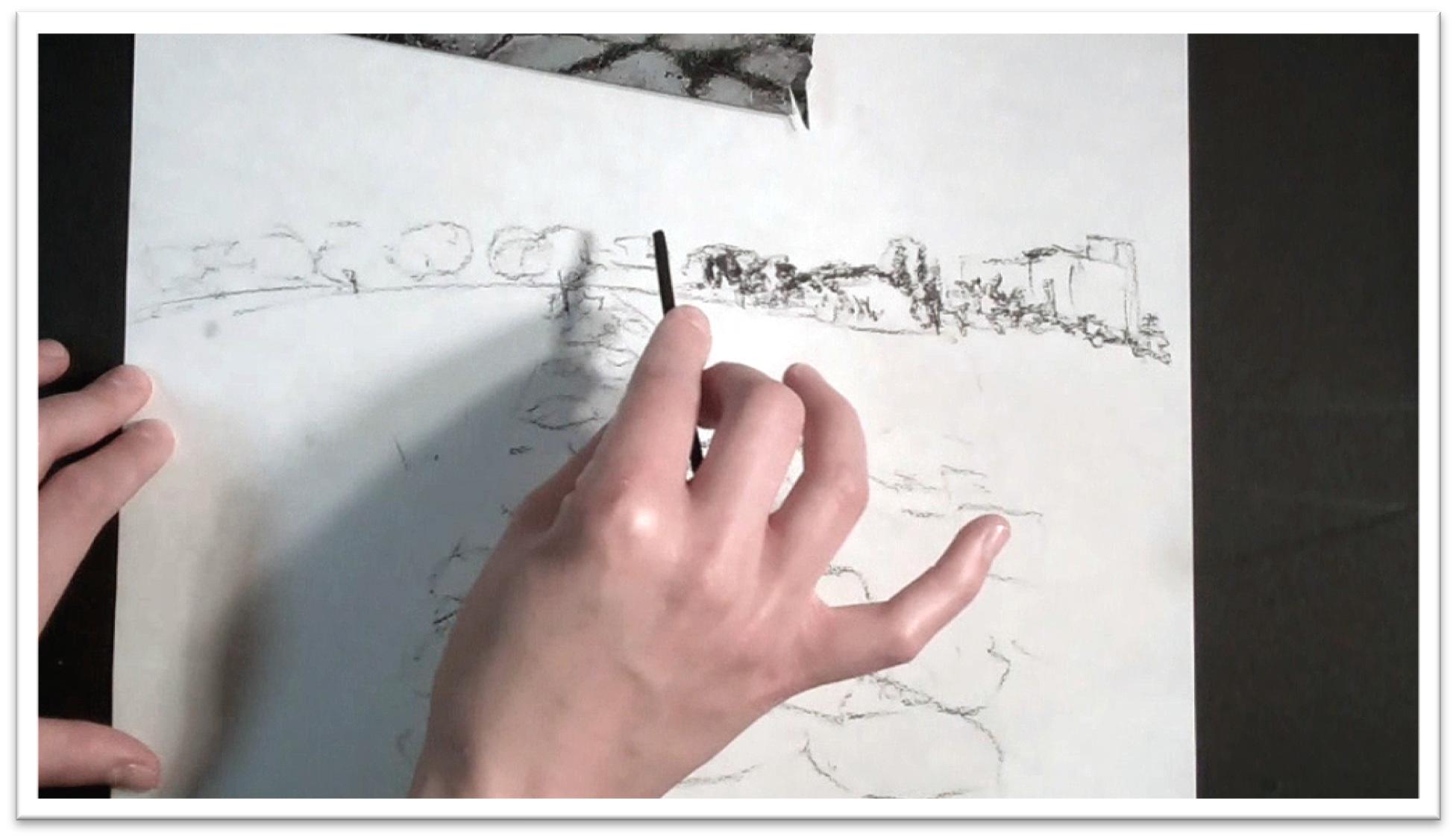
Draw the other large shapes next; the cliffs in the mid-ground, clusters of trees, roads, and so forth.
When the shapes are accurately placed on the page, add tone to the dark shadow shapes using a large piece of solid graphite.
Indicate how the darks and lights relate to one another to develop a good understanding of the relative contrasts of the landscape.
Don’t work too haphazardly or you won’t be able to see how the tones balance one another. Place all of the major lights and darks, and work quickly but accurately.
Transfer the drawing to the watercolor paper using the horizon line and vertical half-points to help place the large shapes.
Once again, define the highest and lowest points on the mountain range and then accurately draw the jagged shape of the mountain cliffs on the page.
Sketch the valleys on the mountains as well, and the shape of snow on the cliff peaks, but don’t over-work the sketch.
You don’t want too much pencil line on the watercolor paper; it will show through.
Place the river, and just enough indicators of tree placement so that your sketch will provide enough detail to paint from confidently.
In this painting we won’t preserve any whites with masking fluid, so you’ll be able to see how the procedure changes when you have to work around the whites.
Session 6
Painting the River Scene
Even without whites preserved you can still develop paintings in a two-stage process of first flinging paint and then using more control to working up details.
Just plan ahead and be watchful not to cover your highlights in the first stage. Begin in the sky.
The sky in the reference photo is dark and foreboding with some sharp-edged cloud
formations, so wet some but not all of the sky area, carefully working around the mountain range.
Flood in blues and reds to make a dark purple, then add more darks to intensify. In some areas, drag the gray of the sky right down over the top of the mountains so the sky won’t appear pasted on.
When the sky is dry, load a large flat with dark purple and quickly outline the uppermost edge of the mountain range and the delicate snow formations, dragging down some blues and broader swathes of color as you paint toward the base.
While the paint is still wet, drop in some reds and blues to give some depth, then spritz the surface with the water bottle to build up some texture.
When the mountains are dry, lay down the path under the mountain as one large shape with clean water, then flood the area with some browns and blues.
Drop in some tans for the hillside in the middle ground, and scumble in some brown to serve as a base color for the forested area in the foreground.
Let that layer dry, then define the road using a damp flat brush to lift the color. Next, work up the large dark shadow shapes in the foreground.
Spritz the hill with water, then drop in dark colors using a syringe.
Move those droplets around by spraying, tilting the paper, and using a brush handle to get the desired effect, then re-fill the syringe and drop greens and yellows in the trees in the middle and foreground.
Use a damp round brush to roll across the wet paint and gently blend the colors. Develop shadows on the surface of the water and drop in darks as needed.
You can begin to indicate the tops of pine trees using a loose brush stroke by holding the brush at the very tip of the handle and bobbing it up and down, just barely brushing the paper.
To get more texture in the foreground trees, protect the rest of the paper and then fling paint liberally by tapping a loaded round brush over the surface.
Fling in yellow ochre, yellows, browns, and carefully at the end, darks.
The moving water can be worked up easily using a dry brush technique.
Use a dry fan brush dipped in blue-gray paint then alternate between dragging and stippling the water texture, focusing your efforts in the closest water, where you would expect to see more detail.
Finally, pick a few places to work up in greater detail. You don’t need to add detail everywhere; the eye will do that for you if you choose your areas carefully.
Pick out highlights with a wet brush, soften some lines and darken others until you’re satisfied.

Session 7
The Pastel Sketch and Supplies
The fourth landscape will be done in pastels rather than watercolors, so there are some fundamental differences in how to develop the painting.
First and foremost, pastels are opaque, which means that rather than preserving highlights, you can layer them on top of darker pigments.
However, you will still work back to front and focus on laying in large shapes before placing details, and you will still begin with a tonal study to familiarize yourself with the composition.
Draw the horizon line with a piece of willow charcoal and from there develop the big shapes such as the path in the foreground, background tree shapes, the building, and so on.
To make the perspective correct, draw the smallest stones in the distance, then jump to the middle and make slightly larger stones, and finally draw the largest stones in the foreground.
Fill in the rest of the path between those three shapes.
Shade the tone once the lines are placed, blend with your finger, and work up the darker contrasts by pressing harder with the charcoal.
When you’re satisfied with the layout, transfer the drawing to the pastel paper. Make sure that the textured side is up and start laying in the lines of the composition using willow charcoal.
Start with the horizon line, then make guidelines for the extremities of the largest shapes, filling in the specific lines between the guides.
In these tutorials, we’ll be working with three types of pastels; pastel pencils, nu pastel sticks, and soft pastels.
Pastel pencils are very similar to charcoal pencils; the other two pastels have no outer coating and will smudge very easily. You can buy sticks individually, or in sets of 6 and more.
You’ll also want to invest in a pad of multi-colored pastel papers; inexpensive is fine to start, but you will need pastel specific paper, as it’s textured to hold the medium.
The three major pastel techniques we’ll be focusing on are feathering, scumbling, and dusting.
Feathering: is drawing thin parallel lines of one color over another to add interest to an area of otherwise solid pastel.
Scumbling: is similar to feathering, but the second color is dragged over the first in broad, broken strokes or lines that allow the first color to show through.
Dusting: is scraping particles of pastel with a razor blade and then pressing them into the paper using a palette knife.
You can either press straight down or make small circles for different effect.
In addition to your fingers, you will find other blending tools useful to have, including a selection of stomps and tortillons, chamaois cloth, and a soft brush.
There is a wide range of blending techniques to be had by each, and the only way to really become comfortable with them is by experimentation.
So before you begin a pastel drawing, take some time and some scratch paper and see what your materials will do for you.
Session 8
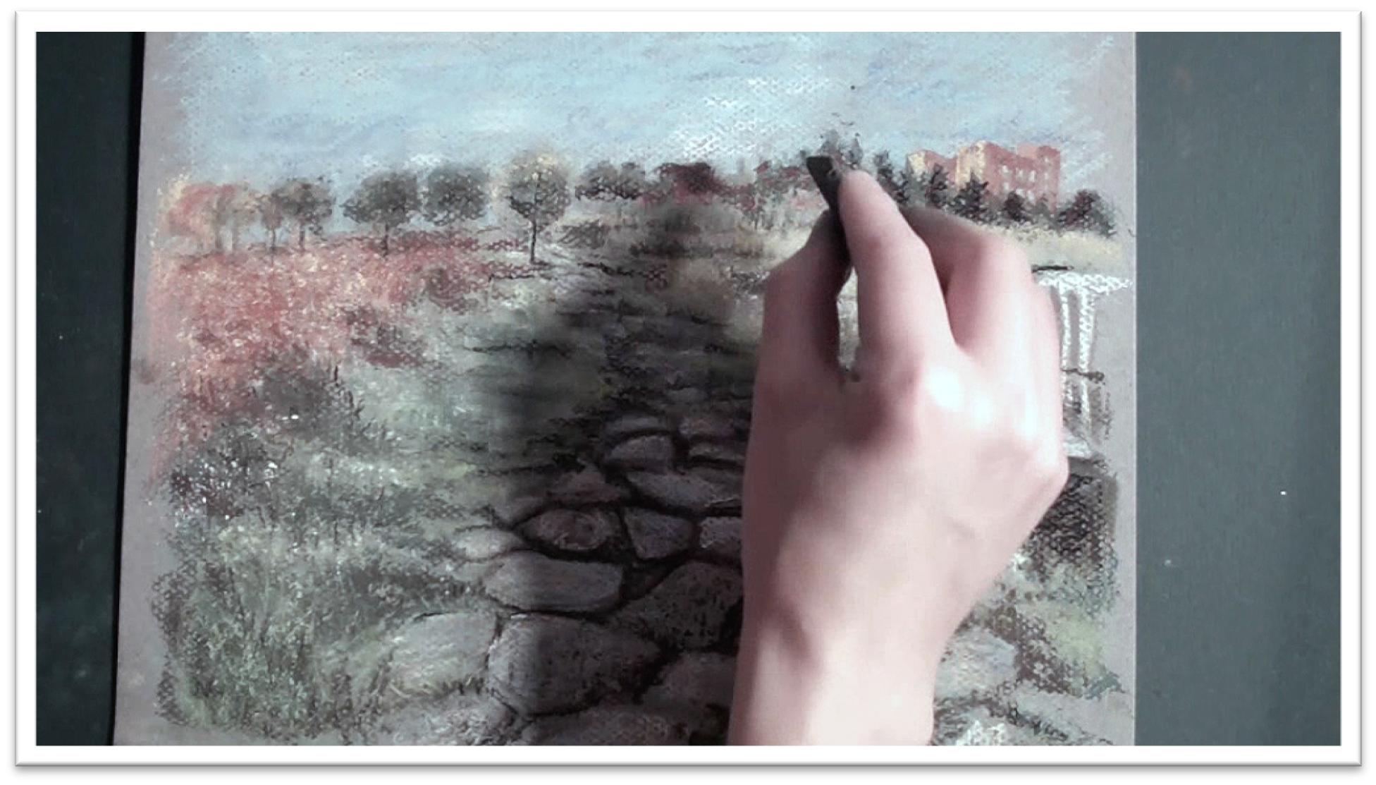
Painting a Stone Path in Pastel
For this study we’ll be using the linear approach to pastel painting, which means building up a color map of the painting first by using thin lines of nu pastel sticks and pastel pencils, then adding heavier tone over the top with soft pastel sticks.
As you cover the painting with line, work in a free, almost scribbly stroke that simply indicates what colors go where.
This step is sort of like building your own colored canvas for embroidery, but it’s not precise; a sky may have lines of several different blues crossing one another as well as purples, yellows and white.
Keep your color exciting, but not random. Too much pastel on the page will fill the tooth of the paper and make it impossible to add more color later on.
When your color map is complete, start blocking in more color with soft pastels.
Use the pastel stick on the side and lay in wide areas of color, focusing at first on the large shapes of darker colors, and then refining, blending, and adding lighter colors and smaller shapes on top.
Try not to blend with your finger too much, as the pigment will dehydrate your fingertips after a while.
Concentrate your efforts on the foreground, where you should be able to see more detail. Keep perspective realistic by decreasing detail the farther back you move in the picture plain.
For grasses, highlights, trees, and texture on stones, use the dusting technique, scratching off the pigment on two or three different pastel sticks, then mashing the dust into the paper.
As you work, take a step back and squint at the reference material to help you see the large areas of darks and lights and their relation to each other.
You can use a stomp to good effect by stippling, mashing pastel, or dragging it across the surface to render different textures as desired.
Try to build up everything you see with more than one color, and not just different shades of the same hue but complementary colors and brightening colors as well.
You can add blues to browns, yellows to reds, browns to greens and so on. This will not only add dimension and visual interest to your otherwise flat tones, it will also help colors to stand out.
In the foreground, add lines to the stones to make them pop more and tamp the lines down with a stomp.
Don’t overwork your painting; whenever possible, use techniques that disguise your strokes and give your painting a free, easy look.
Finally, scumble light colors here and there and accent a few dark lines to add a last bit of sparkle and interest to the painting.
Session 9
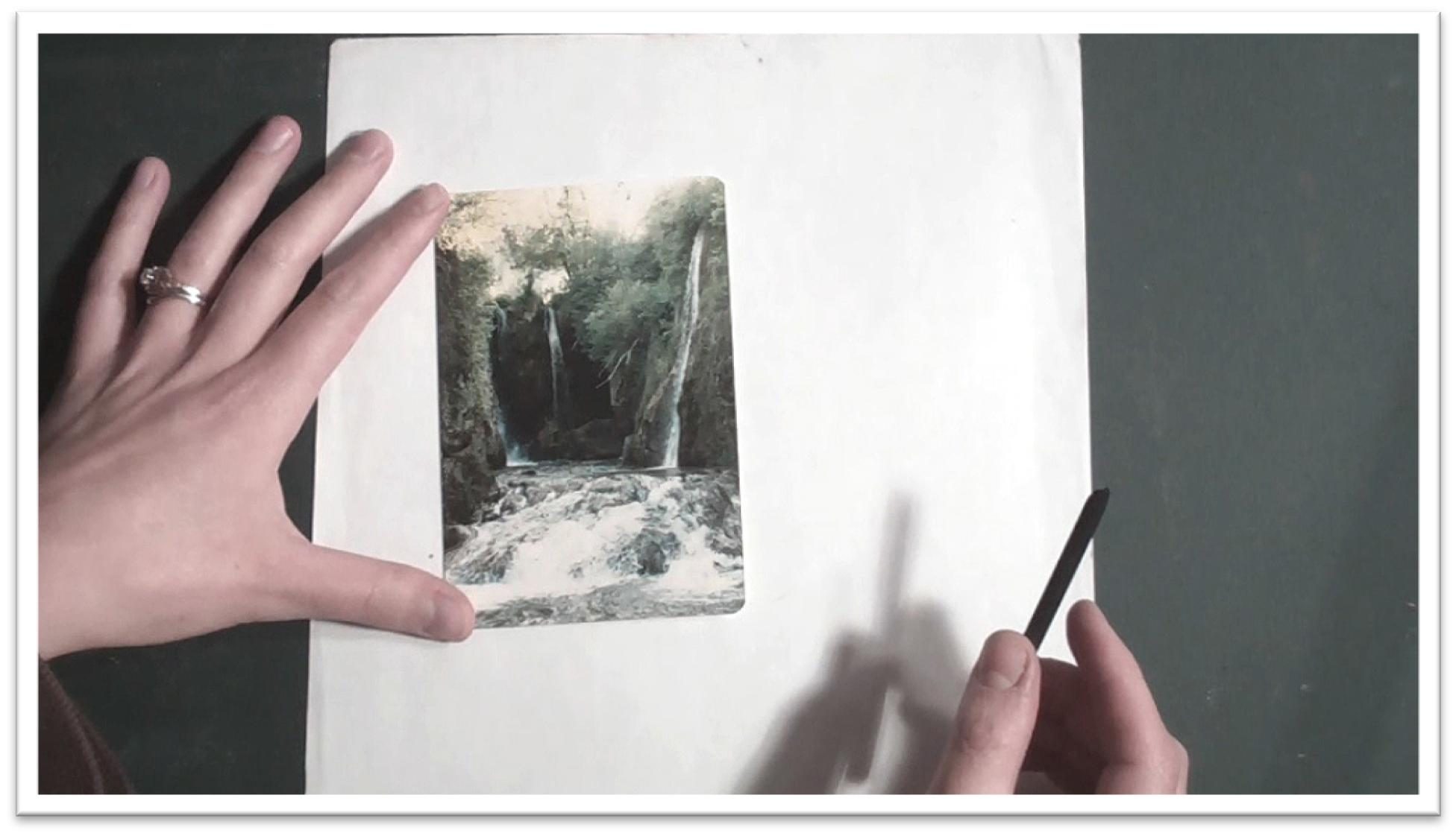
Drawing a Waterfall Scene in Pastel
Lay out a tonal study in willow charcoal beginning with the horizon line and the largest shapes, which in this case are the three rectangular cliffs that form on the upper half of the picture.
Refine the textures of rock and foliage within those rough shapes, and then sketch in the other major lines of the composition, including the boulders, tree line, the three waterfalls, and the spillover in the foreground.
If the big shapes are right, you can count on them to be guides for the smaller shapes, so examine how all of the major shapes relate to one another on the reference picture and link them in the same way on your sketch.
Tone is very important in this particular picture because the dark contrasts push the farthest waterfall back; if the tone were lighter, the waterfalls would appear to be in a line and the entire composition would be changed.
Add the darkest tone by simply pressing harder with the willow charcoal. Lighter tone can be scribbled on with a loose back and forth stroke, and then the entire surface can be blended with your finger.
Willow charcoal is very soft and will lift off easily, so blend with light strokes or by tapping the surface to avoid removing too much.
The tonal study is very helpful when you’re developing paintings with fussy, intricate elements like rushing water, because it’s so easy to lose sense of the context of the whole when you’re focusing on details.
In a sense, you’ve already done the entire painting when you finish a tonal study, so it’s much easier to keep that perspective.
Transfer the drawing to the pastel paper by placing the horizon line, three rectangles, and other big shapes using the willow charcoal stick.
Whenever possible, give yourself reference marks for the extremes of each shape, and then sketch the shape by simply connecting those marks.
When sketching the water, focus on getting the large shapes of the light and dark areas correct.
Don’t assume that things are going to get easier once you add some color; if the lines aren’t there to guide you, your colors will easily turn muddy as you get lost in the painting and become frustrated.
For the same reason, clean up any ambiguous lines with an eraser before you start painting. A clean sketch means a clean roadmap for the painting, and the more care you take in this step, the more confidence you’ll have as you move on to colors.
Session 10
Painting a Waterfall Scene in Pastel
Begin this landscape by developing a sketchy, linear undertone of colors on the pastel paper.
Start at the top and work your way down, dropping in the appropriate colors on the page by working quickly with a scribbly cross-hatched pattern of lines.
Work until the entire picture is covered with the line map.
Since the pastels layer so well, whatever you put on last—light or dark–is going to show up on top.
Therefore, look for the layers in your reference material and put the lower layer color in place first, blend it into a block of fairly solid tone, and then scumble over the top with lighter colors and details.
Use this technique in the hillsides, first blocking in the dark rocks and smoothing the tone, then dropping in the foliage over the top.
Liven up flat areas by feathering over different colors or scraping some particles of pastels onto the paper and pressing them down with a palette knife.
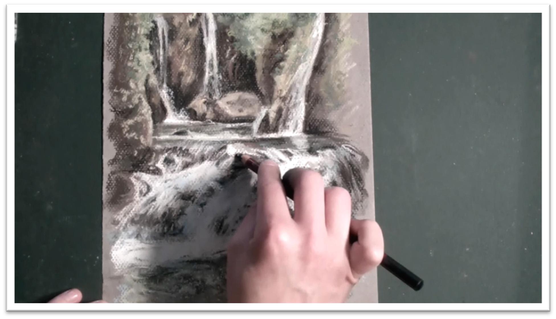
Work up the water in grays and blues, being aware that water isn’t white, but a translucent reflector of the colors beneath it.
Use the bright whites to show the sparkle on the surface only; limit the use of whites in the body of the water or you’ll lose impact for the final highlights.
Darken the pooled water with the same colors that you used in the waterfall, adding several greens and blues and then blending them together with a stomp to smooth the tone.
To place the water in the foreground, first develop the dark rocks that the water is moving over.
The rocks should be dark browns, greens, blues and tans.
After you have the pigment in place, mash it with the stomp to soften and blend the various colors, then scumble over the top with a light blue piece of soft pastel. Work in the direction of the water’s movement. Add some lines in light green as well.
Use the white soft pastel stick on the side to block in the largest shapes of white. For the delicate white lines in the smaller places, use the pastel pencil.
Smear the whites over the dark gently, again following the direction of the water running over the rocks.
Develop the dark water pooling at the base of the spill with dark greens and blues.
Don’t assume that it will be either a fast or simple task; you have to work those tones up gradually, paying careful attention to placement.
Finish the water by adding more dark tones in the white, fluctuating between the whites and darks to build up realistic water that has both highlights and dark patches of rock.
Step back and examine the painting from a distance to make sure you’re getting the impression that you wanted.
Squinting at the painting will help you develop the most important light and dark shapes and not get distracted by unnecessary details.
When you’re satisfied, spray the paper with a workable fixative, let it rest for a few days, and if you don’t need to make any changes after looking at it with fresh eyes, spray with a permanent fixative.
Session 11
Showing Depth With Color Sketch
This set of ten classes will troubleshoot sunsets, cloudy skies, showing depth and distance, reflections in water, and city scenes, beginning with a close look at showing depth.
Depth is hard to capture, because if you don’t get the colors just right, the farther elements will not push back and the result will be flat and unrealistic.
Begin by examining the reference material in terms of the largest shapes first, and visualize the landmarks in terms of easy measurements, such as the vertical and horizontal centre of the picture plane.
This approach will help you to place the elements correctly. Because our atmosphere is blue, objects that are farther away appear more blue, and in the foreground, colors have higher contrast and more detail is visible.
As you work, you should both pan out and focus in on individual elements, but try not to see details until the large shapes are in place.
Sketch a tone study on a piece of paper that is approximately the same dimensions as the finished piece will be.
In the tone study, you can better acquaint yourself with the subject matter, and get a sense for potential problem areas. This also gives you a chance to play with the composition, changing the layout to strengthen the picture as needed.
Don’t feel too bound by the photograph or reference material (or even nature itself). You’re the artist; make whatever changes you need to make an eye-pleasing piece of art. And keep in mind that part of “eye-pleasing” means reliance on the rule of thirds and other fundamentals of strong composition.
Don’t place elements in the center of the page, either horizontally or vertically. Make lines that lead the eye into the picture and around the composition, versus shoot the attention off the page.
Place focal points at the approximate intersection points of the paper being divided into thirds horizontally and vertically, and make sure your objects balance each other, not compete with each other.
When the large shapes are placed, sketch enough of the details to get a sense of where they’ll go and how they’ll impact the finished product.
Then, use a piece of willow charcoal on the side and quickly add tone to the drawing.
Remember that the darkest darks will be in the foreground, whereas the background mountains are quite light, and may even be smeared in with the blending tool without adding willow charcoal.
When the tone has been laid in, emphasize the strong lines where two planes meet, such as the mountain ridge against the sky and foreground mountain slopes against the background.
Focus on both the positive shapes and the negative shapes to have a better chance of accurately depicting the shapes on your paper.
When the tonal study is complete and you’re satisfied with the result, translate the line work to the pastel paper.
A willow charcoal stick is good to use, since it erases easily and can be rubbed away without damaging the tooth of the paper.
When you’re sure of the large shapes, detail work can be added with a sharp charcoal pencil if desired.

Session 12
Showing Depth With Color Pastel
Begin the color stage with rough, sketchy strokes using pastel pencils.
The lines can stay loose and scribbly, but remember to vary even flat colors with multiple shades to add interest.
The closer you get the foreground, the brighter the local colors will appear.
When the whole surface is covered with line work, start filling in broad strokes of color using a soft pastel stick.
Start in the sky and work forward to help keep from smearing the colors and also to keep the lines crisp as you layer forward.
After you’ve filled an area with soft pastel chalk, smooth it with your finger, or for smaller areas, a two-sided rubber tipped blending tool or paper tortillon.
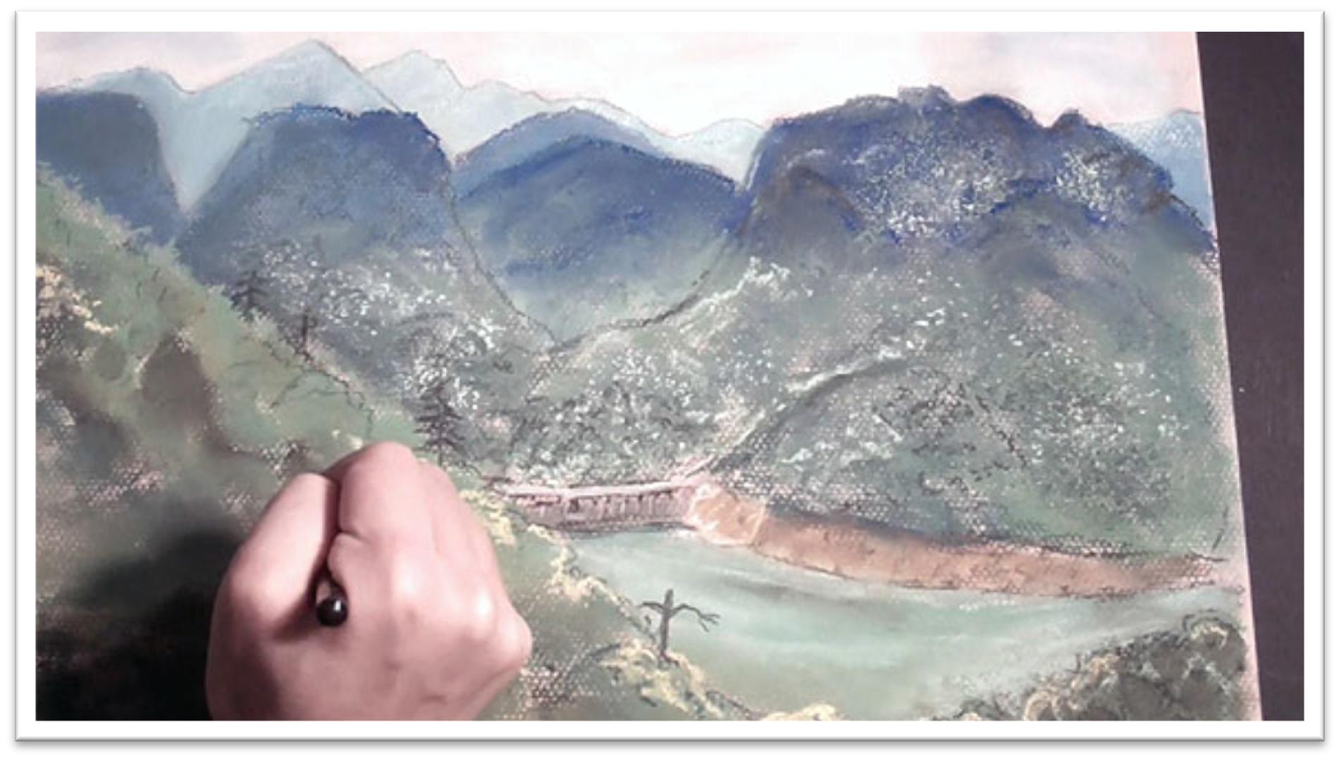
When the sky is finished, lay in the farthest mountains. Be careful to keep the upper edge very clear and distinct.
Smooth the color, and lay in the next closet mountains with a slightly darker blue to make them appear closer.
Blend again, clarify the upper edge with a pastel pencil, and then dust in some particles of lighter green and whites to start building up some interesting texture.
You want to give the impression of trees on the hillside without bringing out too much detail, which would ruin the sense of depth.
Remember that the trick of realism, especially in nature scenes, is to make your own marks on the page as little as possible. The wildness of nature is best captured with techniques that don’t give you much control, so rely on techniques like dusting, which makes a random speckle pattern.
Add the dark tree at the top of the hillside in the foreground, and lay in a broken foliage pattern down the edge of the mountainside.
Lay that tone in with a mid-tone color so you have somewhere to go to create both darks and highlights.
Cover the foreground with broad strokes of several shades of green, then blend carefully, keeping to the same color patches that you developed with the pastel sticks.
Work up the water at the same time, since the water is behind the foreground edge of the mountain.
Still water at a distance looks like a solid patch of color with a line or two on the surface to indicate eddies and deep places.
There’s also usually a line of reflection right next to the bank. Blend the colors, then add some more texture to the dirt of the hillside by scumbling in some dark brown. Add the detail work on the bridge and in the water line with a pastel pencil.
Finally, add detail in the foreground. Use a dark olive pastel to draw irregularly placed trees on the edge of the hillside.
Scribble lines to build up some more contrast in the foreground, add some of the bright yellow patches of foliage with a yellow soft pastel stick, then drop in final detail work with the pastel pencil.
But remember that when it comes to detail work, you should err on the side of too little.
You can always come back with fresh eyes and add more later, but it’s easy to add too much when you’re concentrating on the reference material and working at one sitting.
Session 13
Depicting A Cloudy Sky Sketching
In this class I want to study how to develop a cloudy sky with pastels.
The first decision is where to place the horizon. Don’t put it in the center of the paper, because that will chop the picture plane in two, which looks awkward.
Move a piece of paper around on the reference material to help decide the
best placement, then transfer it to the scrap paper to begin making a tonal study.
Place the small farm area on top of the horizon with a few loose lines, then move to the sky.
Clouds are tricky to draw because they require a clear, crisp line quality with a fuzzy interior texture. Shadows beneath the cloud forms are necessary to show that the clouds have dimensionality, and aren’t simply flat shapes pasted on a blue sky.
There should be definite shadow and highlight areas on each cloud, which show consistent lighting conditions across the whole sky.
To begin sketching the clouds, use broken line to draw the largest shape, which in this case is the blue sky between the clouds in the center.
Let the dark tone of the charcoal stick stand for the blue sky, and concentrate on focusing out and in, to see both the large negative shapes of the sky and the positive shapes of clouds.
Make light shadow on the clouds by adding light lines of willow charcoal and blending with your finger. The clouds in the distance appear closer to the horizon line and are smaller relative to the other clouds.
Watch the tendency to make the clouds too uniform in shape and size; good reference material is very important, as is close observation of the real sky whenever you get the chance.
Sketch in the dandelion field by indicating the streaks of green of the field, and a few clusters of dandelions in the foreground. The farther away the dandelions are, the smaller they get until they’re simply dots and then a field of yellow.
Work on white pastel paper for the finished piece, which will save time in depicting the white clouds. Re-draw the largest shapes with the willow charcoal, keeping in mind where the shapes fall on the paper with respect to the horizontal and vertical center of the paper.
This will give you a frame of reference for placing them accurately. Make sure to include where the lowest clouds will fall in relation to the horizon line.
Add a few of the largest outcroppings of dandelions in the foreground, but keep in mind that most of the charcoal will need to be erased to keep the yellow pastel chalk from getting dirty in the next step, and for dandelions in the distance, the flowers will be more easily dusted in than drawn.
When the major shapes are in place and accurate, you’re ready to start adding color.
Session 14
Depicting A Cloudy Sky Color
First lay in the negative shapes of the blues around the clouds, then go into the clouds themselves.
The blue in the center is very bright and vibrant, whereas the tone closer to the horizon is more subdued
Show that tone change as you begin sketching in the colors with the pastel pencils.
To avoid having black lines in the clouds, erase the sketch lines made with the willow charcoal once the cloud shapes are established a bit with the line work.
Work up the details on the horizon such as the mountains, barn and buildings, and then move down to the field.
Plan your approach before you begin. To keep the yellows clean on the green background, avoid some of the foreground patches to keep them white.
In the background, most of the color is yellow with some green stripes breaking through, so put the yellow in first with the darker green on top.
When the line work is done, use soft pastels to fill in more color. Work just as you did with the pencils, starting in the negative shapes of the blue sky and working around the clouds to sculpt them out.
Blend the blues smooth, and gently blot the color into the clouds. A lighter tone of blue around the edges will help the color transition naturally into the clouds.
For showing areas inside clouds where you can see the sky behind, build up darks with the pastel pencil, dot in some of the sky color, and blend.
For showing wispy edges, wipe the dark tone into the light using a clean fingertip or blending tool, then add additional white as needed.
In the field portion of the drawing, clarify sharp lines on the horizon with pastel and charcoal pencils, then move down to the yellows and greens of the grass and dandelions.
Lay in the distant, solid swath of yellow first, blend it, and then add the stripes of green. If you need to make the green brighter in the foreground, you can add yellow.
Dust in green in the middle ground of the field, flatten the particles with the palette knife, and then add yellow in the closer middle ground.
These will only look like dandelions if the foreground flowers are worked up to higher detail, so add those next, keeping the colors bright. Darks can be added using pastel pencils.
Final details can be added to the clouds by stamping color in the shadows using a wadded paper towel. This technique is useful for adding tone to subtle areas, lifting color out of dark areas, and softening edges without lifting too much dust off.
Finally, take a step back to see where the painting needs more work. Make final adjustments as needed, spray with a workable fixative, and let the piece rest for a few days.
Come back to it a final time with fresh eyes and then determine if the painting is finished.
Session 15
Depicting a Sunset Sketching
For this class we’ll study making a sunset, which combines the difficult elements of making extreme contrasts and showing the aura of yellows, oranges, and reds that splay out and are reflected in the trees, rocks, and clouds that are touched by the sun’s rays.
Capturing such a majestic scene in chalk dust can be difficult to say the least.
Consider carefully the placement of such a strong focal point. The sun will grab all the attention in a sunset painting, but you don’t want it to be in the center of the page or you’ll have a bullseye slamming the viewer in the eye.
Keep the horizon line either in the upper or lower third of the paper, and keep the sun off to one side on the horizon line.
When you’ve decided where to place the sun, add the rest of the elements. Don’t be too finicky about the details, but do take advantage of this opportunity to better acquaint yourself with the shapes and lines of your picture.
The practice will not only give you a better chance of making a successful pastel painting, but it will also show you potential problem areas, give you a chance to plan your best course of action in laying in the color, give you a chance to painlessly improve your composition, and provide you with a roadmap for the color stage. The tonal study is, in a word, crucial.
Take care with it.
When the lines are in place, add the large black mass by using the willow charcoal on the side to fill in tone quickly.
Blend it with your finger and add the other large elements on the page, such as the large rock on the bottom of the page, the bushes and grasses sticking up above the horizon, and the rolling clouds.
Next, stand back and examine the finished tonal study from a farther distance. You may decide that changing the placement of the horizon line or the sun would strengthen the composition.
If you even wonder whether the picture might be stronger with a different arrangement, take the time to whip up another tonal study and see for yourself. It doesn’t need to take more than a few minutes, but that time can save you a lot of time and effort later on.
When you’ve decided on the final composition, transfer the line work to your pastel paper.
Sketch lightly, and limit the lines as much as possible since most of the black charcoal lines will need to be erased so as not to interfere with the bright colors of the sunset in the next stage.
Work until you’re confident that you can begin to lay in the color, and then begin the next step.
Session 16
Depicting a Sunset: Color Stage
In the first color phase, add grays and blues to the sky with the pastel pencils, keeping your lines loose and scribbly.
Around the cliff edge, change to bright yellow and add some pinks to the underside of the clouds.
Erase the charcoal lines to keep the colors bright, and then start on the colors of the sunset.
Sunsets are white at the core of the sun, and then become more yellow moving to red as the colors splay out.
Add those colors, then lay in the burnt umber and black of the cliff side. When the line work is done, work from the sky down using the soft pastels. The cloudy sky can be put in with blues, purples, and pinks.
Blend the colors smooth, then clean up and reshape the clouds. You may need to scumble in a white soft pastel to divide the blue sky into individual cloud shapes, and you can also blot the color with a wadded paper towel to soften lines and add texture.
When the sky is complete, start building up the bulls eye of yellow, peach, orange, and red around the sun.
Keep the colors intense, or they’ll wash out in the blending phase. Beneath the red is the brown, burnt color of the mountainside. For blending, use your finger to make gentle circles to keep the transition very gradual.
Keep your fingertips clean for every stroke, or you’ll muddy the light colors with the dark.
Re-scumble in more colors of the sunset after blending once, then blend a second time. Repeat the process until the sunset colors are finished, then drop in the darks of the mountainside.
Carefully add the trees with a sharp pastel pencil. After you have the lines in place, you can fill in with careful strokes and blend with the rubber blending tool.
Use the same process to add the bushes on the other side of mountain, beginning with guidelines that establish the height and width of the bush, then filling in the shape from the inside out using a soft pastel. Add orange to the branches that are nearest the sunset.
Next, add detail to the dark mountainside. Use a light colored soft pastel and drop in some rock shapes, and continue the tree down the right side of the mountain.
Sharpen the horizon edge with a dark brown or red, depending on nearness to the sun, then finally, work on the foreground rock.
A lavender base tone will make it stand out. Blend that color smooth, then add detail work with pencils for the line work and dusting to show speckles in the granite and texture on the surface.
After letting the work rest for a while, see if you need to loosen up any of the lines or liven up some blank patches with more texture.
Tie finicky, small shapes together with a pastel on the side, liven up flat areas with additional color, and use dusting and feathering techniques to add texture as needed.
Session 17
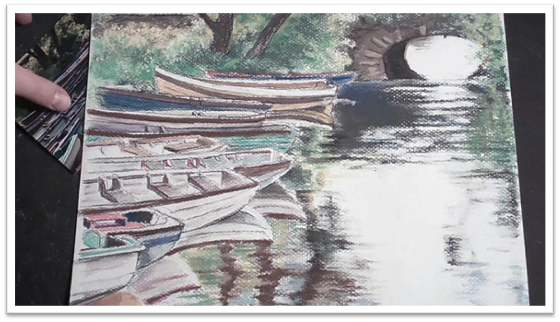
Depicting Reflections in Water Sketching Stage
In this class we’ll incorporate pastel lessons on showing not only water, but also colorful reflections in the water, both of which provide their own particular challenges.
The boats in this study are quite involved and the composition complicated, so be sure to take extra care creating the tonal study.
Begin as usual by placing the horizon line, followed by the largest shapes on that line, which in this case is the bridge.
The boats intersect the side of the bridge, so indicate that point first, then give yourself a guideline for where the large shape of the group of boats end at the bottom of the page.
Connect those two guidelines with a large shape that incorporates all of the individual boats.
You want to make sure to draw the boats accurately within this large shape, but don’t worry about too many things at once. First, get the largest shape correct so you’ll be sure that all the boats will fit in the specified area.
Next, break that large shape into the smaller shapes of the individual boats, and finally, add the reflections of the boats on the water.
Always see the large shapes in terms of other large shapes and in terms of landmarks that are common to both the reference material and the drawing paper.
For example, mark off where the sterns of the boats lie in terms not only of the bridge, but of the horizontal and vertical center of the picture plane. If you need to, make adjustments to be sure the boats are falling where they ought to on the page.
This is the best opportunity to clarify shapes and the composition for yourself, so use your time wisely.
When the boats are roughed in place, add some tone to the darkest areas of the boat, bridge, and ripples in the water.
Tone in the boats especially will help you keep your place and differentiate one from another. Sketch in the shape of the clump of trees and darken it as well, then add some tone to the background foliage and shadows on the water.
When you’re satisfied with the tonal study, transfer the drawing to the pastel paper. Begin once again with the horizon line, but also give yourself a light guideline for the vertical center of the page so right away you have a frame of reference for the boats.
Fill in the large shapes like the bridge and the large boat shapes, the trees, and the bank.
Once the largest shapes are in place, you can clean up sketchy lines and tighten up the detail.
For the highly detailed boat interiors, switch to a charcoal pencil which can be sharpened to a finer point. The boats are man-made, so if you’re not able to make lines that pass for mechanically made, you may need to use a straight edge to help you.
When all the details are worked up as far as you want them to be, you’re ready to start laying in the color.

Session 18
Depicting Reflections in Water Color Stage
Start adding color with the pastel sticks beginning with a base green in the banks behind the waters, then adding more shades of green and yellows to vary the tone.
Use a neutral color for the stone wall and bridge, and darken the underside of the tunnel.
As you work, spend some time planning the best course of action for the soft pastel stage.
For example, when you reach areas with leaves falling over the stone, you know you’ll need to have the stone color in place first, since the color on top needs to be added last.
Add line work in the water and boats, focusing on the shape of the shadows and color patches.
Darken the trees and so on, working until the entire page is covered and the road map is complete. Don’t push forward until you have a good, clear sense of where the colors go.
When you start laying in the green with the soft pastel, squint at the reference material to see the foliage as one big shape that extends across the bank, over the wall, and clear over to the bridge.
When the mid-tone is blended, add the shadow shapes and highlights. Add the leaves that are hanging over the wall last, then drag through the darks with the blade side of the rubber blending tool to create grasses.
Next, move to the trees and the details in the bridge. Darken the branches with the darkest pastels you have, layering burnt umbers, blues, and reds to give the impression of a rich black that retains a sense of depth.
Make the lines more distinct with the charcoal pencil, add more texture in the bark, then draw some grass up over the tree trunk to help incorporate the tree into the background.
To add detail to the wall, build up the top line with a dark pastel and scribble on some texture, then work up some foliage behind it.
On the bridge, smooth the dark around the overhanging leaves, add some stone shapes with a soft pastel, and highlight them with various neutrals. Darken the shadow cast by the plants and the inside of the bridge, then blend a final time with the rubber blending tool.
Move to the water next, dropping in the color under the bridge and adding additional tone to the largest shadows.
Blend with your finger and layer another dark blue over the dark brown to build up depth. Use a combination of scumbling and blending to get a realistic impression of ripples and sparkles on the paper.
Add more color to the boats, squinting to see the shape of the color on each one. Work from the top down, filling in each boat with the local color.
Begin with the base color, blend it smooth, and add the detail work on top with sharp pastel pencils.
When the boats are finished, step back from the picture and see where you need to add additional darks and highlights. Reshape and revise as needed until you’re satisfied.
Session 19
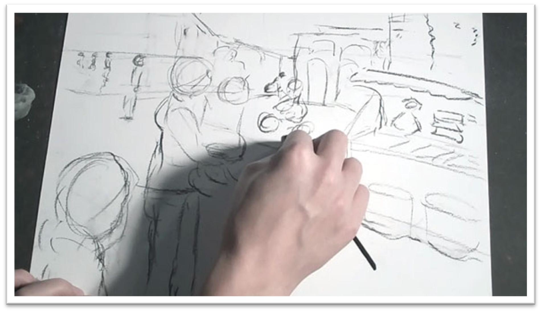
Depicting a Street Scene Sketching Stage
This last scene is a complex street scene, filled with straight lines of buildings that need to be drawn in perspective as well as crowds of people.
There are a lot of details to contend with, so work the sketch up carefully.
Begin with the horizon line and add the large fruit stand in the foreground.
Behind it, give yourself some guidelines for the buildings. The rooftops should slant down at a constant angle and the buildings get smaller and more vague as they retreat in the distance.
At this stage, keep the lines loose and focus on getting the main elements in place to help you plan out the composition.
Sketch a mother and child in the foreground, starting with the heads and working down towards the feet.
Make an even larger head in the very front foreground, and then draw a cluster of people at varying distances from the back.
Keep in mind that people of approximately the same height walking on an even ground will have heads at one constant height on the page no matter how far away they’re supposed to be, so if you always start with the head and let it’s size determine the size of the body, you shouldn’t go too far wrong in drawing the people in proper perspective.
Fill in more details in the buildings and crowd, then step back to examine the composition.
You want to establish a clear point of interest that draws attention to the page, then leads to something else in the picture which in turn leads to another area, so that the eye moves naturally around the picture and isn’t drawn away at any particular point.
When the tonal study is complete, re-sketch the picture on the pastel paper.
Start once again with the horizon line, then fill in the largest shapes: fruit stand, mother and child, foreground head, and the background buildings.
When those are in place, fill in the shape of the clusters of people. Do the loose line work with the willow charcoal, and when everything is in place you can sharpen up details with the charcoal pencil.
In the final phase, straighten up the lines of the building with a t-square to establish clear 90 degree angles.
You can freehand the lines again after placing them carefully, but this step will ensure that the buildings don’t look bent or melting.
To clean up the facial features in the foreground people, erase the loose willow charcoal lines and re-draw them more carefully with the sharp charcoal pencil.
Don’t spend too much time on details; this is a roadmap for the color stage, so all the lines will eventually be covered.
However, you do want the faces and details to be accurate enough that you don’t put color down in the wrong place and spend a lot of work cleaning up mistakes.
It’s up to you to decide when you have enough line work done that you can confidently fill in the color.
Session 20
Depicting a Street Scene Color Stage
Begin with sketchy lines of blue in the sky.
Cross hatch those lines with a darker blue, then add some gray and blue tones for the mountains.
Move forward to the base tone of the buildings next, keeping in mind that the larger buildings in the foreground should have more detail and brighter color than those in the back.
Add dark line work over the base tone of the buildings, then move into the pavement, people, and other details.
Work until the page is covered with line work, pushing it as far as needed to get yourself comfortable laying in the soft pastel.
Go back to the sky with soft pastel, scumbling in both blue and white to build up a mottled, interesting texture.
Experiment with flattening the sky tone with the palette knife and smoothing it even with a soft brush to see what effects you can get.
Make sure that you run the sky edge well over the corners of the buildings so that there won’t be a color gap between sky and building. Use the rubber blending tool to smooth the fussy edges.
Add more tone to the mountains, using a pastel stick for the base color and pastel pencils for the sharp upper edge. Re-draw the mountain top over the sky to keep a clear division between those two plains.
Move forward to the buildings, and add interest by using several blues, browns and greens layered together to establish a highly textured gray.
Accent the highlights with pure white here and there, and use a charcoal or pastel pencil to darken small details like windowpanes. Keep the painting lively by adding plenty of color.
Give the buildings in the distance definite highlight and shadow sides to add depth. Keep the differences between the sides striking, but keep to one color family or the two sides won’t appear to belong to the same building.
Blend lightly, then strengthen the darks and highlights as needed.
In smaller shapes like skin tones and clothing of the people in the background, you can rely on pastel pencils to lay in color, but keep to the same lessons of using multiple colors to lay in local colors and seeing large shapes before you work up details.
Cross hatch an interesting texture of several dark colors in the street, then either tamp the dust with a blending tool or scrape across the surface with a palette knife to make a rougher texture. When the street is finished, add the people on top.
Finish with detail work on the people in the foreground. Strengthen the colors of the clothing to punch up the contrast.
When the colors are in place, you may want to smooth the tones more carefully than you did in the background figures to make the foreground people pop forward even more. Contrasts of color and texture will both draw the eye.

 If you wish to download the files to your desktop, simply right click the link below and select ‘save as’
Then select the location you wish to save the files to (either your DESKTOP or MY DOCUMENTS e.t.c.)
Once finished, simply unzip the files (PC use winzip, MAC use stuffit) and your files will be there.
All written material can be opened as a PDF.
All videos files can be opened with VLC Media Player.
Select your download option below …