
 Login
LoginPortrait Mastery
Class 1
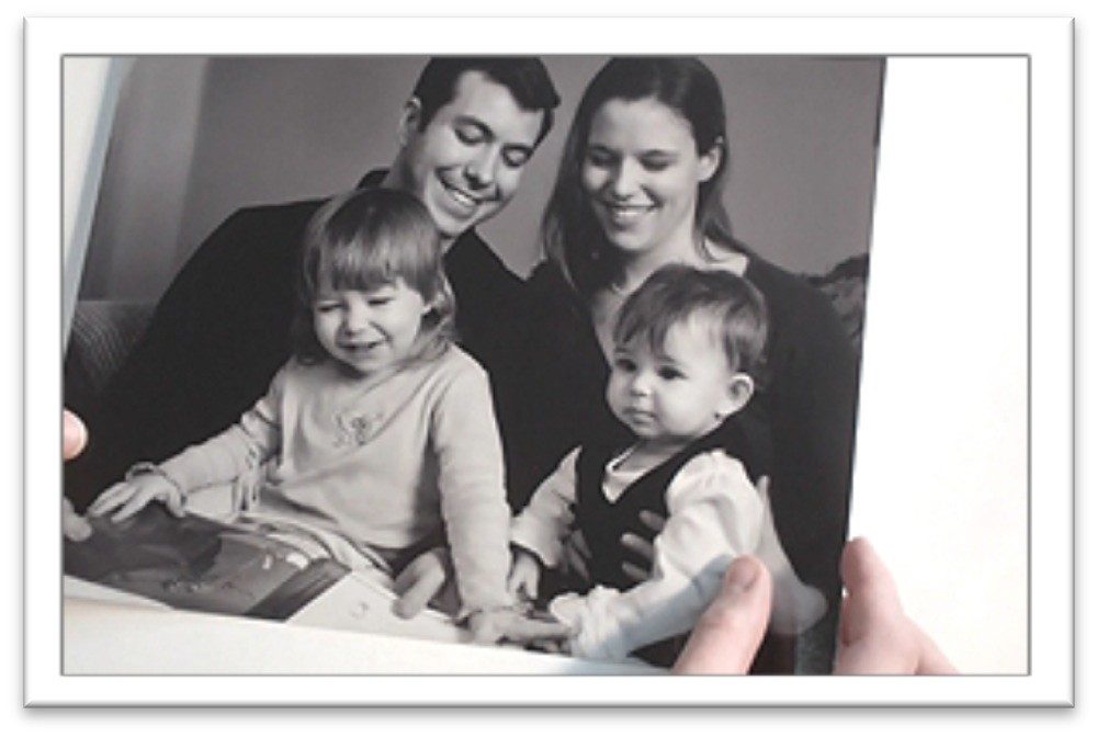
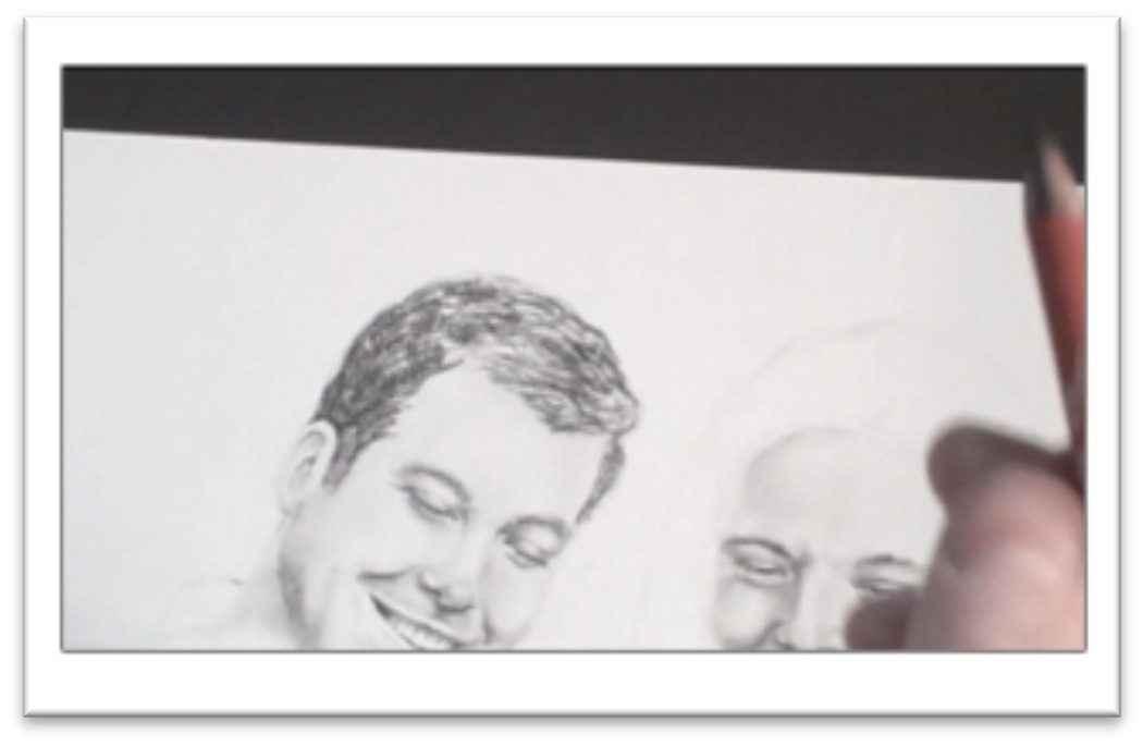
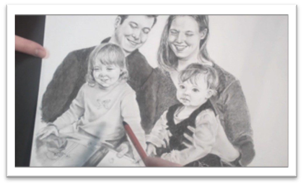
Drawing Family Portraits Layout
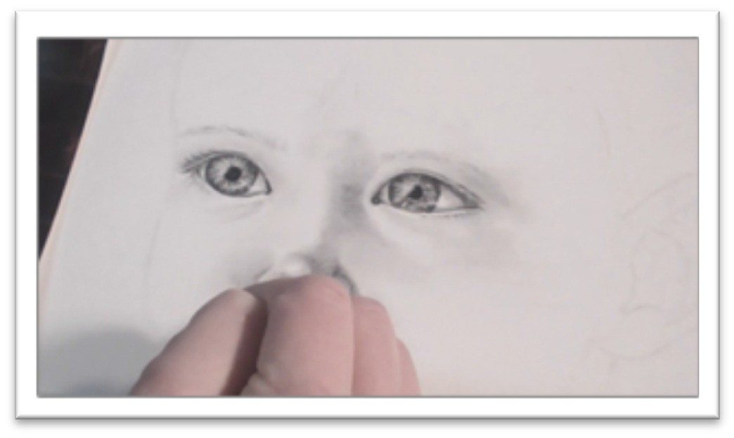
Choose a paper with low tooth that is high quality, such as Bristol board.
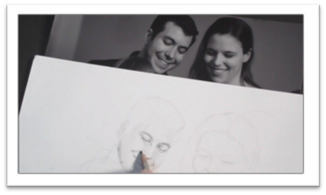
Start the layout by sketching the basic angles and shapes of the heads on the page to get a better feel for the approximate size you to make things.
Use loose, light strokes, working clockwise from the upper left hand corner down and focusing on the largest shapes first.
Keep your pencil work light enough to erase easily. The sketch should be fairly accurate, but don’t get bogged down with anything but how the largest shapes interact with each other at this stage.
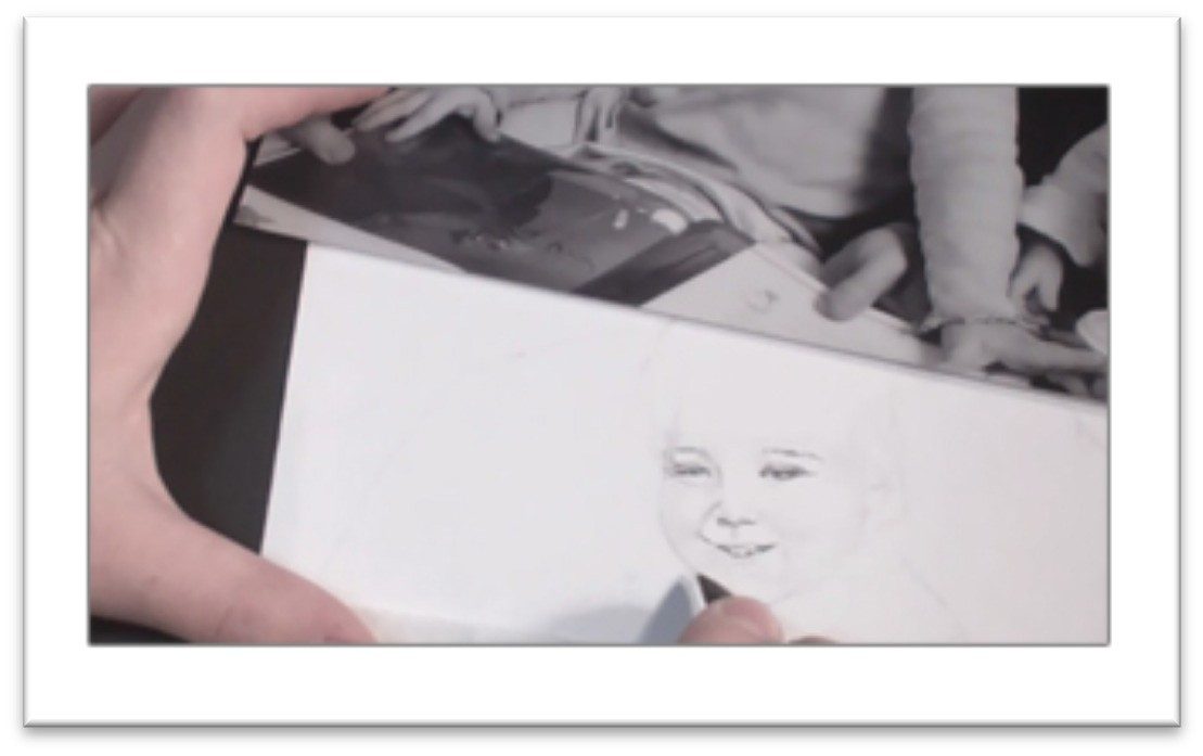
Erase the lines that you don’t need, then start refining the drawing with measuring. Use the largest head to determine relationships with the smaller shapes
Place a scrap of paper over the head and mark off the length, then compare it to the other heads in the photo.
Do the same thing with the head’s width, then transfer those proportions to your drawing.
For example, if the father’s head is the same length as the mother’s in the photo, make sure that they’re the same length in your drawing as well.
When you have the adult’s faces in relation to each other, do the same thing with the children’s heads, using the dad’s head as the basis of measurement.
As you work, look for intersections of the shapes on the photo and compare them to your drawing.
For example, the father’s shirt collar may touch the child at the center of her head, or an arm may line up with someone’s nose and so on.
Also look for the negative shapes and compare them to your drawing as well—the shape between to heads nearly touching, the shape between two hands, et cetera.
Make your drawing as accurate as you can in the early stages. If you want to combine photos or make other changes, you can do that after you know the layout is correct.
The roadmapping, information-gathering phase of the layout is done when all of your large shapes are correct in themselves and in relation to one another.
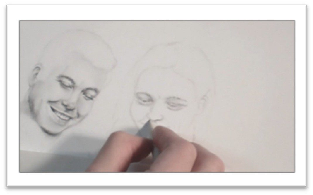
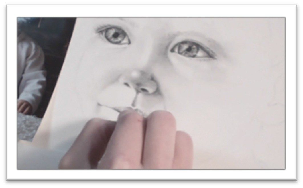
The next step is to start filling in smaller details of the portrait. Vertical and horizontal guidelines on each face indicate where
the nose and eyes belong.
Next, use the scrap paper system to make measurements for features.
Working in the uppermost face first, place your paper over the photo and mark off the eye’s length.
All of the facial features can be placed in relation to the eye; double-check the
common measurements against the photo before you begin drawing them on your page.
Generally, eyes are one eye-length apart and half an eye wide. From the bottom of the eye to the bottom of the nose is an eye-length, and so on.
Use the eye as your basis of measurement and determine the width and length of each feature on the face, then sketch an appropriately sized box on the drawing to show where each feature will be placed.
You can draw the lines of the features within those boxes once you’ve measured and re- measured to make sure they’re correct.
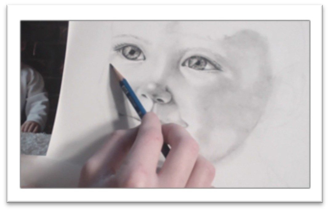
Clean up the guidelines once all of the features are lightly drawn in place, and then you can start adding tone to the face.
Class 2
Drawing Family Portraits Father’s Face
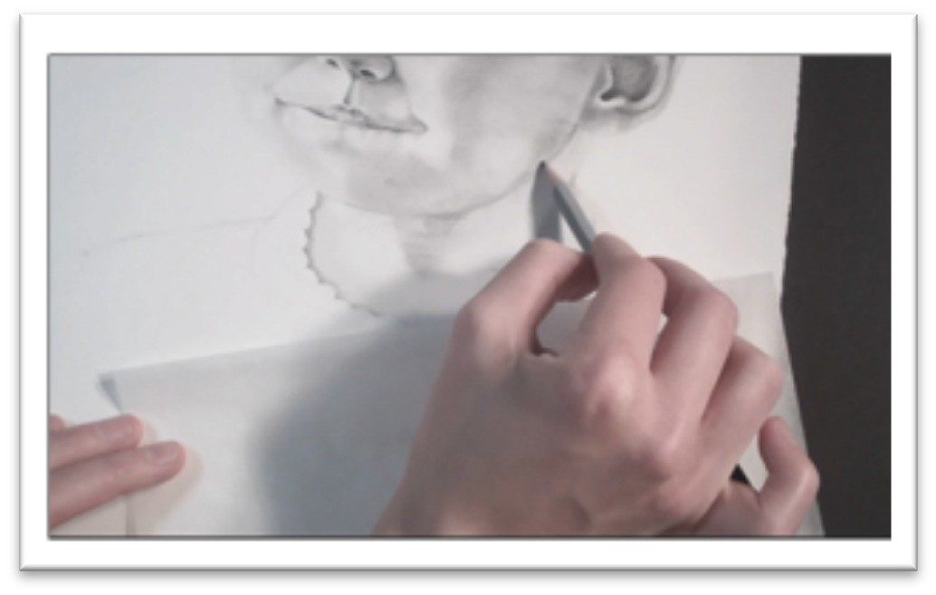
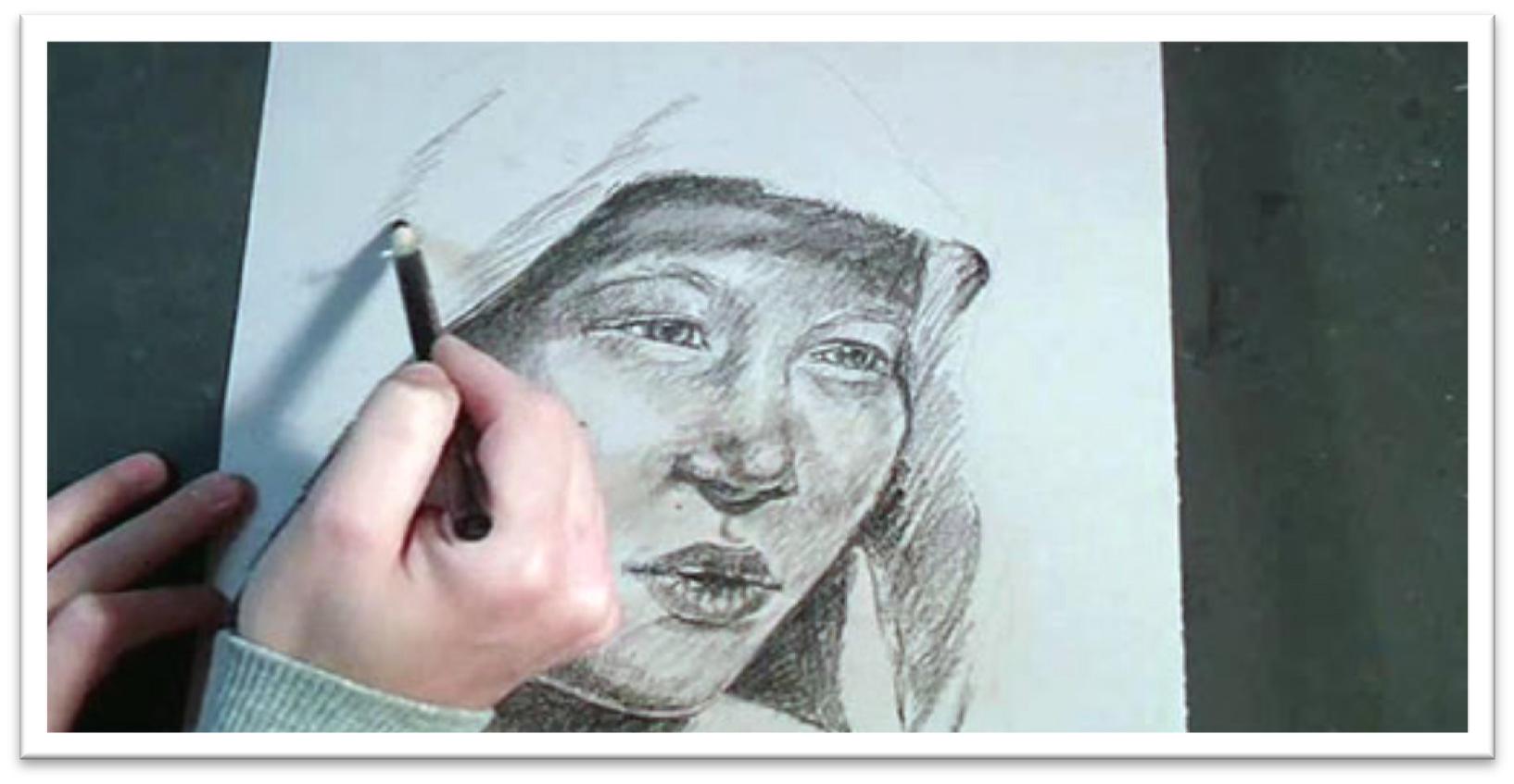
Pick up an H and 2B graphite to have both on hand for light and dark places of the face; H for most of the skin tone and a 2B for darker areas.
Start by bringing out the dark lines of the face that help to define the key features; the lines of the eyes, bridge of the nose, nostrils, lips, and ear.
Don’t outline, just define them a little more clearly. Next, build up some skin tone starting in the darkest areas; above the eye, side of the nose, underside of the tip of the nose, corners of the mouth, and so on.
As you shade, constantly look for shapes of shadows on the face as a whole, versus focusing on individual features.
When the tone is down, smooth over it with the largest blending tool you can. Felt or chamois is best for early stages in a drawing because they give the smoothest finish.
For smaller areas, choose a stomp or tortillon which don’t pick up so much tone and allow for more accuracy.
After smoothing, build up the darkest places in the skin with more tone. Pick out highlights with a kneaded on the tip of the nose, in the eye, on the mouth and anywhere else you find them.
If the person is looking down, the eyes are easily defined with lines that indicate the upper and lower lids. There should be some shading in the corners and a highlight on the top of the upper lid to show that the eye is round.
Blend the skin around the lids, then place the eyelashes with a sharp charcoal pencil. Each lash should be one stroke, drawn in the same direction that the hair grows.
When drawing eyebrows, shape the upper and lower lines first, then fill in the eyebrow with tone and pick out a few hairs with a kneaded eraser and a charcoal pencil.
The nose is usually dark under the tip, with an area of reflected highlight both on the side of the bridge and in the septum between
the nostrils there that helps to lift it up and out.
There’s a strong highlight on the tip and the highest line of the bridge which you can pull out with a kneaded eraser.
Use a charcoal pencil to darken the nostrils when the rest of the nose is done then blend that tone out with a small tortillon using a circular motion that will disguise the strokes.
Define the mouth with just enough light lines to indicate the shape, then build up the tone with graphite.
The upper lip is usually darker than the lower, the corners are darker than the middle, and there is more detail visible on the lower lip.
If teeth are visible, show where they are by drawing the shadow around the teeth, not the teeth themselves.
It’s very easy to over-draw teeth, so avoid that tendency by barely drawing lines of division, relying on the viewer to fill in the lines of separation for you.
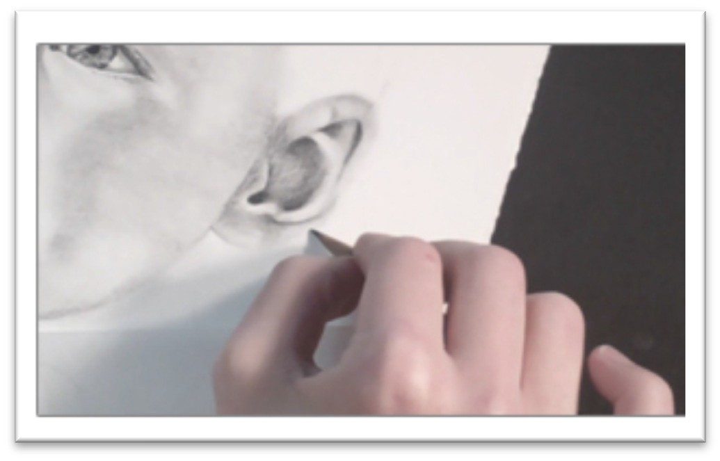
Lay some graphite tone over the entire ear and blend it smooth, then darken the interior lines with soft graphite and in the darkest places, charcoal.
Blend the dark lines out with a small tortillon, and if necessary, clean up the other side of the line with a kneaded eraser.
Look for areas of highlight and reflected light and pick them out with a kneaded eraser to finish.
Class 3
Drawing Family Portraits Mother’s Face
Begin with the H graphite and work the same way that you did in the Dad’s face darkening the largest shapes so they don’t get lost in blending and to get a better idea of how the face looks with more contrast.
Make adjustments in the features as needed, then work up some darks in the eyes with 4B graphite.
Place heavy lines in the iris and blend out, starting in the darkest areas. For the lighter areas in the eye, use 2H or 4H.
Blend with a fresh stomp or tortillon to make sure you’re blending existing tone rather than laying down additional darks.
Use an H and start laying in areas of tone in the rest of the skin, remembering that you need tone everywhere in order to show highlights.
Work in controlled strokes, covering the entire surface, then blend it smooth with a chamois cloth. This is fast way to get an even coating over the face, and then you can pick out highlights with the eraser later.
Once the base tone is blended smooth, lay in a few of the darks with a charcoal pencil; above the eyelids, the eyelashes, the nostrils, and so on.
Don’t push it too far—you should work on the whole face at the same time, progressing up gradually.
Begin picking out some of the highlights on the more finished areas; on the eyelid, bridge of the nose and so on.
Then continue to build up dark areas of the skin, always following the natural contours on the face.
Put the shadows in as shapes that cross the lines of the features and then blend with a clean tool, using the largest thing you can for the space to ensure a smooth finish.
Draw teeth by developing the darks that are around them, not by outlining the individual teeth, which will make them look over-worked and cartoonish.
Add more shading, constantly taking a step back and comparing the contrasts between the two faces on your drawing to make sure they appear consistently lit.
Remember that the corners of the mouth are very dark, as are the corners of the mouth. Darken them with a sharp charcoal pencil to make them push back realistically.
You will also want charcoal in the eyelashes and eyebrows, and perhaps in the lines beside the nose if the person is smiling.
If lines on the face are apparent, blend them out so they don’t look artificial. When blending a line, blend on only one side to keep it from looking smeared.
That way, the contrast will remain distinct.
On the neck, lay in the dark tone using light pressure with a charcoal pencil, blend with a chamois or felt by stroking horizontally with the contour, and then pick out lines with the eraser to indicate the folds in the neck.
Accent the white line with pencil tone and blend to make the transition less distinct.
Class 4
Drawing Family Portraits Child’s Face
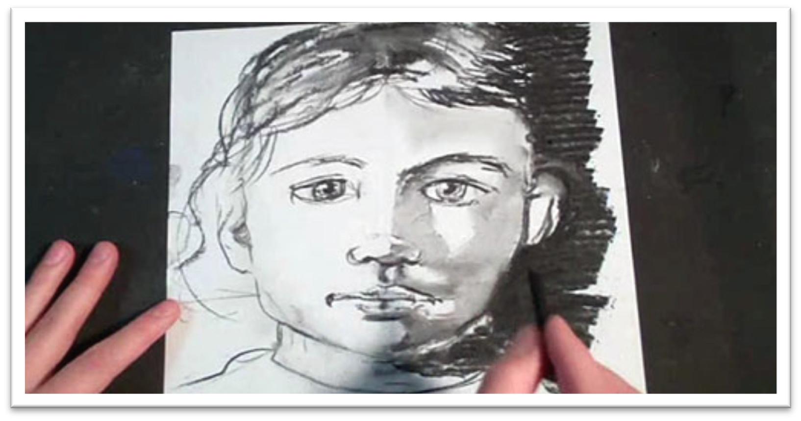
Begin with the F pencil, darkening up the nose, eyes, mouth, chin, and shape of the face to make them more clean and distinct.
Remember, there are no lines on the face, so don’t over-draw the features; just give yourself a clear roadmap for adding tone.
Switch to a B graphite and put in the crease above and below the eye, then lightly start to shade the face with the essential shadow shapes.
Take into account that young kids don’t have the same amount of contrast as adults, so work up the base tone with a harder pencil such as a 2H and keep it lighter.
You still need to have tone everywhere, however, so that you can make highlights stand out.
Blend the initial skin tone with a chamois or large stomp, and then start bringing out the reflected light around the chin and cheek area.
This is the line of highlight that exists around the curvature of the face, so you need to develop the negative shape (the shape of shadow behind the face) in order to see it, but in the early stage, simply leave a small band of white around the edge of the face and darken tone beside it.
Darken the eyes with a 4B for the iris and corners and a 2H for the tone in the whites. Add eyebrows by laying down graphite for a base tone, then accenting the shape with individual hairs drawn in with pencil and pulled out with an eraser.
When the base skin tone is blended, you can begin to accent the darkest areas with a sharp charcoal pencil. In the eyes, go over the corners and lines in the lids, as well as the eyelashes.
Remember charcoal is softer and will blend more easily, so make sure you have the blending done before you lay it down, or it will smear.
As you work, pull back every few minutes and examine the picture from a distance. If you’re working flat, prop the drawing against the wall to see it from different angles.
It’s surprising how many problems you can catch with just this simple step, so do it often.
When drawing kids’ teeth, consider that their teeth are smaller and more gappy, but otherwise they should be defined the same way as the adults; by shading the negative shape around them.
The ear, chin, and cheek may be defined the same way.
As you lay down dark areas, make sure that you’re using a softer pencil rather than pushing harder on a mid-range one or your tone will be streaked with lines that are almost impossible to get rid of.
Work up more shadows in the individual features and blend with a stomp with a little bit of tone on it for the small areas.
Blend using small circular strokes that give a smooth finish and disguise directional strokes.
Finally, darken a few areas with a sharp charcoal areas; the nostrils, mouth, nose, and so on as needed.
The darks should clean up all of the ambiguous areas and make the picture pop with realism.
Class 5
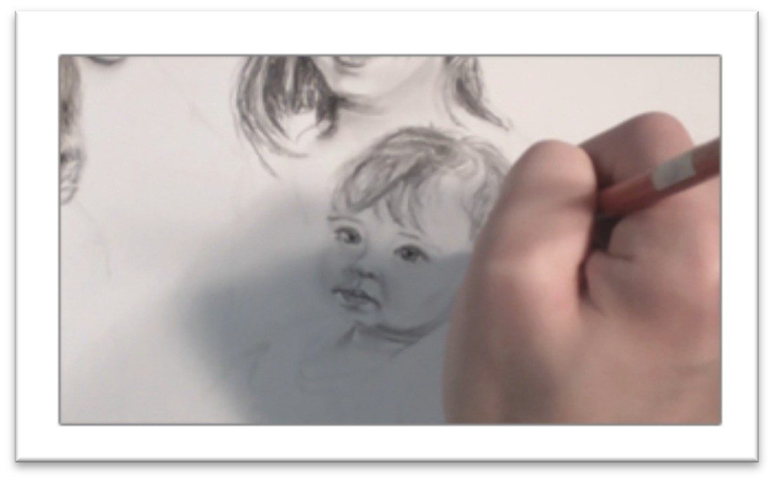
Drawing Family Portraits Baby’s Face
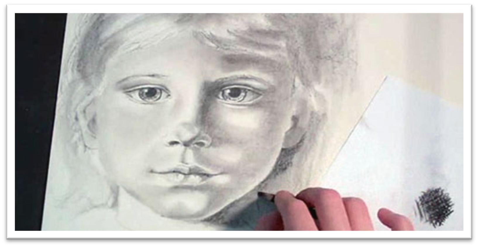
The same rules apply for the baby, except that the tones and contrasts are even lighter.
Babies look like they have large eyes because proportionally, the ratio of head to eye size is smaller than in adults.
For that reason, it is very easy to make a baby’s eyes too large, so a good plan of attack when drawing a baby is to start with the eyes.
Since everything is measured in terms of the eyes, you shouldn’t go too far wrong.
Darken the features with F graphite, then begin laying in darks with a 4B. Work in the eye, adding heavy tone to the lines of the eyelids, the nostrils, and the mouth.
Add some spokes to the iris in the eyes and blend it out, then add some tone in the whites as well. If the eyes are too small to avoid the highlight in the corners, you can pick out white areas with a razor blade when the rest of the drawing is done.
Blend the skin tone around the eye with a small stomp or tortillon, then use a sharp charcoal to add the eyelashes—one stroke per lash, working in the direction of growth.
Then use an 2H pencil on the side, starting in the darkest areas of the face, and lay in some skin tone.
Use smooth, controlled strokes that follow the contour of the face. Work up gradually, but don’t be inefficient—the darkest areas can be put in with a softer pencil.
Accent the roundness of the baby’s cheeks with fairly strong shadow beneath the apples, but keep shading in the chin and forehead very light.
There isn’t much contrast yet because the baby’s face is soft and round with very little visible underlying bone structure.
Babies usually have very distinct lines around the eye, nose and mouth. Draw those lines with a sharp graphite pencil, then blend over the entire skin tone with a chamois to soften.
Next build up the darks of the skin tone a second time, blending in the smallest areas with a stomp or small tortillon using circular motions.
Look for the subtle shadow shapes in the reference, but be aware that the longer you stare at the picture, the darker the shadows will appear to be.
If you don’t stop and step back every so often to get a broader perspective, you will tend to over- darken the tone.
Bring out contrasts in the nose, mouth, ears, and beside the cheeks and chin with the sharp charcoal pencil.
There’s a nursing callous on the upper lip of all babies, which you can accent with a bit of line and a kneaded eraser.
The mouth is very sharp and distinct as is the divot above it, and there is usually a strong highlight on the lower lip to show that it’s wet.
Once the face is fairly close to completion, focus on the small details. Remember that shadows are darkest closest to the source, and then blends out to a reflected light.
Blend a smooth base tone over the neck, then add lines and highlights to show rolls of skin on the neck. Darken under the chin and one side of the neck with charcoal if necessary to finish.
Class 6
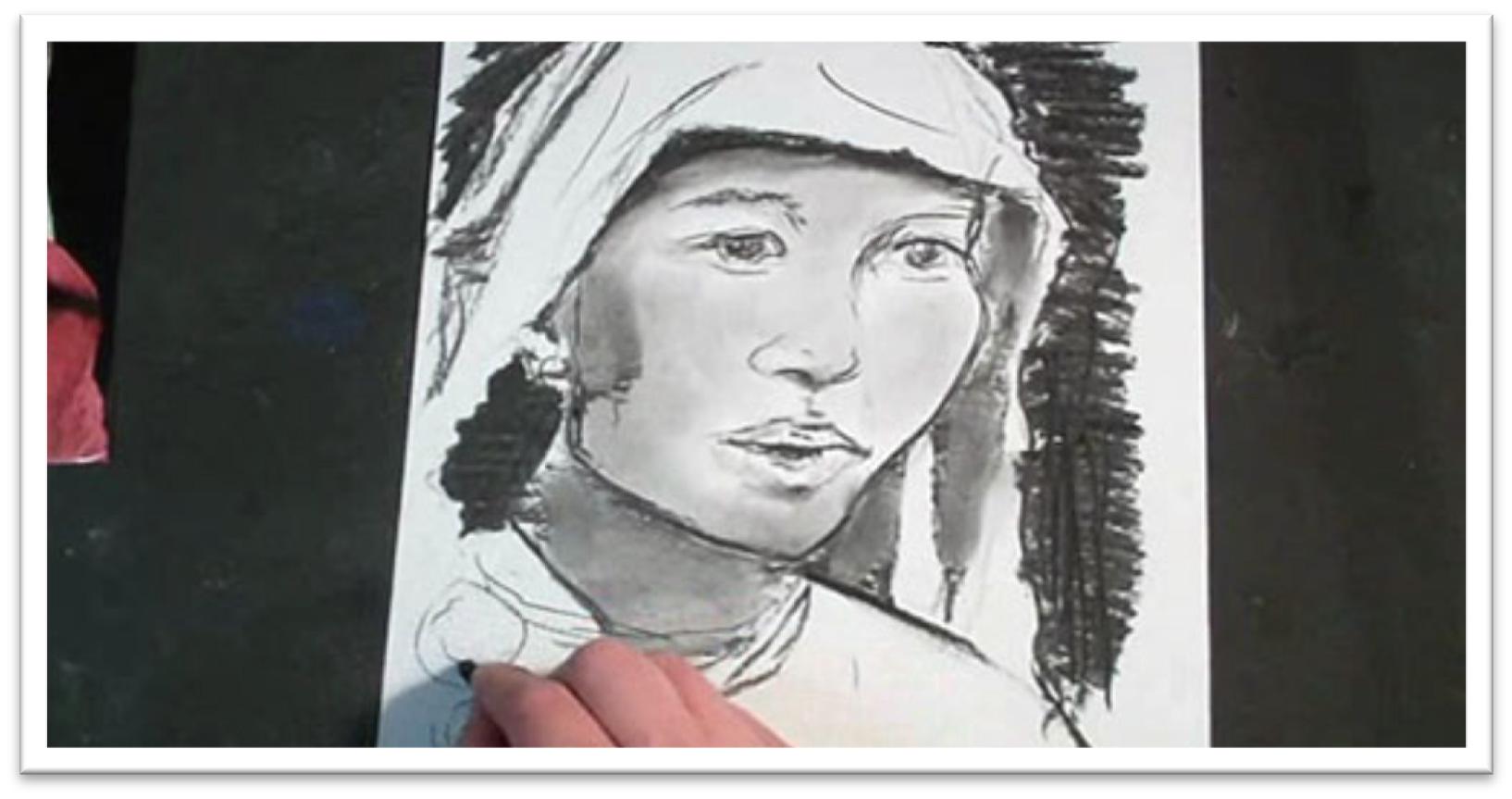
Drawing Family Portraits Dad’s Hair
Start by solidifying the lines that determine the hairstyle shape and the shape of the head.
Indicate the placement of strong shadow or highlight shapes by outlining the shapes using short, broken lines that follow the direction of hair growth.
These lines will serve as a roadmap when you begin adding tone, and they are easier to blend in if they follow the hair growth.
Indent a few white lines to serve as highlights using a stylus or a sharp hard graphite pencil over a piece of tracing paper.
The indented lines will remain white even after heavy tone is laid over the top, so it’s a useful tool for bringing detail into areas of heavy darkness.
Avoid the temptation to scratch out more than a few hairs, however. Less is more.
Use a charcoal pencil to begin building up tone in the hair, always following the growth pattern as accurately as you can.
Concentrate as you work and visualize how the hair is growing. If the hair is short, keep your strokes short. Try to imagine yourself creating the hair with the pencil strokes.
The matte black charcoal is used in the hair to help push the graphite face tones forward, so make sure to use both mediums in your portrait for best effect.
When you come to features that are defined by the hair, such as the ear, cheek, and forehead, draw the line lightly, then build up charcoal right up to the line, working in circles that will hide the outline.
Blend lightly in places with a stomp to fill in the white speckles that always result when you use charcoal.
You’re polishing the tone more than blending it smooth, though. If the hair gets too smooth, it will match the skin too closely.
After blending, use a graphite pencil to develop the shadows on the skull that are cast by hair lifting up off the surface of the head.
These shadows should look like loops, with a light area at the top closest to the hairline.
Use the graphite to draw a few loose flyaway hairs that lift off the outside and inside of the hair style as well, and fine hairs in the hairline.
Break through the hairline with the kneaded eraser and add a few hairs there with a sharp charcoal pencil if needed.
You may also need to connect highlight shapes in the waves by erasing some of the tone there.
Use the kneaded eraser to stroke over the hairs that were indented with the stylus as well, so the white core remains, but the hairs don’t look artificially sharp.
Finally, step back and look at the picture from a distance. Once the hair is in, it often changes the contrasts on the face.
You may need to darken the eyebrows, eyelashes, or other dark areas of the face to keep them from being washed out.
Class 7
Drawing Family Portraits Mom’s Hair
Start laying in the directional strokes with a graphite pencil to begin what’s going on in the hairstyle.
At the end of this stage, you should know where the part is, how far down on the forehead the hair falls the outline of the shape of the hair, and the placement of major shapes in the hair.
When you’re confident that everything makes sense and looks natural, use a stylus or sharp graphite pencil over a piece of tracing paper to indent a few individual strands.
Limit yourself to only placing hairs in areas where it will be difficult to pull them out with the eraser later, and where they’re necessary to explain what’s happening in the hair.
For instance, you may indent a few lines in a curl, in the dark areas where a hair or two crosses the others, or where individual hairs are distinct against clothing or background.
Switch to a charcoal pencil to lay down the tone, always following the direction of the hair growth.
Think of this step as laying in the mass of tone, not individual strokes. Look for the large shadow shapes as you work to help simplify the form, and avoid the shapes of highlight for the most part, breaking through once in a while to show that the hair isn’t smooth, but uneven.
As you lay in tone around the cheek and ear, those shapes will become more defined. Take a step back before you build up the darks very heavily.
You will often find that the hair seems smaller after filling in the tone, so make sure that the outer shape is correct by re-measuring against the photo.
You may also need to make adjustments to the head shape, ear, cheek, or chin.
When tone has been laid over everything, blend lightly to change the base tone to off-white and to fill in some of the texture, but don’t over-smooth the hair.
You want to retain the rough texture so it will contrast with the skin.
Add hairs that are falling down on the forehead and pull out the highlights more cleanly with the kneaded eraser then break up any apparent white stripes with strokes of charcoal or graphite.
Once the hair is in place, you may need to make adjustments to tone on the face.
Use a 2H, which gives a smooth, finished tone without blending.
When you’re satisfied, add some more flyaway hairs around the skin and on the outside of the hair.
Blend again if needed, and pull a few dark strands out with the sharp charcoal pencil to finish.
Class 8
Drawing Family Portraits Kid’s Hair
A little girl’s hair is drawn much the same as an adults, but the hair usually has a finer texture and in this case, it is also lighter in color.
For those reasons, put in the initial strokes that show direction of hair growth with a 2H pencil.
Map out the shadow pattern with short, vertical strokes that are easy to blend
in, and indicate the bangs, cowlicks, curls, and all other features specific to her.
Press in some indented highlights with the stylus, then build up tone with the charcoal pencil, starting at the top of the head in the darkest area.
Don’t press hard; the pencil should actually skip over the surface. Build up tone gradually, following the growth of the hair and starting in the darkest areas first.
Avoid the shapes of highlight for the most part, breaking though the shape only occasionally to keep it from looking too smooth and regular.
In areas right beside the face, lightly draw the line and then use a charcoal pencil to circle strokes right up to the line, hiding it.
Make this line as definite as you can, and the face will pop forward with the contrast.
Children’s faces are much rounder than adults. As you develop tone on the hair, think of shading a balloon; the top and sides of the head are darkest.
Darken tone by going over the same area over and over rather than pressing harder, and even in the early stages of laying in tone you should still follow the direction of the hair growth.
Blend lightly over the main body of the hair with a large tortillon to fill in the charcoal texture a little bit.
Because the child’s hair is smoother than the adult’s, you can smooth it a little more to make it look softer.
Once the tone is blended, go back in with the charcoal pencil and re-darken the darkest areas.
Accent shapes in the hair by alternating between the charcoal pencil and a kneaded eraser, darkening and lightening as needed.
For instance, shade a curl by pulling out a highlight on the most outward point, then break across that highlight with a few charcoal lines.
Follow this same procedure throughout the hair wherever there’s a highlight.
Pull out small highlights in the body of the hair with the kneaded eraser, including a few strands that cross the top in the opposite direction.
Darken one side of these light strands to make them pop forward even more, and add a few final flyaway hairs along the outside of the hair to finish.
Class 9
Drawing Family Portraits Baby’s Hair
The baby’s hair is fine, but in this case it’s also quite dark.
Baby hair is also usually fairly scraggly and messy, so before you begin sketching it, make sure that you want it to look the way it does on the photo.
If you want to make changes, gather references that show the hair the way you want it to be so you have something to look at.
Draw lines that give you a clear roadmap of what’s going on in the hair using 2H graphite.
Indicate the shape of the head, shadow shapes in the hair, highlights, the part line, the largest pieces of hair, any visible curls, and how far down the hair falls on the forehead as well as any other major shapes.
There may be a few places where it would be helpful to have a few indented lines placed with the stylus, so place just enough of them to give the impression of hair.
Fight the temptation to overwork the drawing.
When the roadmap is complete, begin laying in tone with charcoal. Just as with the child, begin very light.
You just want to build up the tone, not draw individual hairs. Concentrate the strokes in the darkest areas, leaving the finest hairs to be put in later with graphite.
Continue filling in the tone, darkening the tips of the hair where they fall on the forehead, and then blend with a large tortillon or stomp.
Work carefully and don’t over-work the blending, which would make it too smooth. Blend just until the hair appears soft and fine.
Pick up a 4B and 2H graphite and go back in to the body of the hair, adding a few individual hairs.
Darken the hair beside the ear to increase contrast and make that ear pop forward, and do the same thing beside the neck, cheeks, and forehead.
Pull out highlights with the kneaded eraser towards the back of the head, in the curls, and going over the lines that were indented with the stylus.
Step back to look at the picture to see where changes need to be made, but hold off making too many adjustments until after the clothing has been placed, because those large dark areas will change the contrasts again anyway.
Class 10
Drawing Family Portraits Clothing
Begin in the uppermost areas and work your way down to avoid smudging the drawing.
Pull out flyaway hairs with a stylus or sharp graphite over tracing paper around all of the heads then begin laying in tone in the clothes.
The dad’s shirt is a large expanse of solid black, so begin with a stick of willow charcoal flattened on one side, which is soft and user friendly, but doesn’t stay very dark.
Establish it as the base tone, blend it smooth with a piece of felt or a stomp, and then go back over it with harder charcoal that will stay darker.
Blend the darker charcoal a second time, experimenting with different blenders until you find the one that works best on your paper.
In the mother’s shirt, the tone is still very dark but there’s more visible tone. Begin with a charcoal pencil, which will leave a dark, textured pattern.
As you work, draw in the seam lines, collar, and wrinkles with 2B graphite and charcoal.
Then go over the top of the charcoal tone with graphite without blending first, which will fill in the tooth but retain the interesting texture that will stand apart from the other clothing.
Use a kneaded eraser to lighten the outer edge of the wrinkles, and blend as needed.
In the baby’s jumper, begin the in black dress laying down dark tone with a charcoal pencil. The jumper is solid black, so fill it in with small circle strokes, making the tone as dark as you can without leaving lines.
Sketch the sparkly design on the bottom lightly with a graphite pencil, then indent small circles with a stylus.
When you go over the design with charcoal, those dots should pop forth and read as gems.
Fill in the tone of the black jumper with a little stomp, then go over it a second time with the charcoal pencil.
For the white shirt, begin by mapping out the shape of the folds with graphite. When the folds are placed, lay in tone with an H pencil, starting in the darkest part of each fold.
Blend the wrinkles with a tortillon, working carefully to retain a clean edge by blending into the shadow side of each wrinkle.
After blending, sharpen the shadow shapes with more tone and pick out details in the seams, collar, ruffles and so on.
Look for areas of reflected light within the darks and blot them out with a kneaded eraser.
In the older child’s shirt begin the same way, re-defining the folds of the shirt with graphite.
Look for letters in the folds such as “M’s,” “S’s” and “W’s,” which will help you to make sense of the folds.
When you’re adding according compression folds, make sure that the lines cross at the right place to correspond with the outer shape.
Add some tone, then blend over the entire form with felt. Blend a second time with a stomp without adding more tone, and the folds will become just slightly darker.
Carefully darken the darkest areas with a 2B graphite, then blend that tone with a stomp.
In the very darkest areas, drop in tone with a charcoal pencil and blend out with a large stomp, then slice through the highlights on each fold with the kneaded eraser.
Blend over the top if needed to keep the contrast in the folds from getting too high. Finish by adding details to the shirt—designs, seams, ruffles, collars, and so on.
Class 11
Advanced Portrait Getting Started
The first step in creating highly realistic pencil portraits is to equip your studio with the necessary materials.
To begin, you’ll need a wide range of graphite pencils, carbon pencils, and charcoal pencils.
In graphite, choose 6 to 10 pencils ranging from 8H (very hard) to 9B (very soft).
In charcoal and carbon pencils choose a range from HB to 6B or so.
Willow charcoal, graphite sticks, and larger sticks of carbon and charcoal will also come in handy.
Blending tools are crucial to producing realistic effects. Buy a wide selection of stomps and tortillon blenders, both large and small.
You should also have several pieces of white felt, different types of paper (notebook, typing, tracing, etc.), and a chamois cloth (available at art stores).
Test your blenders on a spare piece of your drawing paper to see the effects that are obtained with each of the different mediums.
You’ll need a kneaded eraser for certain, and it would be very useful to have a click eraser (like a mechanical pencil, but a solid tube of eraser), and an electric eraser with plenty of spare nibs.
Paper is the other must have, and countless types to choose from. Wood pulp paper will yellow over time, but is usually fairly inexpensive and is just fine for beginning drawings.
When you start creating drawings of a higher caliber, upgrade to a cotton-based paper such as a hot pressed watercolor paper.
Whatever you decide to use, make sure that it has low tooth (texture), and is sturdy enough to hold a lot of medium. Smooth paper works best for portraits.
Other tools that will come in handy include a compass, a ruler or triangle, a sandpaper block and small cup with a lid (for sharpening pencils against and then collecting the excess dust)
… a few paintbrushes for applying graphite dust or for blending, frisket film for masking white areas, tracing paper, and a razor blade or exacto knife.
In this course, expect everything—from the initial drawing to the final shading—to take longer than what you’re used to.
Pencil strokes must be kept clean and deliberate, shading must be worked up gradually and blended out repeatedly to render the most realistic skin tones possible.
When blending, begin in the dark area and slowly make controlled, layered strokes of medium moving with the contour of the object being shaded.
Begin with a soft pencil (4B or so) and when each pass is complete, go over the same area with a slightly harder pencil and increase the line length.
In this way, the shadow is developed from dark to light in gradual increments that don’t rely on blending tools for gradation.
When building up darks, work in small circles moving down the page from top to bottom and left to right.
Each new pass should overlap the last one slightly. When the entire area is covered, tilt the paper and cover the same area at a 45 degree angle difference to the right.
Cover the area again, then tilt the paper the other way and cover the area perpendicularly again.
This is a cross-hatching technique that will deliver even, dark tone. For particularly large areas, you can do the same movement using pieces of charcoal or carbon rather than pencils.
Class 12
Advanced Portrait Layout
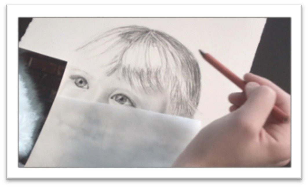
Use a high quality photo reference with clear features and good lighting to work off of.
You should be able to see enough detail to be comfortable increasing the size and the shadows should be gradual, with halftone, shadow, and highlight visible.
Sketch the rough head shape and angle on the page, reserving room for borders around all sides.
Work lightly, with a fairly hard graphite pencil; H or F are good choices. You should be able to see your lines, but also erase them easily.
Mark off guidelines for the nose and eyes.
You may be able to see these more easily by laying a piece of tracing paper over the photo, outlining the head, and drawing two curved lines, one that follows the shape of the head and cuts vertically through the center of the nose and another that defines the line of the eyes.
These lines will help determine the placement of the features on the face, so be accurate.
On your photo, use a piece of scrap paper to mark off the width of an eye. If the eyes are different sizes because the face is turned, use the largest eye.
Everything else on the face can be placed proportionally to the eye. Make specific measurements for your picture, but generally the eyes are one eye’s width apart and half an eye wide.
One eye width measured from the bottom of the eye is the bottom of the nose, and another eye width down from that is the bottom of the mouth. The chin generally falls about half an eye width from the bottom of the mouth.
Once you’ve guessed at the eye width, sketch it lightly on your paper and put the measurement in your compass.
Double check that all of the features fall in the right place on your paper using that width as a guide, and if they don’t, make adjustments.
You’ll either need to modify the size or placement of the eye, or change the outline of the head.
With enough measurements, you should be able to box in the basic shape of each feature before you begin drawing.
There should be guidelines for the width and height of everything, which can be lightly boxed in.
Draw the actual feature within this box, and you shouldn’t be able to go far wrong.
When you’ve drawn all of the features and double-checked them against the photo (several times) to make sure everything is placed where it should be, you can erase all the guidelines.
The only thing that remains before the actual work begins is to save your whites, and this is done with frisket film.
If you’re working small enough, you may be able to get away without masking the white highlight in the eyeball.
It can be scratched out when the drawing is complete using a razor blade, or simply avoided as you work.
However, if the drawing is fairly large, the best method is to sketch the shape of the highlight on your paper, trace it onto a piece of frisket film and apply the frisket to the drawing.
Tamp it down by rubbing over it with another piece of paper, not your finger, which will transfer dirt and oils to your drawing.
Class 13
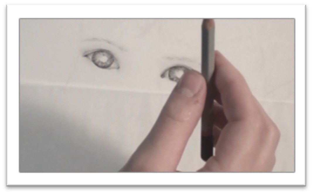
Advanced Portrait Eyes
Before you start darkening and shading the eyes, you should be absolutely certain that the size, shape, tilt, iris placement and pupil placement are correct, as those changes are harder to make the more finished your drawing becomes.
When you’re satisfied, outline the upper lid of the eye with a sharp charcoal pencil.
Use short, controlled strokes to make the line as smooth as possible; don’t try to cover the entire stretch of upper lid in one stroke.
Add some shading to the fleshy crease of the upper lid. Use a fairly light graphite pencil for this, such as H or F hardness.
Shade with short strokes that are close together and even, disguising your pencil strokes as much as you can.
When the graphite is on the lid, blend it out with a tortillon (use as large as size for the area as you can), or a chamois cloth stretched over your finger.
Use a mid-range graphite pencil to develop the eyebrows. It’s helpful to begin with the lower most lines, then do the uppermost hairs, and fill in as a last step.
That way your hairs stay inside the bounds that you determine and don’t become too random and hairy looking.
When the body of the eyebrow is in place, you can use a softer graphite pencil (2B or so) and darken a few hairs as needed.
Ouline the iris, (colored part of the eye) with a sharp charcoal pencil. Avoiding the pupil, work with a very sharp 9B graphite pencil to lay in a series of lines in the iris that radiate out from the pupil and cover the entire area like spokes on a wheel.
They should be uneven in length—examine your eye in a mirror for good reference on the eye.
Blend the lines a little with a stomp, leaving some white in the eye as well, then re-darken lines as needed until the eye is the tone that you want.
Shade the skin around the eye using a mid-range graphite pencil.
Start in the darkest areas and work your way out, keeping the lines as close and even as you can.
In the very dark places, such as beside the nose on one side, start with a 2B
graphite pencil and then gradually trade out for harder pencils the closer you get to the highlight side.
When the skin tone is on the paper, smooth it just as you did the upper lid, with either a chamois or a large tortillon.
Use the motion that works best to hide the pencil strokes and deliver a smooth, evenly shaded surface.
That may be wiping the blending tool across the page in the same direction as the curvature of the face, or it may be working in small circles.
Next, sharpen a charcoal pencil to a very fine tip and lay in the eyelashes. Work from the bottom of the hair and pull up to form each lash, re-sharpening your pencil every few hairs to keep them very clear.
The eyelashes shouldn’t be placed until the shading on the eye is complete, to ensure that they don’t get smudged.
There are upper and lower lashes, but the lower lashes are generally shorter and finer, so you may want to use a harder pencil that will show up as lighter for them.
End by darkening the pupil and pulling out a few highlights in the corners of the eye and/or across the iris.
The largest highlight may have been protected by frisket. If that’s the case, leave it on until the drawing is completely finished.
Class 14
Advanced Portrait Nose
The nose can be tricky to shade because it has no definite lines, and yet has many shapes that need to be made distinct if it’s to look three-dimensional
Begin by slowly laying in the general areas of shadow using a fairly hard graphite pencil such as H or F.
I begin on the lighter side of the face and work my way over to the shadow because
I’m so used to working left to right; you may wish to begin in the shadow side and that’s fine too.
Place your pencil at the edge of the nostril at each new stroke and move outward, so the darkest part of the pencil stroke is also helping to define the line of the nostril as you shade.
Put a mid tone of graphite all over the nose and up the bride on the shadow side, avoiding the highlight on the tip of the nose.
Blend the initial layer of graphite using a tortillon or piece of chamois cloth stretched over your finger.
Blend in small, directional strokes in the nose, helping to emphasize the contours by blending with them.
Because blending picks up the medium and lightens it, you need to re-emphasize the darkest areas after each round of blending.
You’ll find that the tip of the nose is like a ball resting on the nostrils, and as such as darks underneath and on the side.
In most lighting circumstances, one side of the nose is much darker than the other, and the tip of the nose may even cast a shadow onto the cheek.
Darken those places with a 2B graphite pencil or even softer; it’s always better to upgrade to a softer pencil and continue to lay down light strokes than it is to press harder with a mid- range or light pencil, because doing so will almost certainly result in visible lines.
After each new addition of graphite, blend carefully with the chamois or tortillon.
When the skin tone of the nose is finished, darken the nostrils with a very soft graphite or charcoal pencil, and pay attention to the tones dictated by the reference photo.
One nostril may be lighter than the other if the head is tilted.
If that is the case, it’s easy to lighten the too-dark nostril either by blending out the tone with a tortillon or blotting it with the kneaded eraser.
Finally, look over the nose carefully and make sure that your areas of reflected light in the shadows are distinct from the halftone and the shadow areas.
You may need to blot them with the kneaded eraser to make them lighter, or add more medium over the top to darken them.
An HB charcoal pencil can be used over the top of graphite to darken the shadow edge of the nostril, the dark side of the bridge, and other places that may need it.
Class 15
Advanced Portrait Lips
Before you begin shading the lips, make any necessary changes to the shape by adjusting lines with a 3H pencil.
You want the lines to be very light, especially in the bright side of the face but you need to have a distinct edge so it’s clear where the lip begins.
Lay an even layer of light tone over the surface of the lips with a fairly hard pencil such as an H.
Follow the curvature of the lips as you work, and use vertical strokes on the top lip, then the bottom lip
Don’t scribble over the entire area or change direction. When the tone is on the lips, soften and blend with a chamois or tortillon.
Next, begin to darken the line between the lips with a very sharp 2B charcoal pencil. The corners of the mouth are also dark.
Soften the line with a tortillon, then begin adding darker areas of tone on the lips by building up what’s already there with another layer of H or F graphite.
The upper lip is usually darker than the lower, and the lips are both darker the closer they get to the opening of the mouth (the bottom half of the upper lip and the upper half of the lower lip). Blend the tone again.
Begin picking out some highlights and lines in the lips by using your kneaded eraser squashed to a fine point.
There are usually strong highlights in the center of the lower lip if it’s visible, and fine vertical lines cross both lips. These are similar to the spokes in the iris, but lighter.
Emphasize a few of the pucker lines in both lips by darkening one side of the highlight lines with a sharp graphite pencil.
Blend carefully with a tortillon, avoiding the highlights if you can so that you don’t have to pick them out again.
Shade the skin around the lips to show the curvature of the face.
There are subtle lines that extend from the outside of the nostrils down to the corners of the mouth but work very lightly or you may over- emphasize them.
Shade with an H pencil to begin (or harder in the bright skin tones), and lay in smooth tones by using long strokes that follow the curve of the face.
When the first layer is down, go over the strokes again in a perpendicular direction to disguise the lines.
You may even go over a third or fourth time, depending on how dark you want the tone to be. Blend with a chamois to finish.
Class 16
Advanced Tutorial Chin and Cheeks
Depicting skin tone in graphite is one of the most important—and difficult— tasks to accomplish in rendering a realistic portrait.
The method is nothing new, but because the skin covers such a large area, blending a smooth tone becomes more and more difficult.
There are two ways to work. One way is to begin with your 2B in the darkest shadows of the skin and gradually change your pencils for harder and harder leads as you extend toward the light areas.
I prefer to map out the shapes of the darks on the face by lightly sketching them with a 6H pencil, then filling in that tone with a 2H graphite pencil.
When the first layer of pencil is down, smooth the face by gently wiping over it with a chamois cloth.
Then turn the paper at an angle to the right or left and lay down a second layer of tone, this time in the darker areas of the face.
Think of the first 2H layer as the baseline for the halftone (the skin facing the light that isn’t the highlight).
The second layer, placed with a slightly softer graphite pencil, begins to define the areas of reflected light in the shadows. Blend again.
Turn the paper at an angle the other way and build up the darker areas in the shadow side of the face using an even softer graphite pencil.
There are three basic steps (lay down halftone, lay down reflected light in the shadow, lay down shadow), but that doesn’t mean that you’ll be able to complete each step in one pass.
You may have to do each step with several layers of graphite, blending between each one.
You may finish the darkest areas and find that there’s not enough contrast between them and the halftone and need to build it up farther.
If you need more dark tones at the end and don’t want to lighten the graphite by blending, you can dip a soft, dry paintbrush in powdered graphite and paint it on the surface.
Apply it in the same motion you use for blending; follow the contours of
the face, don’t circle in the large areas.
To blend, just continually paint over the surface again and again—you don’t need to use the chamois in addition. For best results, use the largest brush you can for the area.
The great point is that you build up your tones GRADUALLY. Your eye will see more contrast on the photo than is realistic, because the camera flattens the surfaces and emphasizes contrast with flash.
The tones almost become saturated on a photo. So, while you use a photo for reference, don’t stick to it as the end all of making realistic portraits.
Draw the way the naked eye sees, not the way the camera sees.
Another tip: as you work, keep your hand anchored on the paper that you’re using to protect the drawing.
You’ll have better control over the strokes and will be able to produce a more even skin tone and cleaner lines.
Class 17
Advanced Portraits Ears
The ear is really a continuation of the skin tone, so many of the same techniques will be utilized.
There is often a transition in tone from the cheek to the ear, since the ear rests on one side of the face so you want to show that without making a stark line of change.
Begin by laying in an even skin tone over the entire surface of the ear.
If the ear is on the shadow side of the face, even the lightest tones will be darker than the highlights, so everything needs to be covered.
Blend this tone with a large tortillon or stomp, moving with the small curves of the helix.
Darken the interior curves of the ear with a 2B pencil. There is a very dark area in the opening of the ear going down to the ear drum, so this may need to be pushed even darker with a charcoal pencil.
Don’t start there, though—build it up slowly so that the feature develops as one working piece.
Developing the feature this way, it’s easier to make adjustments as you need them instead of laying down tone that is too dark and then having to either lighten it later or darken everything else to make it look right in the context of the whole.
Blend out the darkest areas by working in small circles with a harder graphite, such as an F or B pencil.
Layering harder leads over the soft ones will fill in the tooth of the paper and develop a transition naturally, which means you get a gradual look without lifting any tone as you do when you rub over it with a blending tool.
Keep a careful eye out for areas of reflected light and individual characteristics of the ear you’re drawing.
There is often reflected light in the flat interior area of the ear, on the bottom edge of the lobe, and on the outermost edge.
Use a 2H or harder pencil to better define the outline of the ear against the white of the paper, then blend it into the drawing with a stomp.
You want a distinct edge, but not an outline so always blend your lines into the drawing.
Take a step back from your work and examine the ear in the context of the whole.
If the shadow side of the face seems too light beside the ear, you can darken it either by laying in more pencil tone in the cross-hatching technique, or by painting graphite dust on with a soft paintbrush.
Use a larger brush for smoother tone, and blend it both by brushing over the surface several times with the brush and by smoothing over it with a chamois cloth.
Class 18
Advanced Portraits Neck
The neck is a continuation in style and technique from the skin tone, except for the cylindrical shape and the prominence of underlying bones and tendons.
Because the chin juts out in front of the neck, there is often a cast shadow beneath it along with reflected light.
Pay close attention to your reference to get the subtle shading that indicate the Adam’s apple, collar bone, and the muscles on either side correct.
Begin by laying an even tone over all but the lightest areas of the neck, using a 2H pencil.
As you work, sketch guidelines for yourself that show the shapes of the darkest shadow and highlights. Crosshatch in the dark areas with the 2H and blend with a chamois.
Use a softer pencil such as a B to begin laying in the darks over the first tone. Work in smooth strokes, starting in the darkest areas and moving outward following the curvature of the neck.
Develop these tones up gradually. Your goal is not to make the darks match the darks in the photograph, but to stay consistent within the context of your drawing.
In other words, the dark tones in the neck should only be as dark as the face tones.
To keep from making the neck too dark, you should constantly be stepping back as you work to take in the drawing as a whole.
Blend the B layer, and if needed, crosshatch over the darker areas to build them up. If there are lines in the skin of the neck, pick them out with a kneaded eraser pressed flat, then emphasize with a 2H pencil.
If you can see a shirt collar in te picture, the clothing will cast a shadow on the skin of the neck.
To make the transition from neck to cloth sharp without outlining, use a dark pencil on the skin tone and work in small circles next to the clothing to build up a shadow area.
There should be enough graphite on the page that even after blending it will still read as shadow.
On the shirt itself, pick out a highlight with the kneaded eraser right where the shadow ends and the shirt begins.
Make the highlight as clean as possible. The abrupt transition will make that shirt pop forward and the shadow lay flat on the skin.
Finish by blending the neck tones with a flat brush. The bristles can be synthetic or natural as long as they’re soft enough that they won’t damage the surface or put down a texture.
You should have a selection of sizes and types of brushes on hand for blending different areas of your drawings.
Always work with the biggest brush possible for the area to make the smoothest tones possible.
Class 19
Advanced Portraits Hair
Develop the shape of the hairstyle with directional strokes of an F graphite pencil.
You want to map out the areas of light and dark and get a feeling for how the hair falls on the head.
The darkest parts of the hair are usually at the top of the head and near the neck, but consult your reference photo carefully.
Use short, vertical strokes at the boundaries of the dark shapes so that they can be blended in to the rest of the hair easily as you work.
Sharpen a 2B charcoal pencil and, starting in the darkest parts, lay down lines of hair. Fluctuate the pressure to get lines of varying thickness, and use the pencil on the side to build up the solid dark areas more quickly.
Avoid the areas that you’ve marked off as highlights for the most part, stroking through them only occasionally with charcoal lines.
When the charcoal is in place, blend over the body of the hair with a soft paintbrush such as squirrel hair to gently smooth without lifting too much of the texture.
Do not use a cloth or tortillon, as these will take out the texture and make your hair look too much like the skin tones.
Go over the highlight areas with a sharp F or 2H graphite pencil. Whenever you can, start from the top of the head and draw the hair down in its natural growth pattern.
You don’t want hairs growing every which way.
At the same time, though, watch that you don’t make hair that is too regular and even.
There are always some loose strands, some flyaway hairs, and some strands curving in a different direction than the others. Keep this in mind as you work.
Don’t be afraid of contrast, even in the light places.
The highlight isn’t a perfect semicircle of white sitting on the head, because the hair isn’t smooth like a balloon.
There will be light and dark strands breaking into the highlight where the light bounces off the surface irregularly.
Brush over the hair again after the highlights have been placed, then use the click eraser or electric eraser to take out a strand or to in the dark areas.
These may cross the hair in the other direction, or fly out to the side—do something to lift up a few hairs and make the entire area more realistic.
There are also flyaway hairs around the outside of the head, which you can place using a hard, sharp graphite pencil. Use broken lines so that the hairs appear to be struck with light.
Class 20
Advanced Portraits Clothing
As you develop the clothing, keep in mind that in order to create the impression of cloth, you’ll have to use a different rendering technique on it than you did in the skin or hair, or it won’t read as a new texture.
Begin by laying in a light tone in graphite that will help you to see the shadows and folds in the cloth.
When all but the most light-struck areas are covered, blend a little over the top to establish a smooth base tone.
Once the base is established, you’ll keep the texture rough by working with fast pencil strokes that follow the line of the fabric and avoiding blending as much as you can.
Examine the reference closely to get a sense of where to place the darks, halftones, and highlights in the cloth.
The part of the fold that is pushed under will probably have a strong core of shadow surrounded by reflected light areas. These should be kept darker than the halftone of the upper lips of the fold, but lighter than the shadow core.
Put in the darkest area with a 2B, working out toward the light with smooth, gradual strokes.
Follow the curve of the fold as you work so that the fabric remains consistent.
If there are buttons or other perfectly round shapes, use a template to sketch them in place.
Templates also come in handy in drawing precise patterns on clothes, so invest in a set of circles, ovals, squares, and angles to start.
They can be purchased at any art or hobby store. Keep the template over the shape as you fill it in, and you won’t have to worry about leaving directional strokes in the tone.
If you’re drawing knit fabric as in the example, you can start to develop the details of the cords by erasing lines carefully with the kneaded eraser (making sure to follow the curve of wrinkles as you come to them), and by then emphasizing the white line with pencil line on one side of it.
Take your time and be finicky with yourself—you’ve already invested hours into the rest of the portrait, so the clothes need to be just as carefully done.
Lighten up areas by blotting and gently rubbing with the kneaded eraser, and continually step back as you work to see how the fabric looks from the normal viewing range of three to five feet.
When you need to depict lines but don’t want to outline, give the impression by darkening one side of the “line” and lightening the other. The cleaner the edge is, the better.
End with the smallest details. If you can see holes in the knit fabric, add a few to your drawing here and there.
Pick out a highlight on the button, make a few fuzzy lines stand out from the sweater. The trick is not to over-do it.
Less is always more, but having those little details correct can really pull the portrait together and give it a professional, polished look.
Remove the frisket film from the highlights in the eyes. Oftentimes, the highlight needs to be made smaller, so use a sharp charcoal pencil and touch it up.
When everything looks right, you can spray the drawing with fixative to keep it from smudging.
Class 21
Sketching a Cropped Portrait
In these additional ten classes on portrait mastery, focus will shift to techniques for creating mood in portraits using framing (how much of the face you draw), the lighting, and the pose and expression of the face.
A lot can be communicated simply by where the eyes are looking.
The power behind portraits is that they emphasize the thoughts and feelings of a fellow human being, so put some thought into the mood that you want to convey.
Begin the sketch with a tonal study.
This step will not only give you a chance to familiarize yourself with the features and shadow shapes on the of the face, it will also help you to see the overall effect of the framing, contrasts, and angle of the face.
Start with the head. Make sure that the angle and size is correct, then use light, sketchy lines to place the guidelines for the eyes and nose.
Draw the eyes, nose, and whatever you can see of the mouth, then use some scribbly lines to roughly indicate where the hair is going to fall.
Use a graphite stick to begin darkening the darker lines and adding the shadow shapes that fall on the face and hair.
The tonal study should be loose and messy, but clear enough that it will be a help in making the finished piece.
As you work, consider how you want to approach a finished drawing.
Lay in the hair with a different texture, such as what is created by using the graphite stick on the side, so that the hair will remain distinct from the face.
Blend the skin tones a little with your finger if you want, then go over the top with the most important lines in and shadows that are needed in making his expression.
When you’re confident that the face is finished enough that you have a clear guide for the finished drawing, put the tonal study off to the side and begin work on the final portrait.

Class 22
Drawing on Tinted Watercolor Paper
You can draw on watercolor paper or tinted watercolor to change the look of a portrait.
Simply paint a wash of fairly light color on a piece of watercolor paper (make sure to fasten it to a firm support if it’s not gummed to a watercolor block to keep the paper flat), then let it dry completely.
Begin the drawing in the same way as the tonal study, starting with the angle and size of the overall head, then adding the guidelines and developing the features.
Once you’re confident that the lines are correct, clean up the sketchy marks and give yourself crisp, clean lines to work from.
Darken lines that are in the shadow side of the face and start laying in some tone in the eye.
Develop the shadow shapes in the face using smooth, horizonal lines that follow the curvature of the plains.
When the shadow shapes are filled in, blend them with a large chamois cloth or tissue wrapped around your finger.
This will lighten the tone drastically, so you will need to make a second pass of tone in the darkest places.
When you add the second layer of tone in the darkest shadows on the face, blend the tone out smoothly with a tortillon or stomp, which is better for small areas that need to be precise.
Blend in the same way that you put the tone down initially: directional to the contours.
Emphasize lines not only by darkening some, but by erasing some. Because the areas without tone are the lightest areas on the page, they will read as highlights even though they aren’t white.
When the tone on the face is done, pull out a few hairs flying away over the face using the kneaded eraser as a blade.
You can emphasize these lines by darkening one side of the highlight with a sharp pencil.
For the body of the hair, put down some tone by following the direction of the growth of the hair, then smoothing that tone with a tissue. Pull out a few highlight strands with the kneaded eraser, then emphasize small areas with graphite.
Don’t drive yourself crazy: you don’t need to add every hair. You only need enough so that the entire mass will read as hair, and that takes surprisingly little detail.
To make sure you aren’t over-working your portrait, continually step away from the drawing as you work to make sure the detail is adding realism without overwhelming the piece.

Class 23
Sketching an Outward-looking Portrait
In the second portrait, we’re going to work on the portrait of a child looking at something the viewer can’t see, so the mood shift in the simple change of where the child is looking will be apparent.
In the last class, the old man was looking down, pondering something inward, and the simple fact of looking at him in this private moment felt just a bit intrusive.
By shifting the focus of the person outward, the point of view changes, and with it, the relationship between the person in the portrait and the viewer.
So begin the portrait with a tonal study again, working in the medium of your choice. I’m using willow charcoal in this study, but graphite works just as well.
Quickly sketch the head within the confines of a guideline for the angle and size that you want the head to be at, then place the guidelines for the features.
Remember, the relationship between the features never changes; they just appear to change as the head moves.
No matter where the ear is, the top of the eye should line up with the top of the ear, and so on. When the guidlines are correct, sketch the eyes, nose adn mouth.
Erase the guidelines and clarify the hairline. Already, you can see how the expression and direction of sight modifies the mood of the portrait.
Add a base tone to the skin by loosely filling in a small area on the cheek with willow charcoal, then blend the tone with your finger to wipe it evenly over the surface of the skin.
This will wipe out most of the line quality, so you’ll probably need to go back over the lines of the features to better clarify them.
Add tone to the hair, keeping it distinct from the skin tone by making it darker and/or keeping it a different texture than the skin.
You can begin to add a few lines to show that the hair is curly and to give yourself a map of the hair growth.
If the lighting is dramatic, there will be clear shadow shapes on the face and clothing that can be laid in over the base skin tone.
Even if the lighting is subtle, you can still pick out the shapes and lay them in; just make the contrast between the base tone and the shadow tones less distinct.
Re-darken the darkest places on the face, hair, and clothing, and the tonal study is complete.
Class 24
Drawing a Finished Outward-looking Portrait
This portrait will be drawn on charcoal paper.
Begin by sketching the angle and size of the head, then begin to carve out the profile to show the nose and mouth more carefully.
The interior guidelines should match up with the outer face, so draw guidelines for the eye, ear, bottom of the nose and the mouth. Fill in the shapes of the features and erase the guidelines.
Clean up the lines of the features, remembering that you’re not trying to emphasize lines, but only show the outer shape of the features.
When the features are correct, use a darker pencil to darken up the eye, nostril, and the line between the lips.
This will give you a little clearer idea of how the face will look when the tone has been added, but it’s not so dark that you can’t make adjustments if needed.
Begin adding a base tone with a medium softness pencil on the side, working wiht smooth back and forth strokes working from top to bottom.
In the shadow shapes, you can press a little harder to make the tone darker. When the face and hair is covered, blend the tone smooth with a tissue. If you got tone in the white or highlight of the eye, erase it out.
Use a tortillon to darken the pupil and iris in the eye. Keep the tone uneven to help give the eye depth, darken the upper line of the lid, the eyelashes, and then add tone to the corners of the white of the eye with the tortillon.
When the eye is done, add detail to the nose in the same pattern: darks first, shadow shapes, blend, take out highlights, and work up the entire feature as one piece.
If you want to darken further, use a charcoal pencil. If the skin tone isn’t dark enough, you can add tone with a charcoal stick.
Create charcoal dust by scraping the stick over a piece of sandpaper, dip your cloth in it, and add a smooth layer anywhere on the portrait that you want to darken.
After darkening the skin tone, you may need to go back over the features to bring them out again.
Use a charcoal pencil to add details to the lips, eyes, and creases in the neck. Then blend the tone in the hair using a chamois cloth, wiping the tone smooth in the direction of the hair growth.
When the hair is smooth, pick out highlights with a kneaded eraser and add flyaway hairs over the forehead and on the outside of the hair.
Don’t add too many hairs; you just need a small detail here and there to bring the realism up to the next level.
Add some seam lines to the shirt, then look for the shapes of the shadows on the cloth and add them with a chamois cloth or tissue dipped in charcoal dust.
You may not want to push the clothing very far. When you feel that the portrait is complete, take a step back and see how it looks from different distances.
You may want to come back in a few days and add any final details or make adjustments at that time.

Class 25
Sketching an Adult Looking off the Picture Plane
In this portrait, we’ll couple a face looking off in the distance with more dramatic lighting to see how those elements combined impact the mood of the portrait.
Sketch the tonal study with a piece of willow charcoal, using quick, sketchy lines to establish first how big you want the face to be in the picture plane and at what angle the face is at.
In this portrait, the face is at a slight tilt, so the regular measurements made in terms of eye length won’t work.
In cases like that, you might be farther ahead to eyeball the eye placement, then place the remaining features accordingly.
The rules of proportion in the face still apply, they just can’t be determined as easily in a face- forward view.
When the features are correctly placed, clean up the guidelines and concentrate on the shapes of the shadows.
Remmeber, this is a study in how lighting creates mood, so the shadow shapes are very important.
The edge of her face is defined by a black shadow on the cloth of the headpiece, and the shadows on the face are sharp and dramatic as well.
Lay the shadows on the face as large pieces, then smooth with your finger or tissue to soften the edges.
After blending, you will need to go back over the lines of the face to bring them out again.
When the face is done, add the dark background to get a better sense of how that will affect the portrait.
Give yourself plenty of time to get things the way you want them to be.
Experiment with patterns in the headpiece and dress to develop some interesting contrasts to the smooth dark background, go over lines that aren’t clear enough, clean up shadow lines, and so on.
When the tonal study is complete, you’re ready to move on to the final piece.
Class 26
Drawing a Portrait with Dramatic lighting
In the finished portrait, we’ll work on tinted charcoal paper.
The surface is more toothy than regular drawing paper, and is appropriate for graphite or charcoal, but try to keep erasing to a minimum to avoid wearing that texture down.
Sketch the face on the paper just as you did in the tonal study, giving yourself little
marks for where you want the shapes to end, and then connecting the lines between those marks to develop first the big shapes, and then the smaller interior shapes.
Give yourself guidelines and sketch the features in place, then erase the guidelines carefully, and sketch in the shapes of the shadows.
Once the facial features are accurately placed, you can start adding the tone.
In this portrait, we’ll change techniques to develop a portrait of cross-hatched tone that maintain a clear line quality rather than blending the tone smooth.
Start by darkening the outer lines of the darkest, most definite features, such as the eye and nose.
When the lines are correct, build up tone by hatching parallel lines in the shadow shapes, then cross-hatching to darken the tone.
Start with a hard to medium hardness charcoal pencil to develop a base tone over the entire face, then upgrade to a softer pencil for the darkest places.
This will give you a nice range of tones and allow you to build up depth. The lines don’t have to follow the contours of the face in this technique, but the hatched lines should follow a consistent angle from one part of the portrait to the next.
Make sure you’re not over-outlining the features; the eye will fill in detail if you just give an indication.
As you build up the tone, you may decide to blend some of the darkest areas to more quickly develop a shadow side of the face, but then you’ll go back over that with more line quality.
When the skin tones are established, use the same technique to lay in the shadows on the hair and head dress.
In this case, the dark shadow of the cloth helps to define the side of the face as well, so the whole portrait flows together.
Use a charcoal stick on the side to quickly build up the tones in the extremely dark background, still using a hatching and cross-hatching technique.
Remember, once you introduce the charcoal stick in the background, you need to bring it into the darkest areas on the face as well, so the new medium doesn’t stick out.
You want the portrait to have unity without.
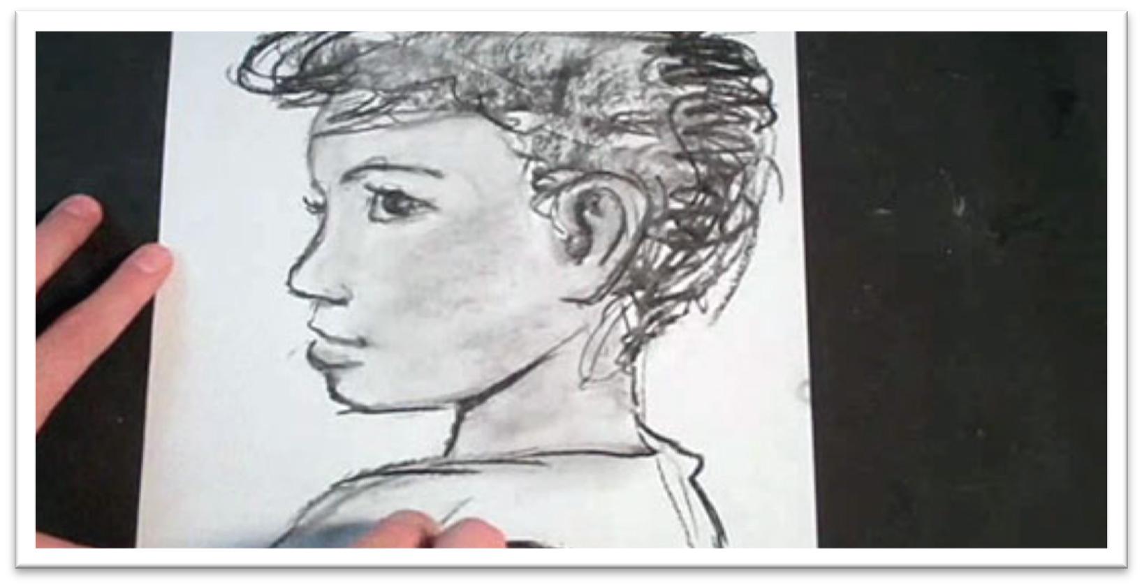
Class 27
Sketching a Straight-forward Stare
We’ve looked at the mood portrayed by people looking down and off to the side, now we’re going to draw face-front expressions in which the person makes direct eye contact with the viewer.
In this class we’ll draw a child, and in the last class we’ll do a similar portrait of an adult.
Begin the tonal study with the face on the page.
Make guidelines for the eyes on a line that is the vertical center of the head. To make sure the eyes are the same width and are one eye-length apart, use a piece of scratch paper to act as a ruler.
Place the other features in terms of the eye length. The eyes are usually half an eye-length wide, and the nose is one eye-length down from the bottom of the eye.
The mouth begins half an eye-length below the bottom of the nose, and the chin is about half an eye’s length from the bottom of the mouth.
Sketch the shapes of the features within those guidelines for the general placement, then erase the guidelines and clean up the lines of the features as needed.
Put down the shadows on the face with dramatic tone using a willow charcoal, seeing the shadows as large pieces that connect.
When the shadows are placed, blend them with your finger to soften and unify the tone to make it read as a flat shadow instead of a dark mask.
You want the patterns of the shadows to be distinct without seeming outlined and artificial.
Don’t do too much finicky detail work on the tonal study, but give enough that you give yourself an accurate representation of what the finished portrait might look like.
Take the opportunity of the tonal study to examine which small changes alter the overall expression, the strengths and weaknesses of the composition, and how best to go about completing a finished portrait.
Think about which surface will be best for the approach you want to take, and try to see how the portrait would look on some of the surfaces we’ve experimented so far: toned watercolor paper, white or off-white drawing paper, tinted charcoal paper, pastel paper, or something else.
Class 28
Drawing a Straight-forward Stare
The finished portrait will be drawn on tinted matboard, which is a wonderful drawing surface for its wide variety of color and texture options, availability, and smooth, heavy weight.
However, make sure to choose an acid free board that won’t yellow with time if you want the work to last.
Begin the sketch with a 2H pencil, starting with the head shape, then placeing the guidelines.
In a straight-forward looking pose, the eyes are in the horizontal center and the nose falls on the vertical center, and everything can be placed (roughly) in terms of the eye length.
Give yourself boundary lines for the width and length of each feature, then sketch them inside the confines that you’ve established.
Clean up the lines of the features, giving yourself just one line to work from as an outline.
Erase the guidelines as you go, working gently so as not to tear the somewhat delicate top layer of matboard.
As you work, concentrate on making your lines interesting by varying the thickness.
You can begin defining the shadow shape on the face early, since it it so pronounced and will alter the appearance of the features.
Work from one feature to the next, gradually darkening lines and blendind to build up the realism of all of them at the same rate rather than finishing one feature completely and then moving on to the next.
When the line work is finished, start using smooth back and forth strokes to push the shadow shape farther, then blend with a chamois.
Once the chamois has some tone on it, you can use that to build up the light tone in the highlight side of the face.
Use a graphite stick on the edge to start building up the tone in the hair. Because it naturally skips over the surface, each line will have in it the broken appearance of highlights and lowlights of real hair.
Press harder in the shadows, then include the hair in the blending step.
After blending, darken the lines and shadows a second time, concentrating only on areas that need to be punched up to another level.
After the second pass of tone has been put down, use a medium to large stomp to blend the tone.
The stomp will leave a lot more tone on the paper and allow you to keep the tone darker, but it is best used in smaller areas.
Use a kneaded eraser to pull out small details in the eyelid, bottom of the nose, and mouth. These highlights help define the form and add a highter level of realism to the portrait.
Add additional realism to the hair by pulling out small flyaway hairs that cross the body of the hair and brush across the forehead.
Stand back and examine the portrait to see its effect from different distances.
The mood created by the defiant, straight-forward eyes of the little girl is certainly different than that of eyes looking at something other than the viewer.
Consider how the portrait makes you feel and what questions it brings to mind. Ask yourself if this is how you want your viewers to feel when looking at your work, and if you want, try changing the portrait by switching the direction of the eyes.
Class 29
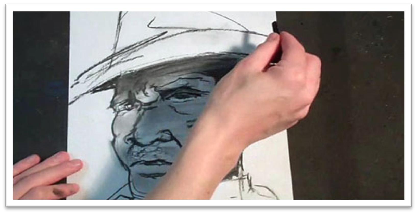
Sketching a Man’s Straight-Forward Stare
The last portrait combines all of the elements of making a highly dramatic mood in a portrait: a straight-forward, defiant stare that locks eyes with the viewer, a face that fills the picture plane, and intense lighting with strong shadow shapes on the face.
Begin with a few rough strokes on a piece of scratch paper that quickly define the shape and size of the head and hat.
You want the angle of the face to be correct above all. Clean up the outer line of the face to help to place the interior shapes of the features, then give yourself parallel guidelines for the eyes and nose.
When the guidelines are in place you can start placing the features.
Because the head is at a tilt again in this picture, you won’t be able to depend on the usual head-forward dimensions measured in terms of the eye length, so eyeball the shapes and refer to references continually to double-check yourself.
Wipe away unwanted lines (if you’re using willow charcoal, this might mean no more than a touch of a finger) and define the shadow shapes.
When you blend these, you can also build up the base skin tone, which is dark in this case.
After blending, you may need to bring out the facial features again, strenthen lines of the shadow shapes, and blend the darkest tone smooth a second time.
Make enough adjustments to the tonal study that you feel you have a clear guide to work off of for the portrait, and then move on to the final piece.
You don’t want to spend too much time on the tonal study, or you’ll begin to lose momentum for the project and you’ll be discouraged from always doing a tonal study before begining a final piece in the future.
Just use the time to familiarize yourself with the most important elements of the picture and do some troubleshooting; it doesn’t really matter what it looks like as long as it does its job in that respect.
The finished portrait will be drawn on tinted matboard, which is a wonderful drawing surface for its wide variety of color and contrast.
Class 30
Drawing a Man’s Straight-Forward Stare
For the finished drawing, we’ll be working on pastel paper.
The tooth of pastel paper is similar to charcoal paper, but sketching a solid graphite layer on pastel will look more round, and on charcoal paper the texture is more like mesh.
Use a 2H pencil to quickly get the head, hat, and guidelines for the features in
place.
When everything looks correct, darken the lines with a HB pencil so you can see everything a little better.
The next step is to lay down a foundation base tone of darker tone using a medium charcoal pencil on the side.
When the face is covered, blend the tone smooth with a chamois, then emphasize the shadow shapes with a charcoal pencil at the same time.
Once the base tone and the shadow shapes are in place, you can do more work on the individual features.
Start work in the eyes, darkening the upper lid, the shadows around the upper lines, the pupils, and so on. Even if the detail is unclear in the reference, add it in your drawing.
Add additional tone where needed and re-darken the darkest shadow shapes. The texture of the paper lends a a sort of gritty quality which is especially fitting to this particular portrait.
However, because the tooth is so prominent, you’ll need to do some blending to be able to pick out highlights. For the initial blending, your finger will work well. It won’t fill in all the tooth, but will soften the skin tone.
For the areas that you want to build up as very dark, use a stomp to fill in the tone completely. Use the stomp sparingly, or you’ll fill in all the tooth and the drawing will look flat.
After the tone is blended, you can squash the kneaded eraser into a blade and pull out some individual lines in the hairs and small highlights.
After pulling out a highlight, you may want to use a sharp charcoal pencil to emphasize one side of the highlight. This technique works especially well on individual hairs.
The final result is an intense portrait. The framing, lighting, and defiant, face-forward expression combine to create a definite mood that we haven’t seen in our classes before now.
In your own studio, play with using the same model under different lighting and casting his or her eyes a different direction to really get a feel for how the simple changes transform the mood of a portrait.
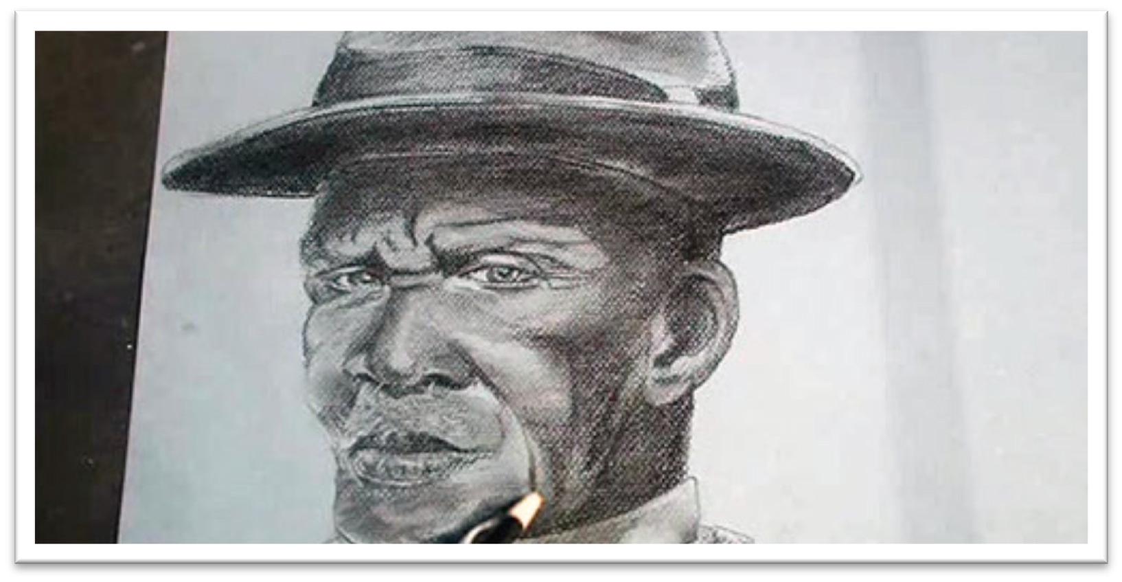
 If you wish to download the files to your desktop, simply right click the link below and select ‘save as’
Then select the location you wish to save the files to (either your DESKTOP or MY DOCUMENTS e.t.c.)
Once finished, simply unzip the files (PC use winzip, MAC use stuffit) and your files will be there.
All written material can be opened as a PDF.
All videos files can be opened with VLC Media Player.
Select your download option below …