
 Login
LoginAnimal Mastery
Animal Mastery Tutorial
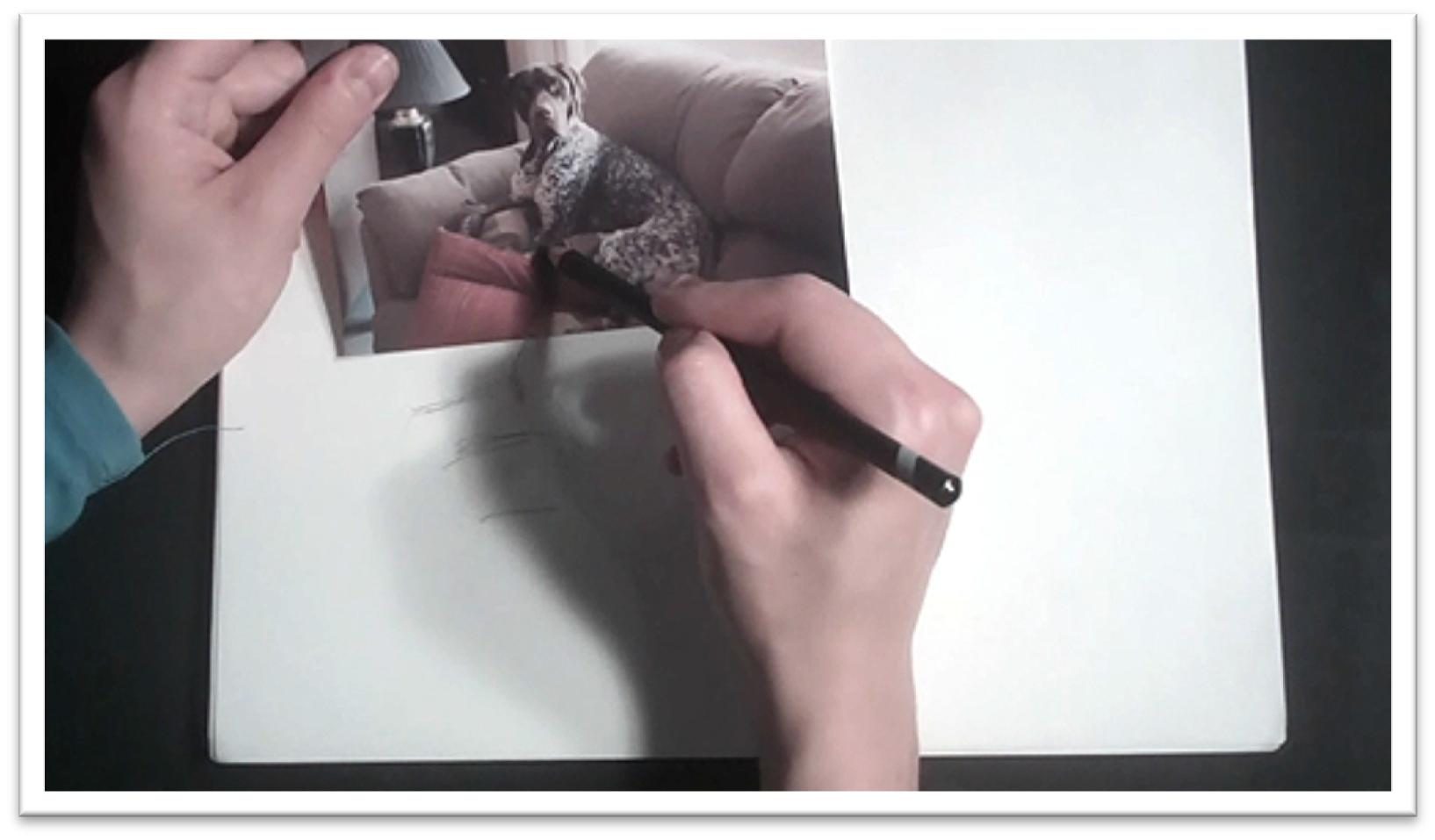
Class 1: Dog Sketch
Before you paint or draw anything, you should always begin with a sketch.
Sketch your dog on a piece of scratch drawing paper, laying down loose, flowing lines of the largest shapes first.
Get the head and body down on paper in their most basic approximate shape.
The head is a trapezoid, the body is an oval, the neck is a square or rectangle.
Seeing the body in terms of more basic shapes will help you to get the initial forms on paper quickly and efficiently without overwhelming you with detail.
Don’t draw as though you’re outlining the form. Oftentimes, beginning artists draw the head and fill in the face before the body is in place, and then work piecemeal, drawing the neck, back, tail and legs as they come to each in turn.
Instead, try to imagine that you’re carving the form out of large, simple shapes that express the overall shapes and angles.
When you’re confident that the largest shapes and major lines are correct, you can begin chipping away the outer lines to refine the finer details and shapes.
As you refine, try to see the lines in terms of one another. For instance, the paw of one foot may line up with the outer line of the ear, the line of the eyes may lie on the same horizontal plane as the line of the back, and so on.
This technique will help you to continually keep a check on your proportions and angles. Draw the background elements that you wish to keep in the finished painting as well.
To draw the dog’s face, begin with horizontal and vertical guidelines on the face that show you where to place the eyes and nose, just as you would on a person.
Use the reference material to measure how the length of the eye compares to the other features; for instance, the eyes may be one and a half eye widths apart, the nose may be two eye widths down and so on.
You can erase the guidelines when the features of the dog have been placed, and then begin laying in the tone, not only of the dog, but of the background as well.
Don’t shade one feature at a time; instead, train your eye to see the large shapes of shadow and highlight that fall across the dog as a whole and try to lay down the shapes as large, non-finicky areas that simplify the form.
This will give you a more polished, professional look. You don’t need to add every spot and hair, but add enough of the fur that you familiarize yourself with the pattern.
Even if you don’t draw everything, in the sketching phase you should be running your eye over every square inch of the drawing and getting yourself better acquainted with the material.
Lay in background detail as needed; don’t waste your time doing finicky detail work in the sketch, but do indicate major pattern changes and contrast areas.
The fastest way to develop large, dark areas is with a piece of willow charcoal, but you can also use charcoal or graphite sticks.
When the sketch is finished, step back and examine the composition from a normal viewing distance.
It’s easier to see potential problem areas a little farther away. Keep an eye out for common composition problems, such as distracting lines, muddy areas of contrast, shapes that are too similar in size, or patterns that compete with the dog for interest.
When you’re satisfied, you’re ready to begin the finished work.
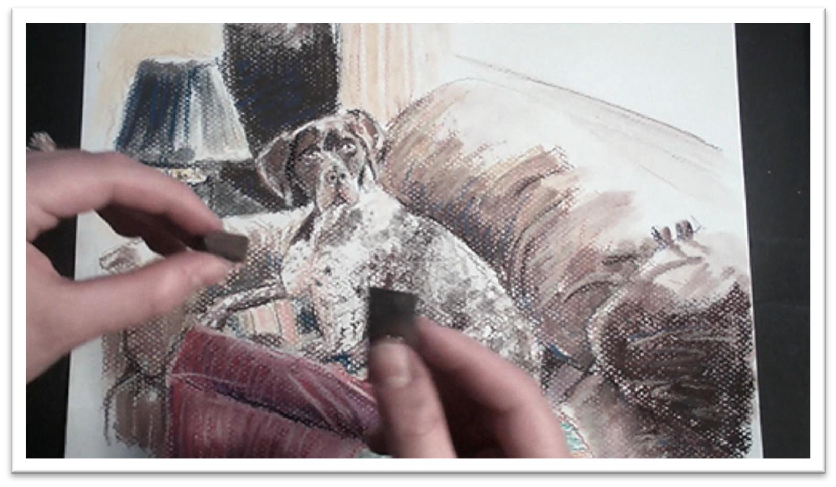
Animal Mastery Tutorial – Class 2
Dog Pastel
Once you have completed a sketch, pick out a piece of pastel paper and transfer the drawing.
The most efficient way will be to trace the drawing in the window or a light box, which is possible if the sketch was made approximately the same size as the finished work.
Otherwise, you’ll need to lightly draw the dog on the pastel paper just as you did the sketch.
When the outline of the dog and background elements are on the page, use pastel sticks and pastel pencils to develop a linear color guide that will serve as a road map for the soft pastel layer.
Work in lines to build up a messy, rough layer of cross-hatched lines that begin to show how the finished piece will look.
Use colors that are adjacent on the color wheel to give the piece depth; for instance, in red areas, cross-hatch in not only red lines, but also orange and yellow.
As a general rule, don’t cross the color wheel and combine complements unless you want to make grays.
Look for shadow shapes and color shapes and put them down in large pieces rather than letting separation in form cause you to see separation in shadow shapes and color shapes.
This stage is loose, but not chaotic; the colors should be the colors that you want the final piece to be, and the forms should be easy to see.
When you’re working up the spotted dog, keep the lines loose and playful to preserve some whites of the paper in the pattern that you want to end up with.
Once the linear road map is complete, you can begin adding heavier tone with the soft pastels.
Break the soft pastel sticks into half-inch to one-inch pieces to make them easier to use, and drag the piece on the side to quickly scumble in color. Blending tools such as a chamois cloth, stomps, tortillons, and your fingers will be invaluable in smoothing tones, and a razor blade and clean palette knife will be used in dusting techniques.
After you’ve laid down some soft pastel, you may want to blend the area with a large stomp or your finger, which will fill the tooth in and make a more solid tone. You can also tamp down the powder to keep down the dust.
Blend large areas first and then get more intricate with smaller tools. After you blend, you might need to add more pastel over the top to re-darken it, or you may want to scribble a line of a different color over the top, which is a technique called “feathering.”
You can use the tip of the small stomp that has pastel on it already to darken up some spots on the dog’s coat.
Use the sketchy lines that are already there to develop a random spot pattern that uses the white of the paper to best advantage.
Place the shadows on the white fur first, and then add the spots after the undercoat and shadow pattern are blended so that when the detail work is done, the whole dog is done.
You use the dusting technique to develop more spots on the dog’s fur.
Scrape the side of the soft pastel with the razor blade so that speckles of dust land where you want spots to be, then mash the dust speckles into the paper with the flat of the palette knife.
The size and shape of the spots will vary depending on how you press with the knife, so experiment on a piece of scratch paper before you use this technique on a finished piece.
Animal Mastery Tutorial – Class3
Shaggy Fur Sketch
This will be a class in painting not only shaggy fur, but solid white fur.
Begin with a sketch on scratch paper to plan out the elements of the composition and acquaint yourself with drawing the dog.
The overall shape is a triangle with a flat top, so begin by sketching that on the page.
You can also draw a few rough lines that give a general idea of where the window and chair will go.
Mark off guidelines for the dog’s head. The head should be the upper quarter of the triangle, and once you have it marked off, make guidelines to help place the muzzle, eyes, and nose.
Use the reference material to determine where parts of the dog line up in terms of each other; for instance, there might be a straight vertical line from the tip of the ear to the bottom of the right paw.
The more guidelines you can give yourself, the more accurate your drawing will be.
Around the outside of the dog, use broken, loose lines to show the flyaway fur rather than a solid outline.
When all of the major elements of the dog and chair are in place, clean up the lines that are sketchy or unneeded and then go back into the drawing and focus more on correctness.
The shadow shapes are very important because they keep the dog from looking flat. You don’t have to get out the ruler for the window, but re-draw the lines to make them as accurate as you can, and do the same for the chair.
Begin laying in tone on the face and in the shadow of the body, then blend with your finger. Add lines in the fur to show the direction of the fur growth as you work, re-darkening as needed after blending.
Pay special attention to the dark areas that help define foreground shapes, such as the darks around the dog’s legs and back.
The broad, dark area of the background that the dog is melting into can be laid down easily with crosshatched strokes of the willow charcoal and then blended or not as you wish.
As you sketch, try to envision painting the dog in watercolor and ask yourself where the potential problem areas are and how you’ll go about painting the picture to alleviate those problems.
When the sketch is finished, transfer the outline of the dog and the large background elements to the watercolor paper using transfer paper or by re-drawing the scene directly on the paper.
Work as lightly as you can to avoid making marks that can’t be erased, since the pencil marks will show through your paint.

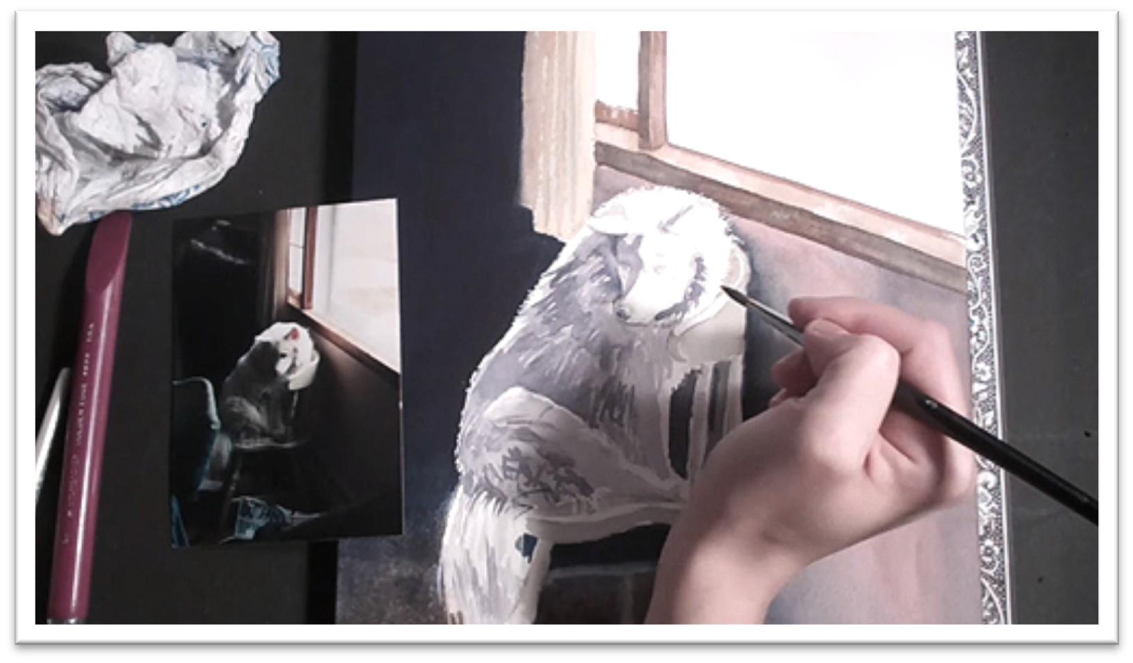
Animal Mastery Tutorial – Class 4
Shaggy Fur Painting
Once the outline is on the watercolor paper, preserve the individual white hairs that show up against the background using masking fluid in a needle applicator.
When the masking fluid is dry, brush a layer of clean water in the background, carefully working around the dog and window.
This is called “water masking,” and it allows you to put down an even coat of paint while still maintaining control.
Drop in many dark colors when the color is wet; browns, blues, and even reds can help keep the background color from going flat.
Wash in the brown of the floor and the peach of the wall as well; you’ll find that they mix themselves with a natural graduated tone when applied to wet paper.
Tilt the board to let gravity mix the colors for you as well.
Use a large flat brush to lay in the browns and yellows of the windowpane, dropping in more yellow ochre and some reds to the light-struck areas.
Let the background dry, and then darken the tone further (if desired) using watercolor ink.
The darker the background is, the more the light-colored dog will pop forward in the foreground. Let the background dry a second time and then start on the dog.
Begin painting the dog by mixing a large puddle of shadow tone. You should have enough to cover everything; you don’t want to have to stop halfway through to mix up more color.
Lay the shadow shape down as one large piece, leaving some of the white paper to show through for an interesting texture that begins to suggest hair.
Soften the edges of the brush strokes with a damp brush, let the first shadow coat dry, and remove the masking fluid.
Mix up a darker version of the same shadow shape and repeat the process, working in the darker areas of shadow.
Test the new color on a piece of scratch paper and hold it against the first color to make sure the two colors will work together, then use a flat brush to drop in a few details in the face and to work around a few lines in the fur.
While the paint is still fairly wet, soften the lines of the fur texture so that it doesn’t look like hay.
When the shadow layer is dry, use a moist angled shader to pick out individual light strands, some of which cross the direction of fur growth. Add tone to the chair and let that dry.
Darken the nose and eyes, and add some pink to the ear. When the first layer of pink is still wet, add a darker pink tone to the base of the ear to give it some depth. The color will flood upward and blend on its own.
Use a small round brush to clean up the outer edge of the fur by bringing the background color into the fur, and then go over the entire dog, picking out details here and there and increasing the contrast with darker shadow colors to accent a few hairs.
When the texture looks like fur, stop. If the painting begins to look too detailed, use a large flat brush and wash a darker shadow color over the busy areas.
Finally, when you think that it’s done, let it sit for a while and come back to it with fresh eyes in a few days and then examine the painting from different distances to get a broader perspective.
Doing this will help you to spot problem areas and make adjustments.
Animal Mastery Tutorial – Class 5
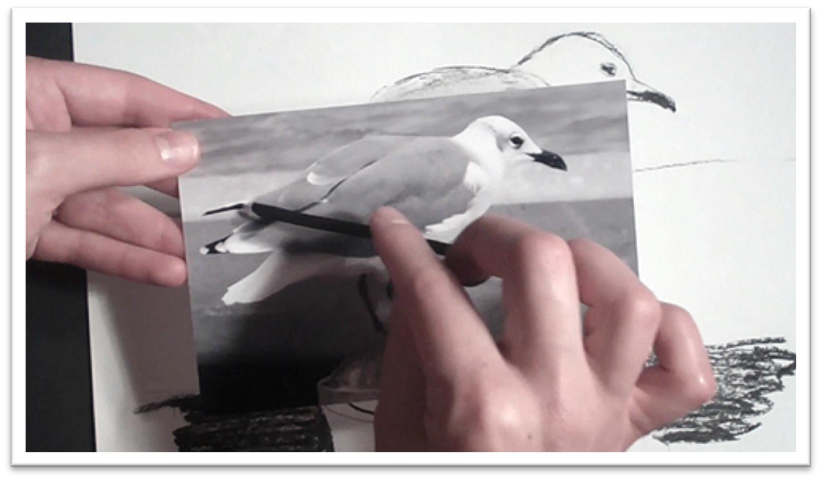
Bird Sketch
Before starting the finished drawing, take the time to develop a sketch of the picture on scratch paper.
This will allow you to spot problem areas in composition, as well as better acquaint you with the subject matter and help you to complete a high-quality finished product.
Use drawing implements that won’t allow you to work too tight; a stick of willow charcoal or a blunt pencil are good options.
Always begin with the most basic shape that you can break the subject matter down into. In the case of sketching the bird, draw an oval for the body and another, smaller oval for the head.
Place your hand or a pencil over the reference material to get a better idea of the tilt of the body and try to reproduce that angle in your sketch.
Even at this early stage, the major shapes and angles should be as correct as you can make them.
Once the ovals are on the page, you can make adjustments and refine. Erase sketch lines that you don’t need as you work in order to keep your drawing as clear as possible.
Place interior lines after you’re satisfied with the exterior ones, always looking for the simplest shapes. When the lines are correct, add some tone to the feathers, beak and eye.
Focus on the details that are important to giving the bird personality and life, versus trying to include every line and shape in the drawing.
You want the drawing to be accurate, but remember that you’re not a camera, you’re an artist.
Drop in the major elements of the background, including the horizon line and any large, important shapes. If you’re sketching with willow charcoal, you’ll find that adding dark tone is a simple matter of pressing harder with the stick.
Work until you’re satisfied that the finished composition is well-balanced, interesting, and accurate.
The lines and angles should be correct, and the black and white tonal study should give you a good sense of how to see the picture in terms of the shadow shapes and contrast areas.
When the sketch is complete, you’re ready to transfer the picture to your drawing paper. If the sketch is drawn to the same dimensions that you want the final drawing to be, you can trace the image onto the drawing paper using a light box or window.
If the final drawing is going to be on board or thick paper, you can use graphite transfer paper under your sketch to transfer the most important lines of the composition, but try to use a light touch to avoid heavy, artificial-looking outlines on your final drawing.
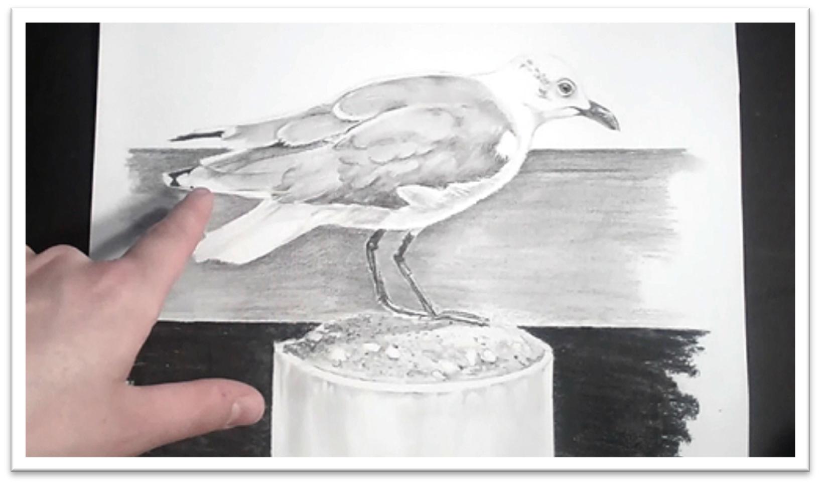
Animal Mastery Tutorial – Class 6
Drawing Feathers in Graphite
Once the outline on the bird is on your paper, you’ll need to preserve the small white lines in the feathers by using the indentation technique.
This is a simple process of bruising the paper with a blunt stylus or a sharp, hard pencil.
If you use a pencil, you’ll need to lay a sheet of tracing paper over the drawing, then simply
press hard enough to indent the lines that need to stay white.
Don’t over-use this tool, or the drawing will begin to look over-worked.
However, indenting is wonderful for small details that are otherwise impossible to erase or avoid.
Beginning in the dark, upper feathers, lay down even tone with a 2B graphite pencil and blend it smooth with a tissue or chamois cloth wrapped around your finger. Blending will lighten the tone, so you may need to re-darken the tone.
When the mid-tone is as dark as you want it, you can begin laying in the darker areas between the feathers. Remember that there are no lines in nature.
Wherever you want to give the impression of lines, rather than drawing them as such, lighten one side of the high contrast area with the kneaded eraser, darken the other, and then blend out the dark side using small circles with the stomp that will disguise the linear quality.
This process will give you the sharp edge that you need without the artificial appearance of a drawn line.
Add tone to the white feathers next, preserving a white core around the outside of the body to make the bird look three-dimensional. Darken the eye, beak, and the underside of the head.
Keep the dark areas gray until you’re confident that the shapes are completely correct, then darken further with a soft pencil. Blend the white feathers with a chamois and stomp, being careful not to fill in the indented white lines.
Move down to the legs, laying in tone with a dark pencil, such as a 4B. You should have quite a few indented lines here that help the legs look scaly and textured, so the legs should be a process of adding some tone and blending a little.
Lay in background around the bird with a soft pencil (2B or softer) using long, smooth strokes that start at the edge of the bird and radiate outward.
When the background around the bird is complete, blend with a stomp and chamois or cross-hatch the strokes to fill in the tooth of the paper without blending.
Protect the straight lines of the piling and horizon line with tape and lay in the darkest black of the background with willow charcoal.
After the willow charcoal is laid down, you darken it further using a charcoal pencil over the top. Spray the charcoal with a fixative before working up the rest of the drawing to keep it from smearing.
Finally, add tone to the piling, working first in the cement gray, then adding the large shadow shape that the bird is casting on the top.
Bring out stones in the cement with the kneaded eraser, then sharpen the lines around each stone with a sharp pencil.
Add broken texture by keeping your fingers tense and moving your hand in a jittery, back and forth motion. Blend to finish, and the drawing is complete.
Animal Mastery Tutorial – Class 7
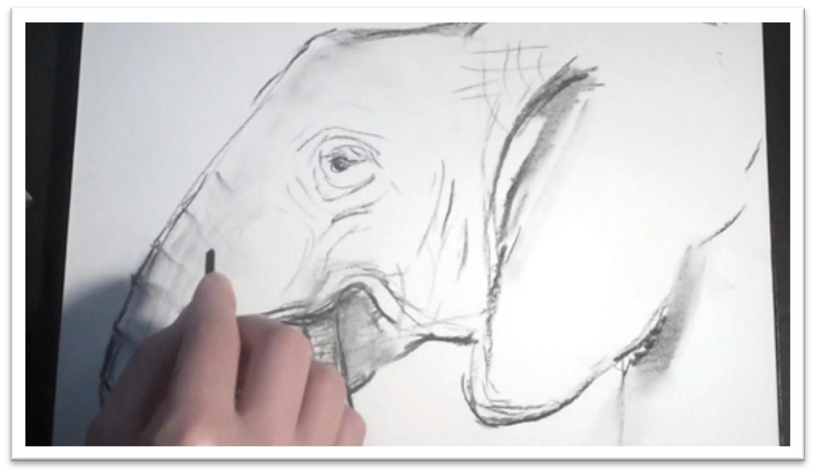
Elephant Sketch
In this class, we’ll be focusing on just a portion of the elephant rather than tackling the whole animal.
Sketch the rough shape of the head on your scratch paper; it should be fairly rectangular with a triangle attached for the base of the trunk.
The head has a knob on top and the ear sweeps up and around like a large, triangular leaf.
The trunk curls down and up to feed into the mouth, and the lower lip comes down to accommodate it.
When the rough shapes are in place, clean up your lines and begin placing the interior shapes and lines.
The eye is roughly in the center of the head, and there are prominent lines at the base of the ear and around the trunk.
The fold lines on the outside of the trunk are wider than those on the inside, and the wrinkles that are generated by each movable section should cross the trunk in parallel lines.
There are wrinkles around the mouth that follow the curve of the cheek as it lifts up to open the mouth, and more wrinkles around the eye that circle the skin in a sort of bull’s-eye pattern.
Make sure your wrinkles make sense; they shouldn’t be scattered everywhere, but should be more like tree bark, with a few definite, dark lines surrounded by lighter lines that cross into the general pattern.
Examine your references until you’re comfortable with the rules of the pattern of wrinkles, and then try to sketch the elephant without continually referring to references.
This will help you fight the urge to draw every line and wrinkle.
Drop in some shading with the willow charcoal using loose strokes and blending with your finger.
You may want to darken up some areas after blending; try to see the shapes of the shadows and put them down with clear lines that will be easy to remember as you work on the final piece.
For the final rendering, we’ll be using pen and ink on Bristol paper, which is thick, but not impossible to trace through.
So to transfer the drawing, use a light pencil and sketch the outline of the elephant on the Bristol paper either by re-drawing it, by tracing, or with the help of transfer paper.
Clean up the lines until you have a clear roadmap to work with. Pen and ink dries quickly, so you’ll be able to erase unnecessary lines as you work.
Animal Mastery Tutorial – Class 8
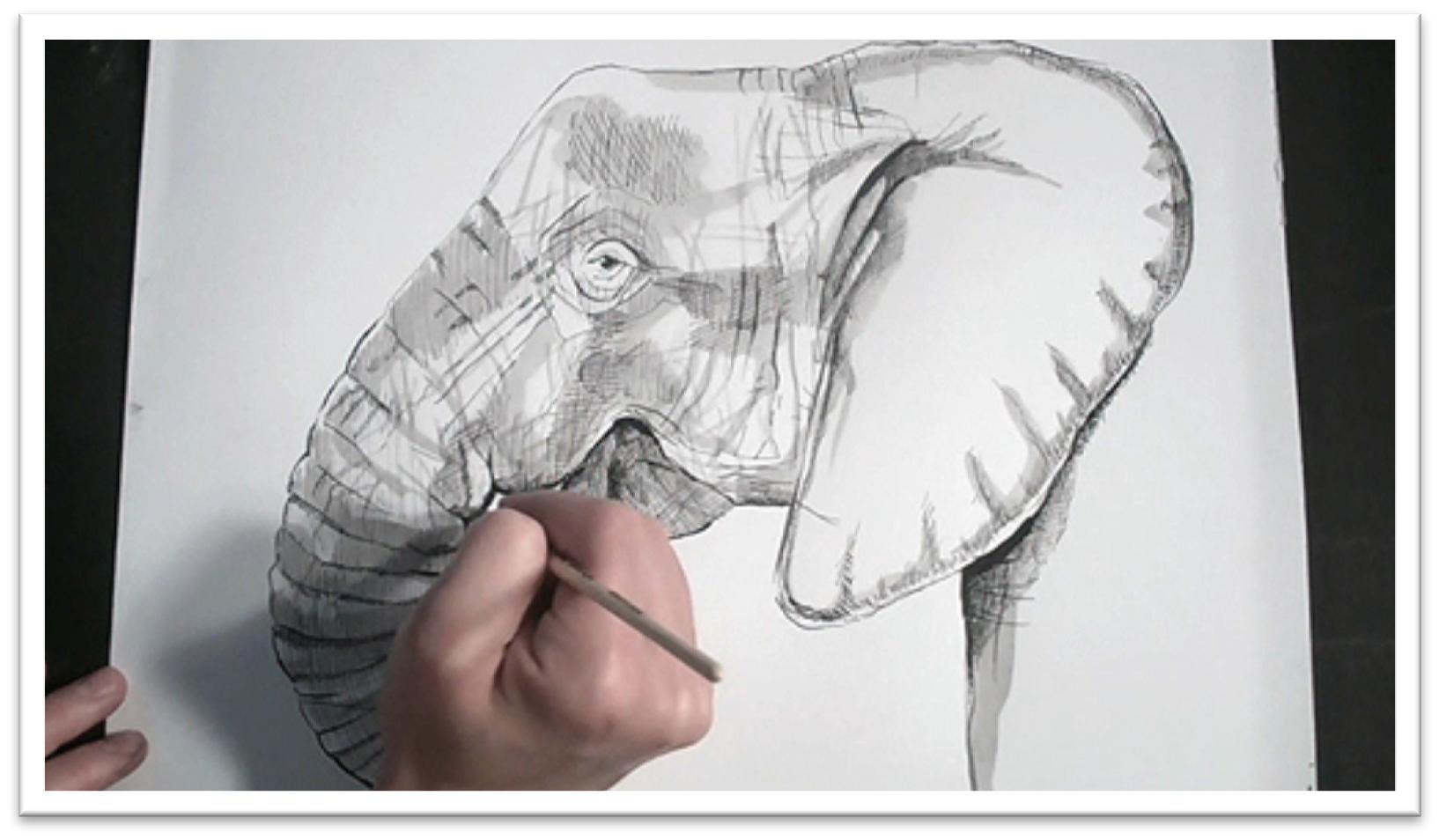
Elephant Pen and Ink
For pen and ink drawing, you’ll need Sumi or India permanent ink, a well to hold ink of various dilution levels in, and a variety of dip pen nibs.
If you’re not well acquainted with pen and ink techniques, take the time to practice hatching, cross-hatching, straight and wavy lines, broken lines, and grass strokes on a piece of scratch paper until you’re comfortable.
Begin the pen and ink painting by outlining the prominent lines of the elephant using an interesting, broken line of varying thickness.
Let the ink dry, and erase the guidelines so you can see the effect without pencil. Move on to the interior wrinkle lines, keeping yourself loose and your lines sketchy.
If you need to draw more lines in pencil as you go, that can help you to feel more confident about adding lines in permanent ink. Clean up the pencil lines again, and then move on to adding tone.
Start cross-hatching the tone in the darkest areas of shadow, always looking for the overall shape of the shadow.
It may be helpful to lightly outline this shape before you begin hatching; that way you have a guide which you can simply fill in.
Cross hatch to darken the tone up, and tilt the paper to cross hatch a third and even fourth time as needed. Every pass will darken the tone.
Make your lines as long as you can comfortably control without having to move your whole wrist. Your wrist should remain firmly planted on the table as your fingers do the work.
Hatching is not scribbling back and forth, but is rather putting down a set of parallel lines that allow you to build up even tone. It takes a long time, so if you find yourself starting to scribble, get up and give yourself a break before coming back to it.
To build up a base tone in gray areas, make your hatching lines farther apart, but keep them going the same direction.
When the base tone is developed, you may need to darken some of the lines by trading out for a thicker nib or by tracing over the top with a series of short, parallel lines.
Also, remember that you can always use brushes to paint on some ink as well; squirrel quill brushes work very well for making both thick and thin lines, and for painting in washes of diluted ink.
If you decide to add some washes, be mindful that you need to add washes as large, solid pieces. The ink dries quickly, and once it has, you can’t add to it without a break in the tone.
Before you begin, make sure that you have enough ink mixed up to cover the entire surface, and test the tone on a piece of scratch paper.
Then, use the largest brush you can to wash over the shadow areas. You can use washes to emphasize areas that you’ve already established with the hatching lines, to thicken lines, and to paint new lines.
When you think the painting is done, let it sit for a few days. You can always go darker, but you can’t bring white paper back again, so build up layers slowly, giving yourself plenty of time to reflect on what it needed before you add more ink.
Animal Mastery Tutorial – Class 9
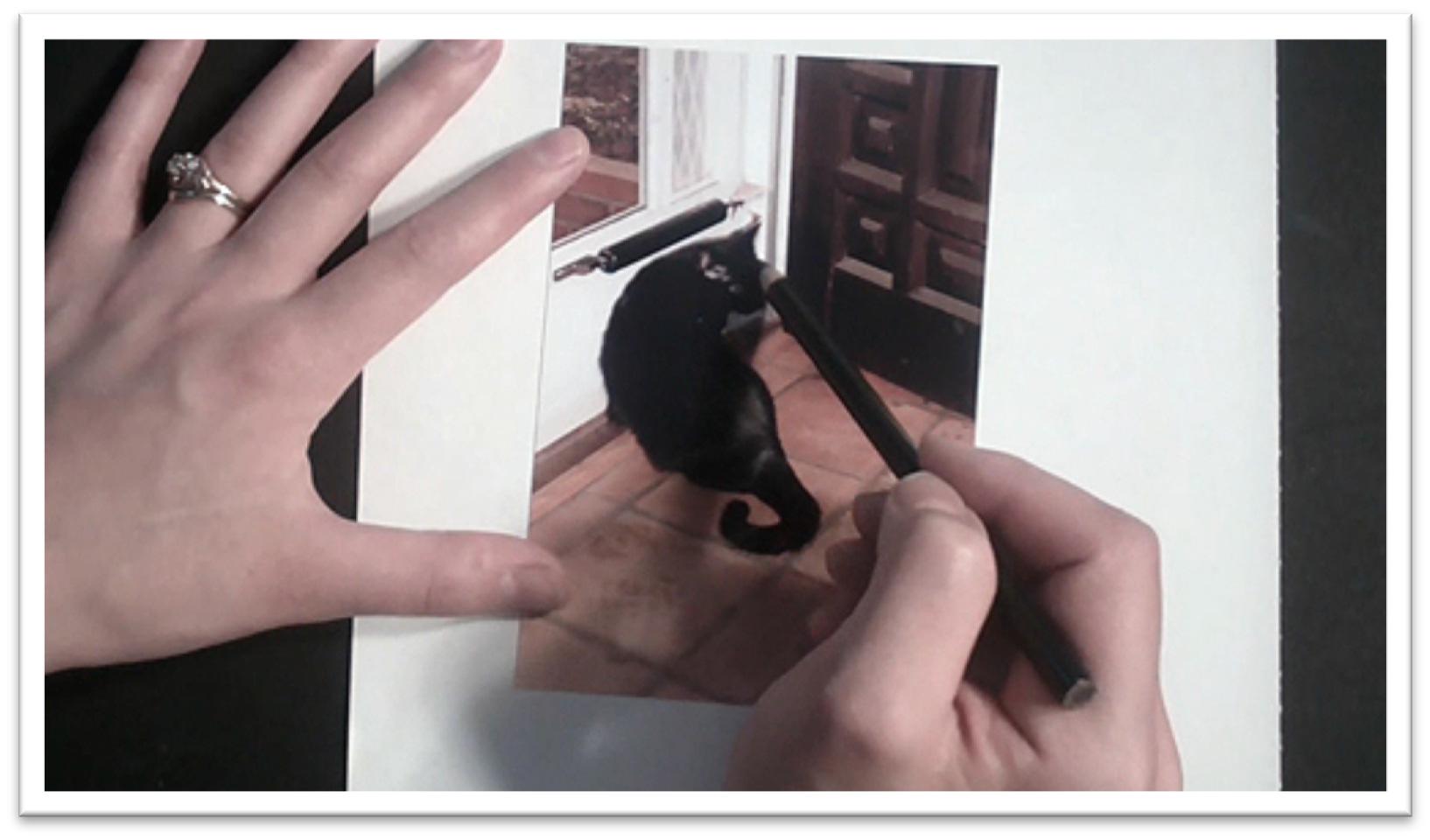
Black Cat Sketch
Because the cat is so flexible, there are often many curves in the body position and it can be easy to draw a cat that appears disjointed.
To help combat that tendency, begin by studying the simplest shapes that make up the body, neck, and head.
The body is a rectangle, the head is a triangle, and the neck between the two is a trapezoid.
Trace the line of the spine with your finger or pencil to acquaint yourself with the angles there, and then move to your sketch paper.
The easiest way to start is by marking off lines for the shoulders and hips. Sketch the oval of the body and the trapezoidal neck shape between those two lines, then make the triangular head on top.
On the head, place guidelines for the basic position of the nose and eyes, and finally, sketch a tail.
The sketching process is a lot like sculpting in that you begin with the largest, most simple shapes and then carve away and simplify from there.
That way, you always have a sense of how all the individual parts of the whole are related, and nothing is tacked on randomly.
Never sketch by trying to outline the form without guidelines; your drawing is almost certainly going to be inaccurate. Mark wherever there are changes in direction: the top of the head, top of the shoulders, bottom of the hips, base of the tail.
When the body is correct, you can clean up the guidelines and work up the face in greater detail.
Don’t be surprised if you need to refine your initial guidelines and the shape of the face; remember, the initial sketching stage is quick and loose.
Use your reference material to help determine the position of the eyes and nose in relation to other features on the face. For instance, the corner of the ear may line up with the inside of the ear and so on.
Sketch a rectangle for the eye that shows the height and width of each, then draw the almond shape of the eye within those boundaries.
When you’re satisfied with the exterior lines, add tone to the cat with the willow charcoal. Blend with your finger or a tissue, then go back in and re-darken areas of high contrast.
Pick out the shapes of the highlights on the body and face using a kneaded eraser, add some flyaway and highlight hairs around the outer edge of the cat, and sharpen lines as needed.
Transfer the sketch onto your charcoal paper with a 2B graphite pencil or willow charcoal to work up the final drawing.
If the approximate sizes are the same, you can trace the lines of the sketch onto the paper using a light box or a window.
Otherwise, you can use graphite transfer paper, or you may need to re-draw the cat a second time.
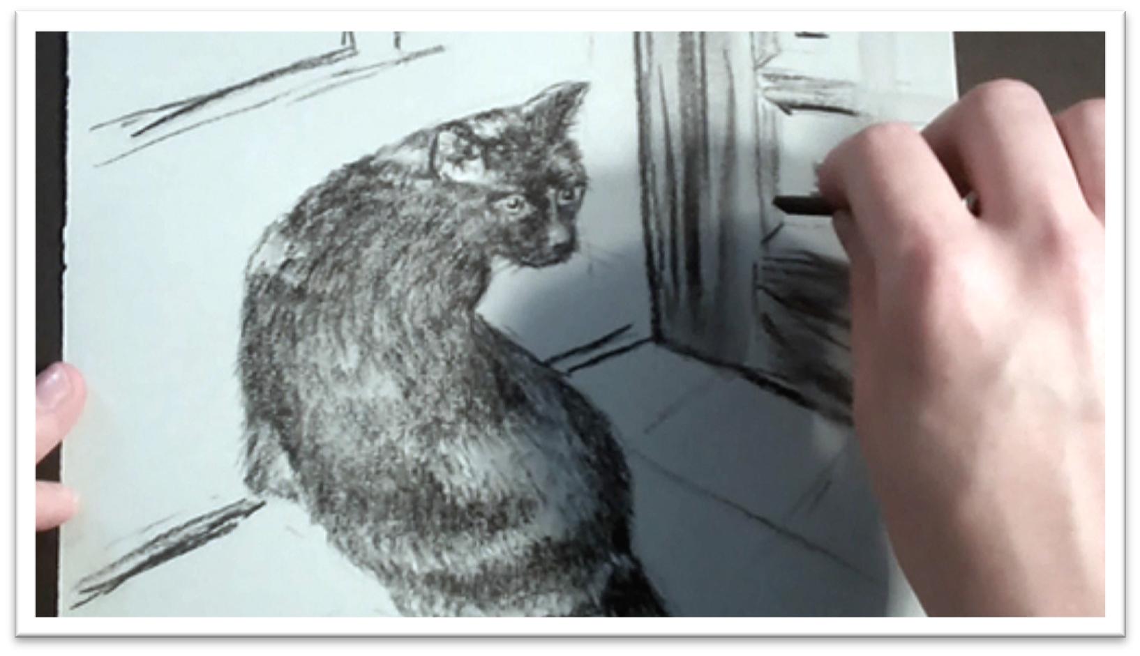
Animal Mastery Tutorial – Class 10
Black Cat Charcoal Drawing
We’ll finish the cat picture in charcoal. After tracing the outline on the paper, clean up the lines so that you have a good, clear roadmap to work with.
Use this period to make adjustments to the cat as well as to make decisions about the background;
you may want to include some of the doorway and floor so that the cat isn’t floating in space.
After the outlines are in place, you can start laying down the tone. Since the cat is solid black, rather than looking for shadow shapes, you’re looking for highlight shapes.
Lay down the tone with a charcoal pencil, using short, choppy strokes that follow the direction of the hair growth so that the strokes can begin to look like hair even from the earliest stages.
When the cat is filled in with black strokes, blend the tone smooth. You can use your finger, a chamois, or a tissue, but use the largest tool you can to keep an even finish.
Blend right into the edges of the highlights to soften them, and indicate some of the background elements with a line or two.
Blending will lighten the tone significantly, so you’ll need to darken the areas that are in shadow, which will be anywhere that two plains meet.
Try to imagine what the cat’s body is doing as you work: where are muscles protruding, which plains are set back and which are pushing forward.
Visualizing it will help you place the darkest darks more accurately. You can pick out some individual flyaway hairs around the edge of the fur at the same time, and bring some lines across the highlights on the fur to keep them from looking like stripes.
When the darker charcoal is in place, use a small stomp to blend the more delicate areas that need a lighter touch; in the ears, the small area around the eyes, and so on.
With a very sharp charcoal pencil, draw the whiskers, hairs in the ear, darken the irises, and add more hairs in the body.
Wherever you have a highlight, darken one side of it to make it even more prominent.
Because your strokes have been following the growth pattern of the fur all along, you shouldn’t have to do too much to make the fur look realistic at this point.
You can use a white charcoal stick to further lighten up a few hairs in highlight here and there, and darken the blacks with a piece of willow charcoal.
For the background, you can work as tight as you wish. If you’re working with a loose style, you can use a piece of willow charcoal to draw a wood grain pattern in the door, then blend over it to build up quick tone.
Darken lines in the door and on the floor, bring out some details in the carved wood pattern on the door, and the picture is complete.
Animal Mastery Tutorial – Class 11
Sketching a Rabbit
In this set of classes, we’ll work on additional techniques for drawing and painting animals, beginning with drawing the rabbit.
Because the body, head, and ears are different sized ovals, the rabbit is a wonderful animal for the beginning artist to warm up with.
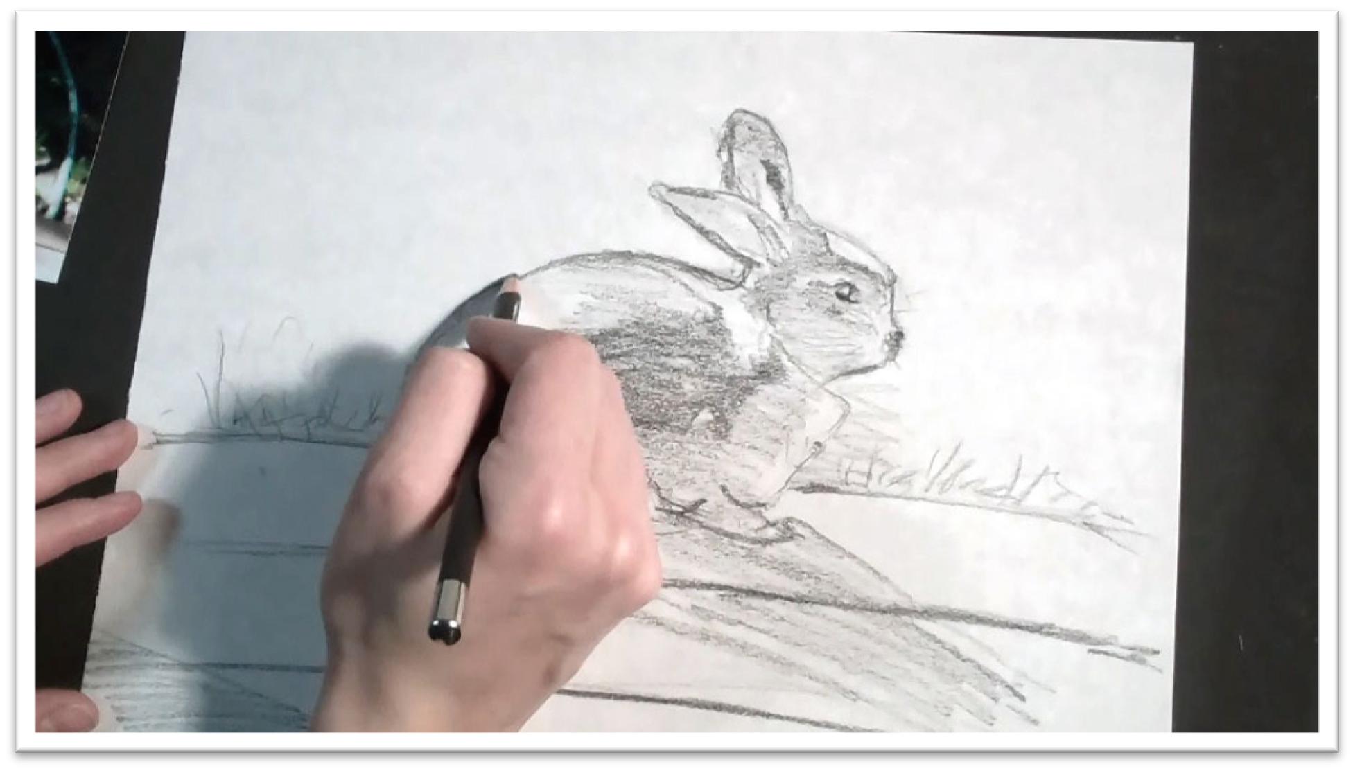
Begin a rough sketch of the rabbit. From the side view, the body is a large oval.
Use loose, sketchy lines that will be easy to clean up later. Draw the head and ears, then place the haunch, front and back paws, and the tiny bit of visible tail.
Clean up the sketch lines, re-drawing as necessary to give yourself a nice, clean outline. When the large shapes are correct, work on making the divisions between planes, such as the line that divides the head from the body, the dewlap, and so on.
Draw the eye carefully, remembering that just as in humans, an animal eye is expressive and will look angry or terrified if the lines are angled incorrectly or if there is white visible around the iris.
Use a soft pencil on the side to add tone to the pattern on the fur and the shadow falling both on the rabbit and the ground.
To give the picture added interest, keep the light source very clear and distinct. Since the light is coming from behind the rabbit in this picture, the upper back will be light-struck and the rest of the body will be fairly dark.
Lay in the lines of the background. This background is fairly simple, but there should be some sort of ground line, as well as grass, details in the wooden boards that the rabbit is sitting on, and so forth.
Keep the backgrounds in your early work simple, so they don’t distract and so that you can devote your time to the animal.
Finally, take a step back from the work and determine whether or not you want to crop in the final drawing.
Examine how the large shapes are working together, keeping in mind the rules of composition and the do’s and don’ts of managing the elements of your picture.
For example, shapes shouldn’t compete with each other, lines shouldn’t lead the viewer’s eye out of the picture plane, and so on.
When the rough sketch is complete and you have a good sense of how you want the animal and background to look, you can transfer the lines to the drawing paper of your finished piece.
Animal Mastery Tutorial – Class 12
Drawing a Rabbit
If your rough sketch was the same size that you want the finished piece to be, you can transfer the lines directly onto the drawing paper using a sharp pencil a fresh piece of graphite transfer paper.
Check before you go too far to make sure the lines are transferring.
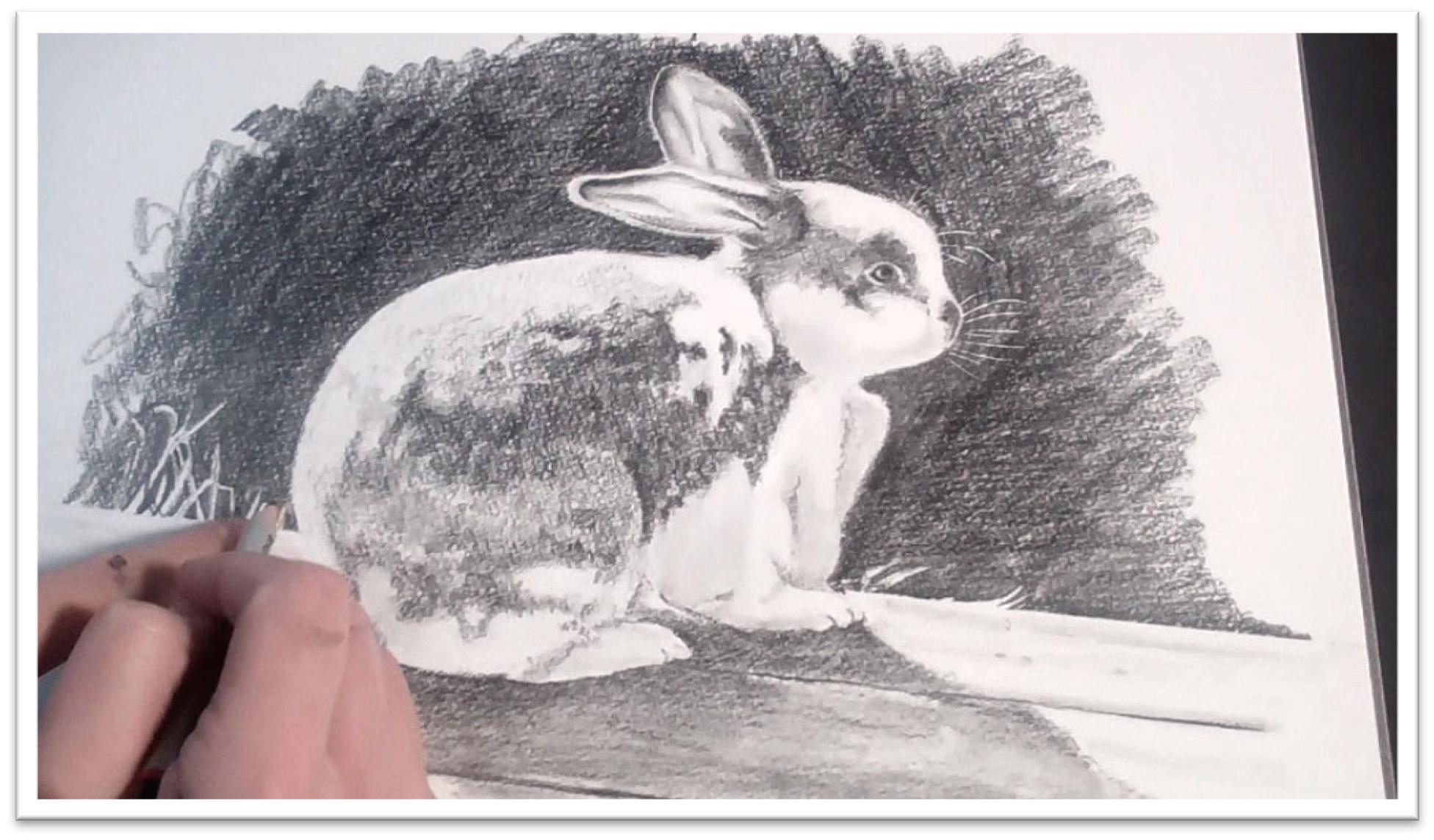
In areas where you want a white line, such as whiskers and a few flyaway hairs around the outside of the body, indent the paper with a sharp tool that won’t damage the paper, or a sharp pencil over a sheet of tracing paper.
When the outline is transferred, use an H pencil on the side to start laying in the tone, working from top to bottom.
Your strokes should go in one consistent direction, and follow the contour of the form. Cover all the dark areas on the rabbit with tone, seeing the shadows as shapes that you can transfer in one big piece.
When the base tone is in place, do a first pass of shading with a blending stomp (tortillon), or in the largest areas, a chamois cloth.
In areas such as the inner ear, you can use the tortillon to draw in detail as well. You need tone in all of the shadow areas, even the white fur, so that the highlights have something to contrast against.
After the first pass of blending, darken the darkest patches in the fur, ears, and eyes by pressing harder with a softer pencil such as a 2B.
Use short, controlled strokes in the fur, always following the direction of the fur growth, and keep a mottled look in the tweed fur by avoiding smoothing all the fur the same. In some areas, rely on the texture of the paper to get the broken texture you need for this type of fur.
In the places where you indented the small white hairs, press hard with a pencil on the side to make that contrast high.
Begin to add the background with a very soft pencil: 4B or more. Go around the outer curves of the rabbit first, then work outward in small patches.
Work up the darks slowly. In places where there is a mechanically straight line, you can preserve the edge with frisket film. Draw and blend right over the top, then carefully pull up the film when the edge is complete.
In the final stage of the drawing work on the fussy, finicky details. Add more detail to the ear and eye, and add one last pass of darkness to the shadow side of the body, keeping the upper edge light-struck.
When you come to lines, blend out one side to preserve the sharp distinction, but avoid the “drawn” quality of an actual line.
Remember, there are no lines on the rabbit. We perceive lines where two planes meet, but if you over-draw these areas, the finished piece will look artificial.
Use a straightedge to darken the lines of the boards that the rabbit is sitting on, then, to keep them from looking too straight, darken the tone free hand.
Finally, lay in the shadow that the rabbit is casting on the boards, remembering that the shadow is darkest the closest to the source and lightens as it moves outward.
Animal Mastery Tutorial – Class 13
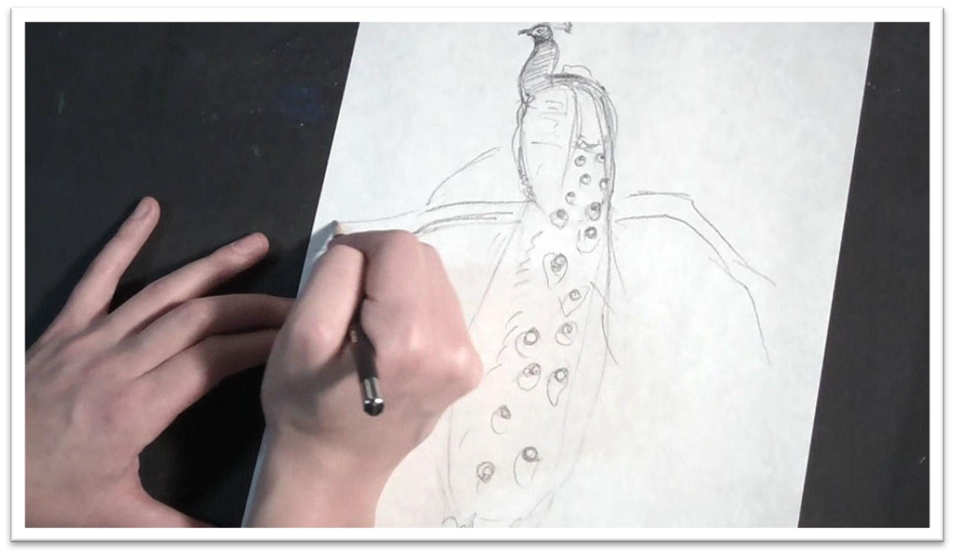
Sketching a Peacock
To sketch a peacock for a loose watercolor, practice with a rough sketch on a piece of scratch paper to familiarize yourself with the form and get a better sense of how to lay out the painting.
The head is a small oval attached to a fat, S- shaped neck, which then attaches to the large egg shape of the body.
Most of the peacock is the feathers, which can be blocked in as one big shape.
As you work, it’s helpful to have references to refer to in order to get natural and realistic details for the painting, even though the painting won’t look much like the reference material in the end.
It’s better to have more information than you need than not enough.
When the large shape of the head and body are drawn in correct relation to each other, add the smaller details such as the wings, plumage on the head, eye and beak, and the eyes on the feathers hanging down.
Briefly sketch in an interesting tree for the bird to be perched in, keeping in mind how the lines of the branches need to be placed to echo the position and angle of the peacock without detracting from it or becoming distracting.
When the sketch is finished, transfer the drawing to the watercolor paper in the same style.
Since this is going to be a loose, free-flowing picture, choose a large piece of paper that will allow plenty of room for the colors to move. Sketch with a 2H pencil, keeping your lines light but clear.
Don’t press too hard, or you’ll bruise the surface of the paper. And make sure that you include enough line work that you have a good, clear roadmap for the painting before you begin, otherwise you can easily get lost once you start painting.
If there are white feathers or small details that need to be preserved, do so with a needle tool of misket. Let the fluid dry completely, and you’re ready to paint.
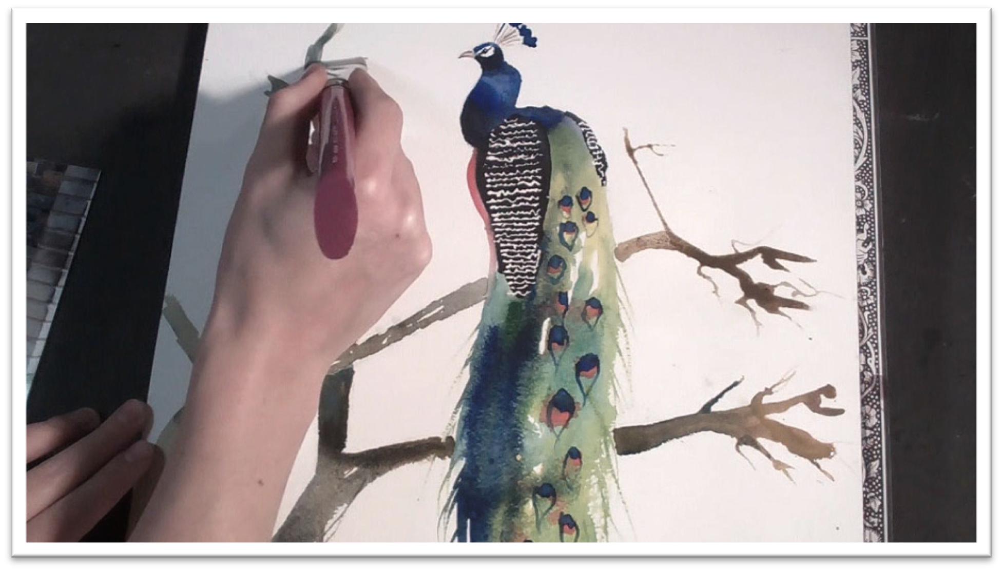
Animal Mastery Tutorial – Class 14
Painting a Peacock
When the misket is dry, begin painting the peacock by washing the head, neck and body with water and flooding the area with a mixture of cobalt blue, ultramarine, and Payne’s gray.
Flood the tail feathers with water and drop in greens and yellows to mix a rainbow of color in that area as well.
By alternating between water and paint in this wet-on-wet style, you get a colorful bleed without losing control. Use a wet rigger brush to develop the loose lines of flyaway feathers around the outside of the tail shape, then let the tail colors dry for a few minutes.
Before the tail is completely dry, drop in some intense dots of bright oranges and reds for the eyes in the feathers.
You may need to re-apply that color intermittently as it dries to keep the oranges from becoming too light.
When the tail and body are completely dry, wash payne’s gray over the wing protected with misket, then add the blue dots over the orange ones in the tail feathers.
To make them bleed a little and match the rest of the tail style, touch the blue dots here and there with a wet brush. Add the plumage to the head with a variety of blues, and add a dot of cerulean to the dark blue dots in the eyes.
Use a rigger to add detail around the eyes in the feathers, as well as to the beak and eye. Make sure to avoid a highlight in the eye to keep it lifelike.
When the plumage in the headpiece is dry, attach it to the head with a few thin lines, then add the red belly.
Let that dry completely. Remove the misket in the wings, add some more definition to the beak and eye, and then paint the branch that the peacock is sitting on.
Begin by flooding the branch shapes with water, then use a syringe filled with browns to drop in paint on the branches. Add yellow ochre and blues on top and let that color mix for an interesting effect.
Once the colors are in place, you can easily clean up the lines with a large flat brush, add additional branches, and use the brush handle to develop some small twigs growing off the larger shapes.
When the first pass of tree branch color is dry, add shadows with cerulean blue, and drop in some texture on the bark with a large flat brush.
The shadows will help the tree to look three dimensional, and the texture will help the bark to read as rough.
Finally, to make the style of the tree match the peacock better, scrub out a few of the hard edges with a wet brush and let the color bleed out. To make the effect look intentional, repeat it three places or more throughout the picture.
Mute the line quality of the texture on the wing by washing over the wing with some cerulean blue, let the painting dry, and the picture is complete.
Animal Mastery Tutorial – Class 15
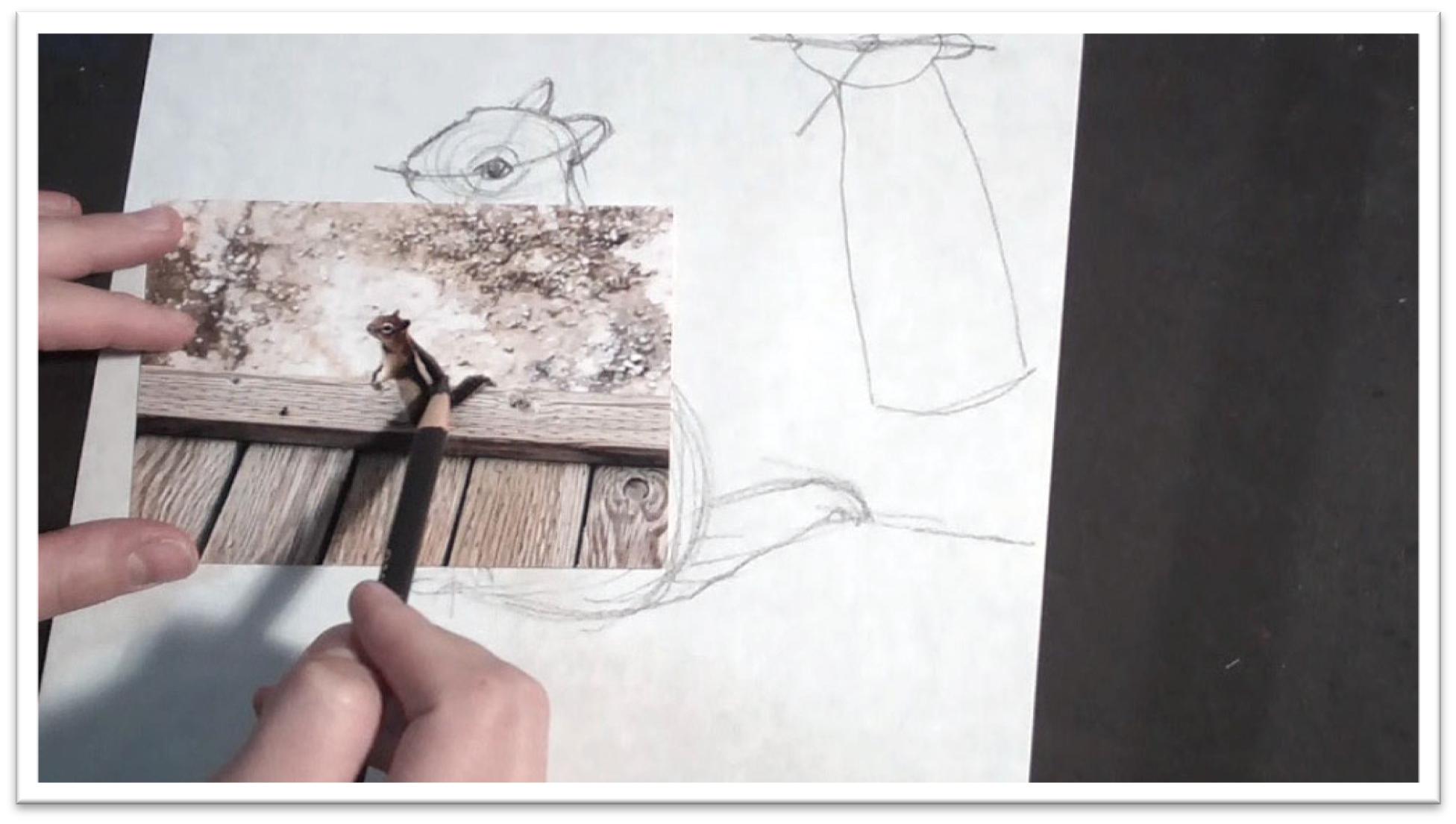
Sketching a Chipmunk
To begin sketching a chipmunk, start with clear reference material.
Then, on a piece of scratch paper, use loose lines to sketch in the shape of his head and body.
The head will look like an almond to begin with, and the body a boxy rectangle.
When those are sized correctly in proportion to
each other, you can round out the bottom to give him a more realistic shape.
Then, before you go any further, examine the reference material to make sure that the head and body are in correct alignment with each other and that both are sitting at the right angle.
The body language is very important to convey the chipmunk’s personality in the picture.
Make guidelines on the head to help place the eye. Once it is correctly placed, you can use the eye to place the front and back ear.
Just make sure that you’re not relying on the measuring devices too much. Remember, the guidelines are only valuable to the extent that they help you place the features correctly— they’re not an end in themselves or a guarantee that your picture will turn out perfectly.
The most important element in producing accurate sketches is maintaining a loose, easy-to- erase approach.
The chipmunk’s arms are being held at the approximate vertical center, measuring from the top of the head to the bottom of the feet.
Place a quick guideline and sketch them in place, then add the stripes to the body and eye. Place the stripes of color as shapes, then immediately shade them to the approximate tone to help distinguish one shape from the other.
Divide the large shapes of the hands and feet into the slender fingers and add something for the chipmunk to be standing on, such as a wooden bridge.
A knothole in the picture will help to size him on the page for the viewer.
To transfer the drawing to the pastel paper, trace the important lines of the rough sketch onto tracing paper, then sandwich a piece of graphite paper between the pastel paper and tracing paper to transfer those lines onto the pastel paper.
Make sure to carefully lift up the paper before you’ve gone too far to make sure the lines are coming through clearly.
Use a straight edge to add the mechanical lines of the wooden bridge, either by using the transfer paper, or, if the paper gets shifted, by lifting up the transfer and tracing paper and marking the lines directly on the pastel paper.
When the finished outline is complete and needs no adjustment, you are ready to begin adding the pastels.
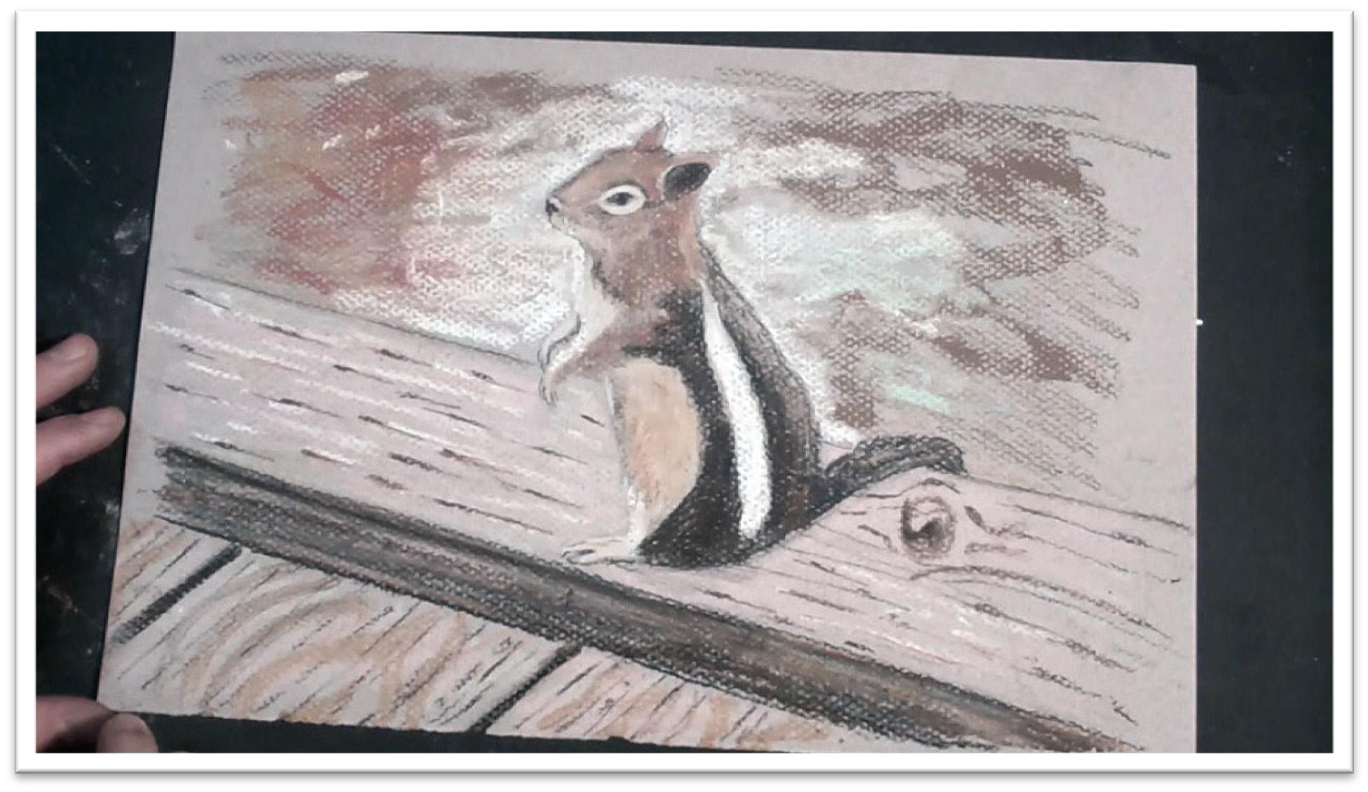
Animal Mastery Tutorial – Class 16
Painting a Chipmunk in Pastel
Start the pastel with a color study made up of rough, scribbly lines with pastel pencils.
This will give you a clearer vision of how the finished work will look, and if you need to make adjustments to the colors, you can do that easily in this stage before there’s too much pigment on the paper.
Break into the tans and browns with blues and creams to keep it exciting.
When the background is done, do the color study on the chipmunk itself in the same way, protecting the surface of the paper from your hand with a piece of scratch paper that won’t smear the pastels you’ve already laid down.
Remember, the more complete and accurate the color study is, the clearer picture you’ll have of how the finished piece will look.
Begin laying down some interesting tones and shapes in the background with the soft pastel sticks.
Keep it lively, but not so much that it distracts from the chipmunk. Mostly, the background should stay back so that the chipmunk can pop forward.
In the chipmunk, start with a mid-tone brown that will allow you to go both darker and lighter for tonal variations.
When the chipmunk is covered with the initial pass of soft pastel, blend the tones carefully using small circle strokes with a tortillon that will tamp the tone into the paper rather than lightening it.
When the first pass is blended, add a neutral wood tone to the plank that the chipmunk is standing on.
Blend that, then add some texture in the wood grains, the knot, and the divisions between the boards.
Make sure that the wood grain goes around the knot realistically, then add some darker tone to the shadows and cracks in the wood.
Blend the wood tones smooth, then tighten up the features of the chipmunk further with charcoal and pastel pencils. They should be nice and sharp so that you can lay in individual flyaway hairs in the tail, line of the back, belly, and face.
You’re not outlining, but merely darkening up a place here and there. The patterns in the chipmunk’s fur need to be very clear and distinct.
In the darkest places, the charcoal pencil will be more effective than the pastel pencils for laying down a heavy line.
Add detail to the eye and nose, which will help gauge how much detail to put in the rest of the body. Simply layer one color on top of another to develop depth and get interesting color variation in the fur.
Work up the detail moving from the top down using short, brushy strokes to give an indication of individual hairs that you might see.
Don’t forget that some parts of the outline are light-struck, so keep those areas white. When in doubt, keep an area vague and let the viewer’s eye fill in the detail for you.
As you work, make sure to continually pan in and out to get a sense of how the picture looks from different vantage points and distances.
What might look loose and impressionistic up close will come together and look correct from further away.
Animal Mastery Tutorial – Class 17
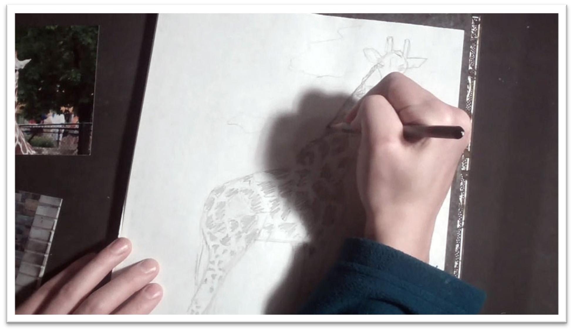
Sketching a Giraffe
This class will focus on depicting patterns in short fur with watercolors and on combining two pictures to make a giraffe that is both full body and facing the viewer.
Begin by sketching the biggest shape, which is the squarish body without neck or legs attached.
When the body is sketched on the paper, refer to the reference material and get a
measurement for the neck length in terms of the body length.
Mark that length off on the paper, then sketch the basic neck in between those marks. Add detail to the head: rough ears, horns, and eyes.
Then make new measurements to figure out how long the legs should be in terms of the body length and repeat the process to sketch the four legs in place.
When the legs are roughly drawn, clean up the lines and better define the angles of the bone structure.
Clean up the sketch lines and refine, then develop the spots. Because they pattern is fairly complex, focus on a small area to familiarize yourself with how the spots fit together in general, then freehand your own design up and down the neck and body.
This is much more simple and efficient than trying to copy the shape of each individual spot. On the body, the spots should be much smaller, and on the neck, the spots may look more like “c’s” and less like blotches.
Step back every now and then to make sure that the spots aren’t looking too repetitive.
Sketch in the small mane, and mark off where on the legs the pattern stops and the tawny fur color begins.
Add context to the background with a few brushy strokes to indicate the ground, grasses, and trees.
Transfer the drawing to a fairly small piece of watercolor paper using the graphite paper.
Clean up your lines as you trace, especially in areas like the ears that may need some more detail.
Don’t fill in the tone in the spots, but leave a clear outline of each to work from so you won’t get lost when you start to paint.
Before you go too far in transferring the sketch, carefully lift one corner of the paper and make sure that the lines are coming through dark enough.
It doesn’t matter if the lines aren’t very dark; you only need enough to see clearly where to paint.
When the outline is complete, lift the transfer and sketch paper off and finish any final details in the drawing directly on the paper.
Make sure not to press too hard, or you’ll bruise the tooth and effect how the paint lays on the surface.
Freehand in just enough background to work by, and then you’re ready to begin painting.
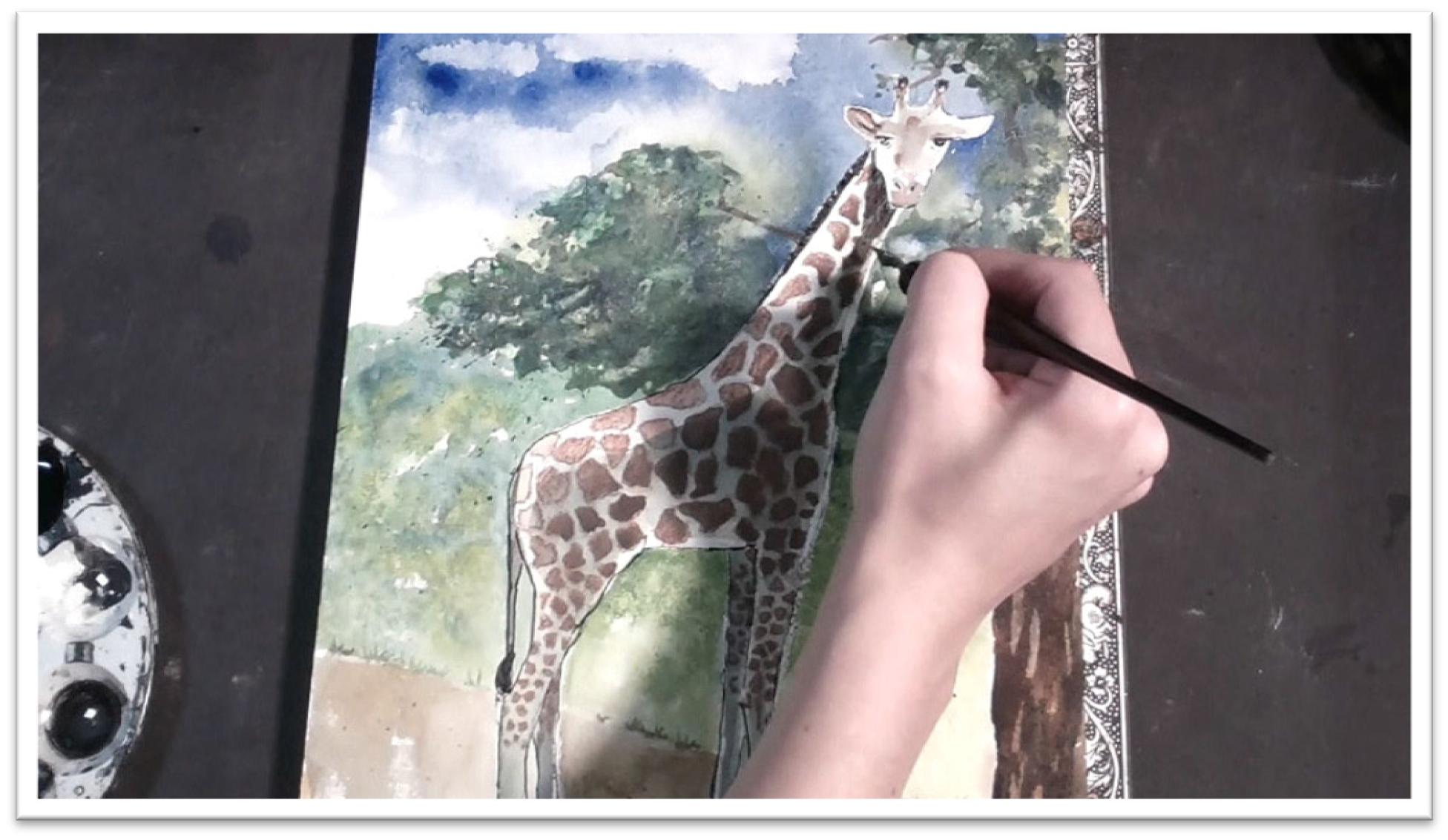
Animal Mastery Tutorial – Class 18
Painting a Giraffe
Start by painting the background with a large, wet, flat brush of clean water, being careful not to get the giraffe wet.
Paint a blue sky with broad strokes of ultramarine and cobalt blues, then sponge out some clouds with a dry rag while the paint is still wet.
Next, add some foliage in a similar way, dropping in the yellows and greens with the side of the flat brush.
Work in the wet areas on the page and let them dry on the paper. When the leaves are dry, add a trunk and branches peeking through the tree here and there to make the tree look more realistic.
Wet the trunk with clean water first, then flood the area with browns and blues.
For the rest of the background, fill in the sand that the giraffe is standing on by using a dry brush technique and fill in some more greens beneath the tree, keeping the colors fairly wet so that they blend together well.
After the background is dry, you may want to experiment with some pastels or watercolor pencils to make some leaves in the tree pop forward more, and to add some additional textures here and there.
Whether the surface is wet or dry will alter how the different mediums look on the paper.
Use a watercolor pencil to outline the spots on the giraffe, then use a brush of clean water to smooth out the color.
But before you go too far on the spots, make sure to lay down the shadow on the giraffe’s body to give him some dimension.
If paint the spots first, you’ll find that the lines bleed out when you wash over with a wet brush.
See the shadows as shapes and lay them down smoothly with as large a brush as you can for the area. When the shadows on the body are dry, fill in the spot pattern with watercolor pencils.
If you need more variation in the background, protect the sky, tree, and giraffe with pieces of scratch paper, then liberally fling on dots of paint to develop some darker colors and more interesting textures.
After the paint is dry, you can also lift out highlights with a damp brush. Let the background dry, then move back to the giraffe to do the finishing work there.
Add some tone variation to the spots to stay consistent with the lighting conditions on the rest of the giraffe.
Spots in shadow will be darker, those that are light-struck will stay brighter. In some places, darken half a spot and keep a constant line of light falling on the animal’s back.
Add detail to the eyes, eyelashes, inner ears, and horns.
Add a shadow at the feet, and if needed, darken the shadows on the giraffe as well.
Let the giraffe dry completely. To finish, get a palette with some permanent ink and use a quill pen to emphasize the lines. In shadows, cross-hatch two sets of parallel lines.
In mid-tones, hatch lines by keeping them parallel to each other. Work in this way until you’re satisfied, let the picture dry, and then re-asses whether or not you’re done after coming back to it in a few days with fresh eyes.
Animal Mastery Tutorial – Class 19
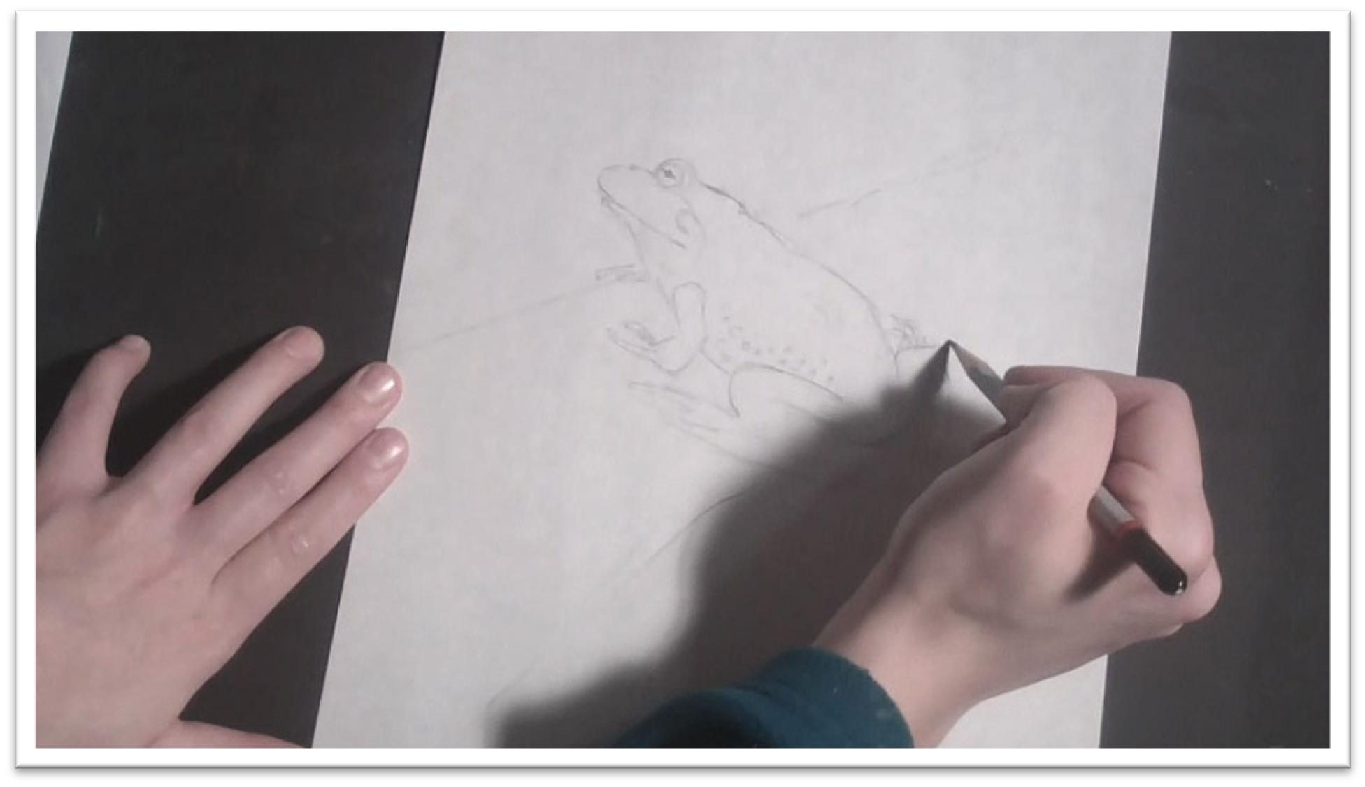
Sketching a Frog
For the last class, we’ll paint a frog, which is a tricky animal because of their slippery, shiny skin.
To paint a frog, therefore, you can either make a very tight picture, protecting every highlight and reflective detail, or you can go loose and just focus on getting a general sense of the frog.
In this class, we’ll work up a loose picture and paint the finished piece on Yupo paper, which will render some really unique effects. Though it’s called paper, Yupo is really more like a sheet of plastic.
Begin the sketch of the frog with the largest shape, which is the pointed almond shape of the body and head together.
The butt and head taper to fairly angular points. Attach the long legs in the crouched position, the front legs, and then, when the large shapes are correct, the eyes and mouth.
Straighten out the sketchy lines and then add further detail in the background. Erase the sketchy lines and clean it up further, then add the final details such as the odd-shaped pupil, and the textured bumps and lines in the skin.
To transfer the drawing to the Yupo paper, cut off a piece from the roll with scissors and tape it to a firm piece of matboard around all edges.
NOTE: Make sure the right side is up. Both sides are slick, but one side won’t take paint at all and the other will. If you buy it on the roll, the right side is usually the side rolled in (so the edges, when cut, will want to roll up not down).
Slip a piece of graphite transfer paper on top of the taped down Yupo, lay your sketch on top, and trace the lines onto the Yupo paper.
Be careful NOT to touch the paper too often with your fingers. Because the surface is so slick, the oils from your fingers transfer easily to the paper’s surface, and watercolor won’t cover oil.
Before you go too far, make sure that the lines are coming through clearly.
If they aren’t, you may need to trace the lines of the sketch onto tracing paper first, and then trace them a second time to get them onto the Yupo.
When the tracing stage is complete, lift up the transfer paper and make sure that all the important lines are showing up.
If you have enough information that you won’t get lost in the painting stage, you can begin.
Animal Mastery Tutorial – Class 20
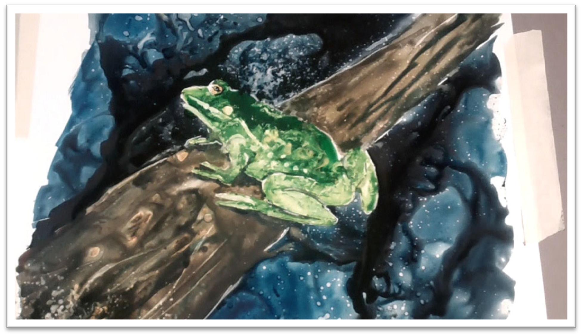
Painting a Frog
To start painting, begin in the background with intense blacks and blues, working carefully around the outline of the frog.
You have to keep your colors very dark, since it will be difficult to go over the top a second time once the first layer of paint has dried.
Drop in some additional colors, then swirl the paint around and make random back and forth brushstrokes before it can dry.
Yupo is wonderful for making interesting textures, not for allowing smooth, even strokes. So don’t fight your medium—push the texture.
Add the brown to the tree branch that the frog is sitting on in the same way, pooling the colors, swirling in more color, and then slicing through dark accents with the edge of a flat brush dipped in Payne’s gray.
You can spritz the wet surface with a water bottle to see what sort or additional textures result that way, then let that dry completely.
If there are areas of bleed that got out of control, you can fix them after the paint is dry by going over the top with additional color, or by removing the accident completely by wiping it away with a wet brush, or by lifting out small areas using the wet brush and blotting system.
Add intense green to the frog using watercolor inks, then swirl in yellows to give it an interesting marbled look.
Spray the skin with water, and it will automatically develop into that warty look that you need.
Let the frog’s body dry, then add color to the yellow eye, take out a few accents in the dots on his skin, and erase a few white accents with a wet round brush.
Touch the wet areas with a dry cloth, and the dots will lift out as bright white patches immediately.
Use this same technique to clean up the lines around the frog’s toes and in the lines that divide the different planes of his body, such as the lines of his bent legs, mouth, and front legs.
You can also clarify these lines with dark paint, but to help those lines blend in better, wash out one side with water to soften them.
Add shadows around the frog’s body and legs to help him stand out from the log, then add the dark pupils and accents in the eyes.
The frog is basically complete now, so you can spend some more time experimenting with texture.
Try scratching out fine white lines with a dry quill pen, both on dry and wet paint. Spritz the frog with water and lift out a fine sprinkling of white dots on him or on the background.
Remember, the biggest benefit (and drawback) of working on Yupo is that nothing that you paint in watercolor is permanent, so don’t be concerned about making mistakes. Just have fun, and keeping pushing yourself!
 If you wish to download the files to your desktop, simply right click the link below and select ‘save as’
Then select the location you wish to save the files to (either your DESKTOP or MY DOCUMENTS e.t.c.)
Once finished, simply unzip the files (PC use winzip, MAC use stuffit) and your files will be there.
All written material can be opened as a PDF.
All videos files can be opened with VLC Media Player.
Select your download option below …