Every shade of gray that you use in your drawing is also known as a tone.
The value of a tone refers to how light or dark it is, and put together, those values form a gradation from black to white called a value scale. Here is an example of a value scale.
Notice that the values (or tones) are numbered. This makes it easier to match the value you have against the value you’re working towards on your drawing.
Contrast is developed by having two values juxtaposed next to each other that are at opposite ends of the value scale.
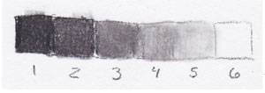
The difference between value 1 and value 2 is not very dramatic, so it would mean low contrast.
The difference between value 1 and value 6, on the other hand, is very high contrast. Those values are at opposite ends of the value scale.
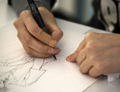
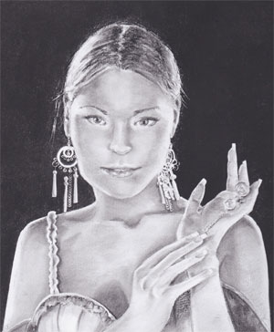
The eye is drawn to areas of high contrast. On the finished drawing below, your eye is probably taken to the highlight on the hair, the fingertips on the hand sticking up into the black background, or the earrings.
That is because those three areas have very high contrast, not only in tone (white against black), but also in line quality. crisp, clear lines have a lot of contrast, versus soft, lost lines such as what you see in face.
In order to make your drawings lively and life-like, incorporate contrasts in tone and in line quality.
Make some lines dark and heavy, others light and thin. Make some intense black tones and keep your highlights bright and white.
But be aware that because the eye is drawn to areas of high contrast, you can easily make “bulls-eyes” on your drawings; spots that grab the eye so strongly that the rest of the picture is ignored. This is detrimental to your composition.
Instead, try to incorporate about three areas of high contrast. This will encourage the eye to move between all three places, and take in the whole picture without being trapped or shot off the page.
You don’t want any “dead” areas on the picture; there should be a gradation, a line quality…just something to take the viewer all the way around the picture plane.
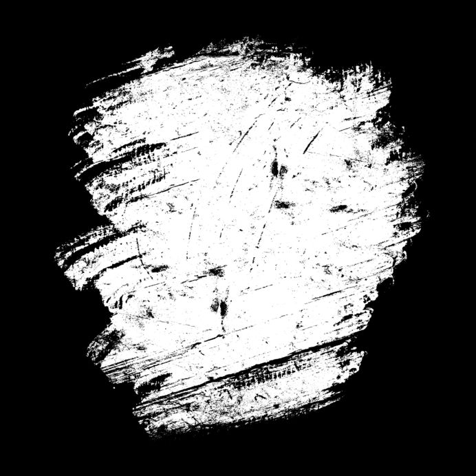
To get those intense blacks, you’re going to need to protect the fine edges and intricate details of your picture beforehand.
When they are protected and the borders are taped, you can use a charcoal pencil to start laying in dark tone across the entire background.
Blend that tone smooth with a large tortillon or stomp, using small, even circle strokes that will disguise the pencil line.
To fill in the tone even more, you can rub your finger over those black tones.
Finally, spray the black tones with a workable fixative to reduce smearing as you develop tones in the hair, face and clothing.
You should also protect the drawing with a piece of clean paper to keep your wrist and arm from smudging your lines and tones as you work.
Want To Learn More…
 Learn how to add life to your pencil portraits.
Did you know that a portrait can still look realistic and striking with very little blending by paying attention to shapes and lighting?
Something as simple as that can make a huge difference in your drawings and we can show you plenty of helpful techniques to add life to your pencil portraits.